Monday, July 31, 2006

You Guys are Lookin' Smart...

A quick glance at the "Looksmart" entries thus far confirms that you early bird folks are really raising the bar on this assignment.

It almost makes me wonder what the procrastinators have in store for us!

Ah, but remember: The deadline, she so relentlessly approaches. August 4th, 11:59 local time.

Tick. Tick. Tick.

Sunday, July 30, 2006

Strobe on a Rope

I used to think that there was special light that only came out when other, better shooters needed to make a picture.

I knew, of course, that they added light when working on controllable situations. But these guys even had great looking photos in "run-and-gun" settings, where you could not hope to have a light stand set up because it would get knocked over. Or your subject was not remaining in one location.

Way back when I got my first off-camera TTL cord, I realized that these little things could give you an incredible amount of control over the direction of your strobe light.

But there was one problem -- all of my photos looked pretty much the same. The light was always coming from the left side of my composition. This was because I needed my right hand to hold and operate the camera.

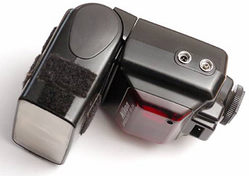
One day I realized that I could use the 1/4 x 20 socket on the bottom of the flash end of the cord to connect it to my monopod. This changed everything. Here were two items I carried around anyway that could be called into double duty to create (way) off-axis, mobile light on short notice.

I used this technique this week while covering the Baltimore Ravens (a professional American football team, for the international readers) training camp. At the end of the session, which usually yields about five dozen very similar-looking action shots, there is the typical media scrum for quotes and the obligatory autograph signings by the players.

Both of these situations are (a) in crappy mid-day light, and (b) too mobile/crowded to add a light stand to the scene.

Since I really try to avoid direct, on-camera flash whenever possible, I frequently go to the "strobe-on-a-rope" technique in a scrum. Here's how to do it.
First, attach the flash to the off-camera TTL cord as and the monopod as shown. The male end of the cord simply plugs into the hot shoe of your camera.

Second, set your camera at the high synch speed to make things easy on your flash if you are working in daylight. Set the aperture to underexpose daylight by about a stop. This will make the flash-lit part of your frame really pop.

This is, of course is done to taste. But it's a good starting point.

Choose a comfy working distance (I like three or four feet) that you will keep constant when shooting your subject. Setting the flash on about 1/8 power gives me a good exposure at that range. I still do not trust TTL with digital, so I always use manual and keep my working distance fairly constant.

The beam angle on the flash is set to 50mm, which is a good compromise between flash efficiency and having to have a good aim when working off camera on the fly.
Now, test it out on something. As our guinea pig today, we have Ace AP Photographer Chris Gardner, who was just as drenched in sweat as I was from covering the sweltering practice.

I very much appreciate Chris modeling for me without being asked. And for that favor, I would never, ever do anything like stick the "I'm-dog-tired-and-sweaty" photo of him up on a blog where 20,000 people from around the world will see it.

Unless, of course, it was absolutely necessary to illustrate the concept.

Some exposure info: If the flash-lit part is overexposed, you either back up the flash-to-subject working distance or power down the flash a little. And vice versa.

Notice that the flash is coming from the camera left side of Chris. That is because the sun happens to be coming from back-camera-right. I always try to let the flash work against the ambient for nice shape and detail. It's your call, though.

Now we are ready to work. In the photo up top, I have the flash coming from camera right (against the sun.) This is something that I could not easily do without the monopod to act as an extension of my hand. Too much of my arm span would be used up by the considerable width of my torso. (Thus the Diet Mountain Dews, these days...)
For illustrative purposes, here's a frame where I included the flash in the frame to show the position of the light source.

It's just a matter of continually adjusting and setting the light source where I want it as I work. It gives me the ability to create very three-dimensional light in a fluid situation. That's something you absolutely cannot do with on-camera fill flash.

There's no reason you cannot use this in more controlled situations, too. Portraits can really benefit by the fact that you can quickly and easily change the direction of the light source in mid-shoot. You can get 15 different looks in two minutes.

Light from either side, back/side light (you have some reach when working up close) top light, bottom light - whatever. Just remember to work the good lighting angles long enough to make sure you get a good range of expressions before you switch the light to somewhere else.

The technique lends itself to trying things you otherwise would not have. Which is a good thing.
I also liked this shot of fans waiting for quarterback Steve McNair, complete with a bobblehead doll for him to sign. That's an ugly, mid-day sky in mid-day light made a lot better by overpowering the ambient with off-axis flash.

Additionally, I like the way that the off-axis light helps to control the exposure on the edges and call attention to the subject. The edges sort of burn themselves. And the closer the various objects are to me, the more of a hard angle the light will be coming from. Look at the two guys arms as an example. This also adds dimensionality to the photo.

Drawbacks? Sure, there are a couple.

First, you have to practice a little to be able to aim your off-camera, off-axis flash. As you get better, you can work with tighter light beam spreads. This can allow you to power down your flash for quick recycling or have a greater working distance. Or both.

Also, you need to be aware of your working distance and keep it relatively constant. (Or adjust your flash to compensate.) With film, you could usually get away with going TTL. But I have not been satisfied with digital TTL to the point where this works well yet. Bear in mind that I am usually trying to overpower daylight for a photo with a "look." The TTL systems sometimes think I am screwing up, and try to "help" me. (Even with the compensation settings.)

Hey, I am simple, manual guy. What can I say.

But the beauty of this technique is that it employs gear that the typical shooter already has.

If you do not have a monopod and/or an off-camera cord, they are not very expensive and are money well spent.

Nikon and Canon both make off-camera flash cords for their systems. But I am not a big fan of Canon's because it is not really long enough to be as useful for this technique as it could be.

Remember, since you are not using the TTL function, you do not need it built into the cord. You can use a normal PC cord. Or the little infra red thing you Canon guys all seem to have. Pocket Wizards also work well. (as long as your monopod is not longer than 800 feet - heh, heh, heh.) Just ball bungee the receiver to the flash.

But then you need to figure out how to connect the flash to the monopod. The cold shoe adapters from your standard umbrella stand bracket will connect just fine. For me, the Nikon cord does both functions in a nice, neat small package.

And speaking of monopods, get one that will be strong enough to use to support your camera and a long lens if you see yourself using it that way one day. That is their main purpose, after all.

If you see yourself turning pro one day. I am a big fan of Gitzo. They are not cheap. But you buy one, and you are pretty much finished buying monopods. They are built very well.

But for light duty (or for just doing this technique as opposed to holding up a 400/2.8) you can spend as little as you want. But don't expect it to work well holding up a big, fast tele later.

So, there you go. The next time you think that a fluid situation is inhibiting your ability to light something well, try some Strobe on a Rope.

Next: Tupperware and Trash Bags, Pt. 1 of 3

Friday, July 28, 2006

By Request: Strobist Button

Someone asked about a button on the Flickr discussion group, so I thought I would whip one out. (That's it on the left.)

Please feel free to place this wherever you wish. And muchas gracias for helping people find the site.

The destination URL is, of course:

http://www.strobist.blogspot.com

The image SOURCE is:

http://photos1.blogger.com/blogger/3792/2480/1600/button.jpg

The format for the code, in HTML is:

<a href="URL"><img src="SOURCE"></a>

(Substituting the URL and SOURCE as shown above.)

EDIT: Added the code. Thanks much for the help.

Tips From The Top Floor Interview

Just got a note from Matt A., telling me that Tips From The Top Floor has posted the interview that was recorded with me earlier this week.

I am downloading it now. While I am waiting, (it's 22 megs) I thought I would throw up the links. The main site link is above. Or you can go to the archive page, or directly to the mp3.

Either way, I hope you will give some of the other episodes a listen. Chris does good stuff.

Thanks, to both Matt and Chris!

Thursday, July 27, 2006

Bits and Pieces, July 27th

Just a few notes to keep you up-to-date with the goings on at Strobist's International Headquarters.

New Podcast Coming

This one was with the very personable (and probably very sleepy) Chris Marquardt, of Tips Fron The Top Floor podcast. Marquardt's shows are really quite good. If you have not heard them, he's worth listening to.

Because of the 6-hour time difference (he lives in Germany) the only time when our schedules intersected for the week was at midnight for him. That was very gracious of him. So if he sounds sleepy, you'll know why. (I have no such excuse for myself.)

And as a courtesy to my regular readers, I insisted on doing the entire interview in English. Also because my German skills could most accuarately be described as "nonexistant." France, Spain, Italy - I'm fine. But the last time I was in Germany, my communication pretty much resembled a non-stop game of charades.

I will post a link when it is up. In the meantime, give him a listen.


Trash Bags and Tupperware

I had a wonderful food shoot yesrterday with a designer from The Sun.

The whole thing (three small set-ups) was done in her kitchen with two SB-28's (only one on a stand) and a variety of Tupperware, cutting board and garbage bags used as light modifiers. I am very pleased with the results, mostly because of the pure bootstrap lighting that was employed to make the shots work.

Of the results achieved compared to the resources used, I feel rather wlike my wife does when she finds a great pair of shoes marked down 70%.

Cramming all of the stuff into one "On Assignment" piece would read like (a very poorly written) War and Peace. So I am going to break it up into thee more managable OA's, each one of which will probably be too long on its own.

The paper will be running the story next Wednesday, so look for the first installment shortly after that.

Keep Those Book Reviews Coming

I have gotten a wonderfully diverse group of book reviews, many of them not at all what I expected. Please keep them coming. I am getting ready to start running them so that all may benefit from your ideas.


First Strobist Seminar Coming Together

Finally, if you are interested in attending the first-ever Strobist Lighting Seminar, please reserve the afternoon of January 13th. It will be in the Baltimore/Washington metro area. As we discussed on the Flickr thread, I am aiming for high value on the what-it-costs-to-what-you-learn scale. So expect it to be short on luxury and long on usable knowledge.

It is being presented with the assistance of a local photography guild, whose members (thankfully) are handling the logistics and detail work. My wife will tell you (as she frequently does me) that I am not a strong person in the "detail" area. My job will be to show up with cameras, lighting, a lesson plan and a caffeine I.V. drip and go from there. It should be fun for those of you are are able to attend.

More details on the location, price and other specifics when we have them nailed down.

Monday, July 24, 2006

So, What are You Reading?

Being summer (for you northern hemisphere readers, anyway) I always like to know what I should be reading while getting my future skin cancer at the beach.

I've showed you mine -- I have my favorites listed on the Strobist Bookshelf. But I would love to know what photo books you all consider your favorites.

Herewith, I am offering anyone the opportunity to make their case in a mini-review for a favorite photo book, DVD, or any other media.

How-to, monolith, photo textbook, DVD -- whatever. Anything in the photo genre in general is fair game. Books that partain to lighting are, of course, especially welcome. Please limit the selections to books you have actually read and enjoyed, as opposed to stuff you heard was pretty good.

Please send me an e-mail with a paragraph or two of the following info:

• Title
• Who wrote it
• What it is about
• In print or out of print.
• Why you love it.
• Your name

(I cannot, in good conscience, put up a review by someone with a screen name like, say, StinkyFeet207...)

And please put as the header, "Strobist Book Review," so I will know to skip right past it when I am busy searching out the important daily e-mails on how to Increase My Breast Size! (or any other part of my anatomy, should that need become critical.)

I will blurb the ones that sound interesting on the blog as a way to plug some of the interminable gaps between my blathering posts.

This will help to spread some good info around while allowing me to get my 2.5 hours of beauty rest per night, too.

And you will be able to turn a couple of people onto a good book. Which is cool.

Muchas gracias,
-D

Saturday, July 22, 2006

On Assignment: Pool Portrait

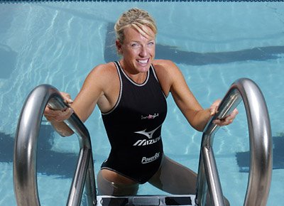
A few days ago, I had an assignment to shoot a professional triathlete at a local pool. It was a quick, bottom-of-the-page sports assignment. But the photos were a good illustration of how to use location to control bad sunlight, and then build the good light back up with flash. So here it is.

We were doing a story on her because she will be competing against men in her next event. She's not superhuman - there was just a scheduling mix-up on a race for which she had properly entered and trained before they cancelled the women's event. So it's gonna be her against the guys.

The assignment was in for 2:00 in the afternoon, which is just in time for bad-quality sunlight. Naturally, I grabbed a flash with a light stand and set out to tame it. I am trying something a little different here and just walking you through the process step-by-step, thinking out loud as I go.

I get there traveling very light, as usual. I am carrying one camera with a wide-angle zoom, a flash with an external battery (overkill in this case) and a portable light stand kit.

I meet her at the front door. She's very personable, and I figure it'll be easy to make a nice portrait of her. As always, one of my first conversation points is to find out how much time she has for me. That's always very important when planning what I'll do. And it also shows that I respect her time constraints, which is important to her.

She tells me that a group of athletes are concurrently being shot by another photographer, Nicole Martyn, a young Patuxent Publishing photographer with a very good eye. So I make it a point to keep an eye on how Nicole is photographing the other athletes. You can always learn something.

The fact that the subject is already occupied with another photographer might have irked me 20 years ago, but now I use it as time and space to figure out how I want to shoot her while I wait. I tell her that I'll need 5 mins to find a spot and set up light, and that works out well for the her, too.

So, where to shoot and how to shoot it?

As I said before, the sun is coming in high and hard. So I am looking to (a) get away from it, and/or (b) make it better. (As it turns out, I ended up both - one each in two separate shots.)

I find an alcove by a door to the locker rooms that is in the shade. The pool is in the background, as seen in the top photo. The shady area is about 4 stops below the sunlit pool area, which gives me a good platform from which to add light.

Within about 30 seconds there is an SB-800 up on a stand to camera left, set on 105mm beam spread and 1/4 power manual. This gives me f/16 @ ASA 200 a few feet away at the wall on the right, as measured by my "Flashmeter LH" (left hand.) As always, I fine-tune my flash exposure by shooting my hand in the subject's light and eyeballing the back of the camera.
It's fast and free. The water drops on the front filter (thanks to the wet kid that just ran by me) even show up at f/16. And at f/16 at ASA 200, I have plenty of shutter-speed choice to set the sunlit pool area just as bright or dark as I want via the shutter speed.

I'm about 3 minutes into the assignment at this point, and catch the eye of the triathlete. She pops over for a minute (not even a minute, actually) and the first shot is done.
Here's the set-up. As you can see, I am using a cardboard snoot on the flash to control the light spill. This gives me a little edge to the light, and a photo with nice, sealed edges.

It could hardly be simpler or quicker. The coiled cord thingie hanging down is my SC-17 off-camera TTL cord, which never ever gets used for TTL. Today, it is doubling as a lightstand-hotshoe adapter, as it has a 1/4x20 thread on the bottom. (When I do use it as an O-C cord, it is in the manual mode.)

I ask here if she can meet me on the other side of the pool in 5 mins. Fine. She goes back to re-join the others, who are being shot individually by Nicole.

Five minutes may not seem like much time to plan a shot. But if you are already familiar with your ambient and have your light already set up, it is more than enough time.

A minute later, I am set up by a ladder on the other side of the pool, facing into the high-angle sunlight. It's coming from overhead background camera left.

I decide to shoot her on the pool ladder to get a clean (water) background that the sun can light for me. I can nuke her from the front, and she will not leave a shadow on the background, either. What I now have are two planes. One is flash lit, and one is ambient. And I can control both independently. Lighting with flash against the ambient this way always give you the most control.

I stick the flash at camera right and set it to 1/2 power on manual. I want the ability to really dial down the water while shooting, without having to alter the flash. I can easily do it with shutter speed at this flash level. The snoot is still on the flash, which will keep the chrome rails from throwing an unmanageable highlight back at me.

Three minutes later, she is back and on the ladder.

I sight down the snoot and aim it right toward her face.

"Can you see the flash at the other end of the tube?"

"Yes."

Good. I know that her face will be lit by the snoot's beam. Who needs modeling lights, anyway?

Now, we all have our different ethical compass points - as do our publications. Mine is such that I feel comfy positioning her for a portrait. This photo does not purport to be a hands-off, documentary action shot of her practicing. It's a portrait. I have already altered the scene by merely showing up and talking with her. Ditto for using flash. And that's true whether it was crappy, direct, on-camera flash or something a little higher on the lighting food chain.

So, if you feel differently, then by all means act on it. But just be aware that an extreme aversion to injecting yourself into a scene for something like a portrait can sometimes be a fear of lighting, masked with the indignance of an ultra-hands-off, documentary artiste.

My position is that you have to convey your subjects with integrity, and balance the fly-on-the-wall times with the times that require you to elevate the technical quality of a photo. On a portrait (if they know you are shooting it) you are already a little bit pregnant with respect to controlling the photo. Learn to work along the ethical continuum in a way that is both honest and allows you publication to have strong images.

Sermon's over. Back to the photo.

Here's a trick I use to improve the quality of light from a snoot when shooting someone. Have them turn their body toward the light and look at it with their face, then have them look back at you with their eyes. It'll help the quality of a hard light. And it is a natural task for the subject to perform. Much easier and less cumbersome than trying to nail everything down and then shoot them while they are stiff as a board.

Just do not get the light too far off of the shooting axis, or it starts to get weird.

So, there's snooted, half-power flash firing into the shadow side of the subject, in line with her face. Looks fine, but the exposure is out of whack for both her face and the background.

This is why I have the flash powered up to give myself some leeway. With the camera set at 1/250th, I pop a test photo. Using the TFT screen on the back as a guide, I adjust the aperture until her face looks properly exposed.

With that nailed down, I repeat the process for the background, except I alter that by adjusting the shutter speed. Takes about 15 seconds.
A minute later, we are done. That makes 10 minutes for the whole assignment, with only two or three minutes of the subject's time actually taken up. Why so fast? After all, I could have shot 300 frames and kept her there for 30 minutes.

My reasoning was two-fold. First, I didn't want to monopolize her time and shortchange the other shooter. And second, it is very good practice for those times when you are shooting someone very important (or consumed by their own ego) and they have very little time.

And, as I am both so very important and utterly consumed by my own ego, that's it for me.

:)

Next: Strobe on a Rope

Friday, July 21, 2006

Dang, We Look Good...

Thanks to a tip from Carl Hutzler in the comments section, we now have a cool way of looking at all of the bootcamp pix easily.

Go here and type in a tag (like "strobistbootcamp") and you will see all of the pix in thumbnail and slideshow format.

Even cooler is that it gives you related tags that you can also jump to with one click.

Thanks, Carl!

Gone Fishin' For the Weekend

OK, maybe not fishing. But we'll be swimming in a roof-top pool, if that's close enough.

I'll be in Philadelphia with the family for a much-needed weekend of R&R. There will be no off-camera flash photography involved.

Philly skyline photo by Strobist reader (and Travel Photographer Emeritus) Bob Krist.

Who will be the 1,000th Flickr Strobist Member?

EDIT: We have a winner!

Ladies and gentlemen, please welcome Bryan Peabody, Flickr Strobist's 1,000th member.

But first, a little about Bryan.

Bryan lives in Louisville, where he apparently enjoys baseball, airplanes and growing stuff, among other things.

He has a cute new nephew, and he gets absolutely rave reviews from his wife (or very serious girlfriend - not sure):

""Bryan is the sweetest, kindest young man you'll ever meet, which is why I've already claimed him as my own. He is thoughtful and creative, intelligent and sincere."


You don't see many recommendations better than that. If he's good enough for her, he's good enough for us. As a married guy, I can tell you that approval ratings like that are not easily won.

I would have had the band playing and presented Bryan with his $1,000.00 Adorama gift certificate when he walked through the door, but I do not have a $1,000.00 gift certificate.

Or a band.

(Or a door.)

Instead, please take a moment to leave Bryan a comment welcoming him to the group. And, while you're at it, ask him what took him so long.

As good a place as any would be under this photo, which shows Bryan holding the aforementioned cute nephew.

(I did notice the first comment was a potentially parental shot across the bow from the significant other, so I am pretty sure they are married...)

Welcome aboard, Bryan!

------------------------
(Original post follows:)

We are at exactly 999 members even as I write this...

Any procrastinators out there? Now's your chance!

Thursday, July 20, 2006

If You Have a Moment...

This is not something I am in the habit of doing. But I happened to visit Strobist reader Dolores Neilson's website after clicking on a link in her comment. Her site - and her work - is absolutely beautiful.

If you have a moment, check it out. You'll have to figure out how to work the buttons on her camera, though.

Boot Camp Assignment Number Three: Look Smart

At the beginning of this series, I told you that we would start out easy and quickly get to the more challenging stuff. So get ready to turn it up a notch.

In the first two assignments, you were given a fairly tight set of subject matter restrictions and lighting styles. The idea was to keep the field of play pretty small and allow you to get comfortable shooting people within a reasonable set of parameters.

In the headshot, the idea was to shoot a simple head-and-shoulders shot, paying attention to detail and lighting in such a way as to transcend the mugshot genre.

With the background shot, you had to shoot a lit vertical photo using a found environment.

On the third assignment, there are no physical restrictions. Any reasonable shape is fair game. Ditto the lighting style - but make it work for you.

If you think this will make things easier, you're likely in for a surprise.

The earlier assignments were the type an assigning editor could trust to almost any competent photographer. The third is an assignment that would cause them to choose a shooter from their "A-List."

In this photo, you'll again be shooting a person. Because of the theoretical article associated with the photo, the person should be an adult. Other than that, there is no preference as to age, gender, etc.

The person you are shooting is plain and ordinary in every respect, save one: He or she just happens to be a genius.

And that is the point your photo needs to convey.

This is very much an exercise in lighting. But it is also one in which you will need to use your interpersonal skills to capture a spark in someone that makes you realize something very special is going on between their ears. (So it would help if the person you choose to shoot for this assignment is not dumb as a stack of bricks.)

Intelligence. Accessibility. Sex appeal. Credibility.

Capturing a "feel" in a photo is a challenging thing, but the A-List shooters do it every day. Heck, if you can capture the last two reliably, you will be a very rich advertising photographer.

Photograph an unknown AIDS researcher for Time Magazine. Shoot some nerdy looking web geek for Wired. Shoot a homely Nobel Prize winner for The Economist. Capture the very normal-looking mutual fund manager (who just happened to nail an 81% return this year) for Forbes.

You get the idea.

Anyone can make a striking photo of George Clooney or Jennifer Anniston. You are helped not only by their looks and recognizability, but by their practice in helping photogs make great photos of themselves.

But what about some plain-looking Joe Schmoe who just happened to hit the Big Time? This is where having the ablility to create your choice in light is critical. Penelope Cruz is a walking, classic portrait in any light. Joe Schmoe is gonna need some help from you.

In sticking with our androgenous past, our Joe Schmoe du jour will be Tracy Watts.

Tracy is utterly ordinary in every respect, except Tracy just happens to have discovered how make solar panels that cost 95% less than the current designs, and return more electric power per square meter.

Our magazine found out about it because Tracy is a neighbor of one of their editorial assistants, who learned about it in casual conversation.

Tracy was weeks from announcing the story (and the associated multi-billion-dollar contract) to the world. But we know early, and we have negotiated an in-depth exclusive with Tracy in exchange for not breaking the story early.

Sitting on a story - for whatever reason - for a predetermined amount of time is called an "embargo," and it happens all of the time. In our case, Tracy gets to control the timing. And we come out with a killer, well-researched, well-written -- and well-shot -- story within minutes of the official announcement to the world.

Does this timing/sequence ring a bell? These things happen more often than you think, and for a variety of reasons. (Frequently, there is a slimy slick publicist involved.)

So you are going to shoot Tracy at home (or wherever) and show him/her for the ubergenius they are. This invention will completely change the future of energy consumption, the balance of power in the world, futunes of countless lives, etc. No pressure, though.

Where to start?

Here are some ideas:

1. KISS. (Keep It Simple Stupid.) Less is more. I'll say that again. Less is more. You have enough to worry about without junking up the frame with content that does not add to the photo.

2. Light. The eyes are the window to the soul. Or in this case, the brain. Use light and composition to draw the viewer into Tracy's mind. A tight snoot might come in handy here, for instance. But don't get too gonzo on us. Bear in mind that this picture might be in science textbooks (or whatever passes for books) in 50 years.

3. Shoot and edit for some expression that reveals a spark. Or you may wish to lean toward revealing the determination that kept her going through the long process of getting to her discovery. How you coax that expression out of Tracy one of your challenges.

4. Associated objects can add to the power of the photo, but use them sparingly. (See #1.) Like what? The sun, for one. Mathmatics. Pre-existing solar technology. Maybe even plants. (It is conceivable, for instance, that Tracy could have used the efficiency of plants as the basis for the discovery.)


That'll get you started.

The cover has already been assigned to an illustrator. Hey, it's not that we didn't trust you. It's just that we've never seen Tracy. And she just might not be Cover Material, for all we know. We do have to sell magazines, you know. So we'll sell the idea of an exciting new tomorrow with a sexy energy illustration and save introducing Tracy to the world for the inside art.

This will certainly be an inside lead photo. Vertical or horizontal is up to you. (Just don't go 1x10 stripey on us.) Either way, it'll run very big. Imagine it that way when you are composing and cropping.

This is a very different assignment than the first two. And I fully expect some of you to freak a little at the prospect, bail and pull the rip cord on this one. We'll see what happens.

Here's your info on the assignment:

Shoot Tracy Watts, whose solar panel design will revolutionize the future of energy.

Photo will run large on the inside.

Deadline is August 4th, 11:59 local time.


Questions? Ideas? Rants? Talk about it here. (Note that in the real world, this assignment would be done in total secrecy.)

Tags:

Strobistbootcamp
Looksmart (make it one word)
[your country]
[pro or amateur]

Wednesday, July 19, 2006

Thanks

Thanks for all of the kind notes of support on the Flickr thread, via e-mail and in the comments section. I am taking many of the suggestions to heart, although maybe not so much the ones that would add a lot of work right now...

I'm not going anywhere, and I am looking forward to continuing to add new stuff. Just at a more sustainable pace.

Coming up, I'll be posting the third Boot Camp assignment. Also, I shot a job today that'll make a good "On Assignment." It'll go up as soon as it runs.

And the seminar details will be posted as soon as they are nailed down.

Tuesday, July 18, 2006

Strobist's Next Phase

Note: The following letter is mainly for the benefit of those of you who have been with me for a while now, as those people who just drift through occasionally will probably not notice the difference.

I first came up with the idea (and the name) for Strobist in February of this year, after being invited by a colleague to give the same lighting talk for the umpteenth time to a fresh group of college students in Baltimore.

Instead, I decided to put it all down in writing once and for all. That way I would not have to repeat myself, and I could save some precious discretionary time.

Boy, was I wrong.

One thing led to another, and the site pretty much went nuts. Word spread faster than I ever thought possible. Not because it is better than anything else -- it's not. Because a lot of people would like to know more about using flash, and there really isn't anything like the site anywhere else on the web.

As the number of hits grew each day, the site began to take on a life of its own. There is something about getting dozens of e-mails a day from appreciative readers asking for more to lead you to give them just that. You can crank out an incredible amount of work when sufficiently motivated.

Since early April, went the site went "live," I have posted approximately 200 articles and you have responded with more than a million(!) pageviews. That blows my mind.

Interested tidbit - that flipping of the switch in early April was via (spotty) cellphone internet connection in a hotel room while dog-tired from shooting a long day on the road for The Sun. How appropriate.

Shortly thereafter, I got sick. And, glutton for punishment that I am, I used the time to crank out about a dozen posts. Two or three of which actually had coherent content. Credit the haze of Thera-Flu for much of Lighting 101.

I had several goals associated with doing the site.

1) Create a body of work that would serve as a reference for anyone who wants to learn how to light cheaply, and without needing a pack mule. (I feel I accomplished that one.)

2) Give myself a creative outlet that was entirely within my control to help to further my own understanding of light by teaching others. (Check - and it has really recharged my own batteries.)

3) Create more net free time in the long run by only having to go through the process once. (Uh, nope. Missed that one by a mile.)

4) Make the site free to all who wished to learn from it. (Did that. Free, and worth every penny.)

5) Build a community of minimalist lighting enthusiasts. (Almost 1,000 enthusiastic and interesting folks, and counting.)

6) Possibly create a site with a high rate of traffic, with an ad model that would lead to a decent supplimentary income. (Yes, and no.)


Number six is at the center of my delimma.

The site is producing a decent part-time income, but nothing proportionate to the the huge amount of work involved. Exacerbating the issue is the fact that the work is being done in my marginal time, at the expense of quality time with my family. And sleep. I am writing this at 1:45 am local time.

The way I see it, I have three choices.

I can give up the site. I can work the business model harder to try to make the income proportionate to the large amount of time that this requires. Or I can scale back the posting frequency and try to reclaim some evenings with my family.

I am choosing choice number three. And as I have always been honest and open about all of the lighting stuff, I am choosing to be up front with the website stuff, too.

Regular readers will notice the changes soon, but I wanted to give you guys a heads-up first.

Here they are.

First, no pre-existing content is going away. If it is here, it will stay here. I want this place to be a free reference for current and future readers.

Second, in my effort to maximize the income to the site, it has gotten pretty tarted up with flashy ad links and displays. I will be exchanging most of those for a few, simple image links that will allow people who wish to support the site to painlessly do so when they shop at Amazon or Adorama. These will be simple and without the flashy bells and whistles that I think are severely cluttering up the overall look.

I am strongly considering using the best ad "real estate" on the site to call attention to non-strobe stuff that is even more important than good light, and worth reading about. I get between 10k and 20k page hits a day. If I can teach you about light and make the world just a little better place - even a tiny bit - that's a very good thing.

Third, I am 100% in favor of completing Boot Camp. I think it has developed into a wonderful "group learning" experience for all of us - myself included. I am pretty sure nothing like this has ever been done on the web before (with flash photo, at least) and I am just as curious to see where this goes as some of you are. So, if you're game, so am I. Don't look for Boot Camp II next semester, though. It will go down as a unique experience.

Fourth, regular readers will henceforth notice a decrease in posting frequency. My goal is to publish fewer, more developed pieces. Yes, I know this breaks a cardinal rule of blogging. But it was pretty much the only blogging rule left that I had not yet broken. (Brevity comes to mind as an early casualty.) So, what the heck.

Fifth, the freed-up time will allow me to explore other educational venues. I can tell you that there is at least one seminar in the planning stages, and more info will be available soon. I am also talking with people from a couple of pre-existing educational organizations about bringing my approach into their workshops.

I hope to at least partially reverse the "many-hours-for-very-few-dollars" ratio that I have apparently embraced in the genre of lighting education. But whatever I do will be very affordable, or I won't do it. I simply do not believe that good light has to cost a lot.

I see this last item as an exciting development. In partnership with another (local) organization, we have come up with a workshop model with a very high content-to-cost ratio. If it is successful, it will not be the last time I do it. And I could hop on a plane and do it just about anywhere. I love the dynamic of working face to face with a classroom-sized group of people. The learning and enthusiasm are contagious.

Most important, the biggest change for me will be to reclaim some very precious family time, which I see slipping away along with the last weeks of summer vacation. My kids will never be 5 and 8 again. And quality time lost with them and my wife is more expensive than I can afford.

Finally, I want to thank from the bottom of my heart those people who have shared with me the hundreds of notes about how much they have learned from the site. I absolutely love teaching people, and hope to continue. And I could not ask for a better and more enthusiastic group of readers. I mean that.

So, I hope you'll understand and join me the next phase of this experiment.

You guys have always been a very opinionated bunch, and I do not expect that to change now. So I am sticking a thread on Flickr to house your comments, rants, reactions, curses, suggestions, etc., to this development here.

I know I do not have to mention this, but please let me know what you think.


Fondly,
David

Monday, July 17, 2006

Background Assignment: Discussion

Looking at the background photos posted and tagged to Flickr, two things struck me.

First, we lost some of you, numbers-wise. This was, after all, a more complex photo assignment. But the ones who did participate clearly put more effort and planning into the final product than on the first assignment. And the results show that, for many, it was worth the effort.

You can see the take by clicking here. As usual there are a few that are not popping up. You can see the URLs of the photos in this thread, near the bottom.

A few of you are off about 90 degrees on the vertical/horizontal requirements. But we will just assume for the moment that some horizontal magazines have popped up to showcase your photo...

Leading off is a really nice example of using a background as a dynamic element in a photo. It's not often that a background adds a layer of action, but that's certainly the case here.

Execution on this one was first-rate all around. This photo is shot in shade, but the lighting brings nice directionality to the shot. Click on the photo (and all of the others) to get to it's Flickr page, where you'll get more info in many cases. Check out the larger versions of the photos, too.

This two-light example submitted from Finland had a lot of things going for it, too.

The balance with the ambient was very nice, and the geometric shapes of the building brought strong leading lines into the photo.

I would personally consider losing the artwork on the stairs with a crop, but the photographer made a point of liking it's inclusion. It's a subjective call - either is defensible.

This photo is breaking several rules but I like it anyway. Which doesn't say a lot for rules, I suppose. It was originally a horizontal that was cropped to a vertical for the purposes of this assignment.

Happens in the real world every day - and not always by the photog's choice.

I love the three dimensionality of the photo. It looks as if several lights are working in there when, in fact, it is just one strobe working against the sun. Imagine this photo without the light at camera left to see just how much the ability to use off-camera strobe adds to your arsenal.

This photo is priceless.

The background (and all of the content, really) is very minimalistic, and it works. When in doubt, less is more.

I am not sure how much the strobe at camera right is actually contributing to the light - it is pretty close to the ambient. But the overall light in the photo is just fine, so no qualms about it from this end.

As simple (yet engaging) backgrounds go, I particularly liked this photo, too.

That the color of the subject's clothing coordinates so well with the background is just a bonus.

Planned, or happenstance? Doesn't matter. It works. Take credit for it.

The background is 3-d and 2-d at the same time. Nice choice. And good execution, too.

I don't know what it is about you guys, but it is uncanny the way a couple of you always tend to anticipate a future assignment with one of your photos.

This isn't really what I had in mind for finding a physical background, but it's a beaut.

And do not feel left out - you'll all get the chance to do one of these before it is over.

But there will also be a restriction involved and a kicker (or two...)

And finally, this absolute knockout of a photo from Thailand.

More than just a background/portrait, this doubles as an action shot. You have warm light vs cool background. The strobe fills from the left, while mimicing the color of the fire as a light source. And a slow shutter speed to smooth the water as a kicker.

Wow. I'd love to say that I shot this one.

I stuck a few others in as favorites, and there were many, many other strong pictures. Please continue (and add to) the discussion by posting your thoughts on the Background assignment here.

Found: Nikon SB-24 Manual PDF

Kudos to Strobist reader Marc Lacoste, who has tracked down a .pdf version of the Nikon SB-24 speedlight. It is posted online for easy download, here.

Great reading, if you are wondering what all of those rubber "mystery buttons" do on the back of your flash, now that the symbols have long since worn off...

Great find, Marc.

Sunday, July 16, 2006

Tick, tick, tick...

Just a quick reminder for those of you who are Boot Camp participants to get those background assignments in and tagged before midnight local time.

I'll be pulling them up tomorrow while I stay inside and away from a 100-degree heatwave in the Mideast Atlantic region. I have already noticed some really nice stuff from some of you. And I am very much looking forward to seeing the group effort.

Saturday, July 15, 2006

A Great Face for Radio...

First of all, no, that's not me. The above guys are Bill Crawford and Ed Hidden, of StudioLighting.net.

They were kind enough to have me on their podcast (which was taped a couple of weeks ago) and it has just been posted.

At 36 minutes long, my wife would note that it is about 34 minutes longer than I am able to talk intelligently about anything. So be warned in advance. It's also just a tad under 20 megs, so this will be a long download for the dial-up folks.

As for the prospect of future podcasts on Strobist, I am learning sound editing for my day job even as we speak. And there is apparently a wide range of opinion as to whether any audio produced here would even be worth listening to. Still working that out.

But there's one podcast already out in the ether, thanks to these guys. Check out the rest of their site, too.

The preview page is here. Or click here to download the file.

Edit: Fixed the podcast link. Thanks for the heads-up.

Friday, July 14, 2006

Friday Night at the Movies

If you have not been hanging out on the Flickr Strobist discussion board, you might have missed a nice find by a regular Strobist reader.

He points out ZugaPhoto.TV, which has dozens of photo-themed how-to and demonstration-type videos to peruse if you are so inclined. There are other subject areas, too. But just click on "photography"on the mid-left menu to get a long list of photo choices to pop up on the right.

Thanks to Codeburner for the heads-up.

Wednesday, July 12, 2006

Pretty, Shiny Things

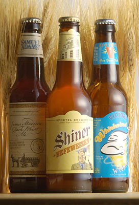
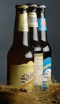
I previously mentioned that I was in the studio the other day, shooting wheat beer. The light painting idea was a bust, and I had to bail to plan "B."

Even though I was using the bigger flashes for this job, I wanted to use this opportunity to show you a new lighting technique. You can also use this as a chance to exercise your "reverse engineering" skills.

The problem when shooting a dark, reflective object like a beer bottle is that it mercilessly throws all of your light right back at you. It's hard to hide from a curved reflector.

In this early photo, which was a quick, CYA shot at the beginning of the session, you can see the problem. The softbox reflections are hot, and the rest of the bottle is pretty much without any useful detail.

To change the way a highlight is reflected back to you, you have exactly two options: You can change the surface quality of the subject, or you can change the appearance of the light source itself.

The former can be achieved with "matte spray," which I did not have. So I chose the latter.

Before I explain how I did it, stop right here and try to figure it out yourself for a moment.

--------------------------------

Now that you may or may not have it all figured out, I will tell you that I am using the same softbox as in the harder-light photo above.

The difference is that I am now double diffusing the softbox, which is actually a strip light. (No mystery there - it's what was available in the studio.)

In doing that, I am controlling the "specular-to-diffused transfer."

The what?

Yeah, I thought that might throw you. But no worries, you already know this. You just don't know the terms.

In any 3-d, lit object, there are three zones of light: The shadow, the diffused highlight and the specular highlight. There are also "transfer zones" between the various areas.

The shadow is the part that is not lit. On the earth, that'd be the side of the planet experiencing night time.

The diffused highlight would be the part receiving light from the sun - the daytime folks.

The specular highlight would be, say, the reflection of the sun you would see in a lake while flying in a plane.

The diffused highlight-to-shadow transfer zone would be the areas of the earth in twilight.

But there is also a specular highlight-to-diffused highlight transfer, which is what we are trying to control in the beer bottle. That'd be that sharp edge of the softbox reflection. And we want to soften that.

As I said before, matte spray would do the trick. It would change the surface quality of the bottle. But it'd also make the bottle look a little weird. So I prefer to alter the quality of the light.

What I did was to place a sheet of Rosco Tough Frost (Made by the same folks who make the gels) in between the bottle and the softbox.
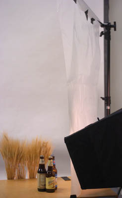
It is kind of difficult to see, even with this scener shot, but what it does is to soften the edges of the softbox as seen from the beer bottle's perspective.

("Tough Frost" is pretty much what it sounds like it is. It is translucent, but not transparent. And if you are careful with it, it lasts through many, many studio shoots.)

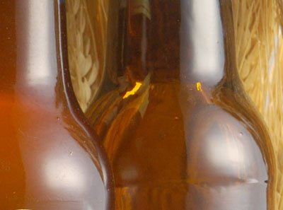
This softening also shows up in the reflection was are trying to control. It is still a hard, glass reflection. But it is a hard reflection of a soft lighting transition. It is important to place the diffusion material very close to the subject, or you lose the effect.

Here is a detail from the final photo, with the target area seen in close-up. (Edit: Sorry about the confusion earlier.)

Nothing has changed about the bottle. But the light is different, and I got the desired by altering the light.

I could have helped this along by getting the beers really cold in the fridge and letting them sweat a little in a warm studio, but I had no fridge nearby. This would have also visually suggested "cold," in addition to altering the reflective surface quality of the bottles.

You'd definitely want to do that in an ad shot.

This diffusion technique works great for shooting small, reflective objects. Instead off tough frost, you can use tracing paper or tissue paper, like we did in the macro studio. The point is to diffuse the light. Or to diffuse the edges of an already-diffused light source. You can completely redefine the (apparent) reflective quality of any surface this way.

I like to tape the back edge of a diffusion material down and support the front, like a little lighting lean-to. Then I put a light above it and shoot through the raised space in the front. Works great. I'll do an On Assignment shot like that soon.

For the record, this is all on a table and there is also another softbox behind the setup, backlighting the wheat stalks.

So, just some new techniques to think about.

Besides, you never know when you are going to be called upon to shoot a high-end shot of a beverage, anyway...

Next: Pool Portrait

Web Video on Portrait Lighting Techniques

The folks at Sports Shooter have put up another cool video from their Sports Shooter Academy (2) this last April.

The subject is portrait lighting, and the presenters focus on the more powerful flash equipment. But the ideas are applicable for the most part.

A warning to you dial-up users out there: At 25 megs, it's a frog choker. But if you get a chance, give Portrait Lighting at the Sports Shooter Academy 2 a look.

Sunday, July 9, 2006

How To: DIY $10 Macro Photo Studio

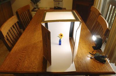
Today we are going to learn how to build a DIY light tent for product photography, for next to zero cost.

Even saying it costs "$10" is a bit of a stretch, because you can probably build this mostly for free. The ten dollars assumes you cannot scrounge a cardboard box and some white tissue paper you have saved in the gift-wrap supplies box. You can get this stuff at an office supply store, but it is more fun to scrounge. Besides, we are all about re-use and recycle here at Strobist. (I can proudly report that 98% of my bad jokes are recycled!)

If you have this stuff, the only thing you will need to buy is two sheets of posterboard - black and white. Total damage would be less than $2. Don't blow the rent money.
__________


Some Basic Theory

Small flash gear is especially well suited for shooting macro shots and other small-object still life and product shots. And this little studio in a box does not even technically need a flash to work its wonders. Any bright lamp will do if you are shooting digital, because it is very easy to balance for tungsten light and get the color balance spot on.

This project is basically a light tent, albeit a very controllable one. It pretty much creates beautiful light by default. Frankly, it's very difficult to screw it up.

This is one of the most useful DIY gadgets you could make - especially when you consider the price tag.

What can you use it for? That's pretty much up to you, and will be limited only by the size of the box you use. Shots of small objects in the studio, on location, items you are selling on eBay, flowers (even still in-the-ground-and-growing ones,) Absolute Vodka bottles for $50,000 ad campaigns, catalog stuff - whatever.

This little thingie does it all in spades - and with a lot of control, too.

The secret is being able to have nice, soft, even light coming from either side or the top - or any combination of the three.

The black and white poster boards serve triple duty as light blockers, reflectors or sweep backgrounds. Not bad for 49 cents, huh?


How to Make It

I used a 12" x12" x12" box, but let your subject needs define your size. I would not go smaller than 12x12x12, tho.

Basically we are gonna cut windows in three sides of the box and totally take out one side. (That last part is optional - see below.) You'll want to tape the original bottom of the box securely into place before making your cuts. Leave two of the top flaps on for light control as shown, and remove the other two. The three-shot sequence just below shows it better than I could explain.


I used a razor to slice the boxes. Try not to amputate anything, okay? Besides, the arterial bleeding will saturate and weaken the cardboard.

The last photo of the three-shot sequence shows the box with the tracing paper taped over the windows. You can choose to leave the "side" of the original box that will form the bottom of your studio attached to make it stronger, but it will preclude your ability to place the box down over an object (like a plant) outside and retain the surrounding ground environment. Your choice. I'll sleep well either way.

The thing could not be easier to use. You'll need at least one light source. A flash works great, as long as you can manually control the output and get it off of the camera.

But you could also use a bright lamp or work light. Just be sure to balance your camera for tungsten and put the camera on a tripod to keep it still during the exposure.

You could even use the sun, making it come from whatever direction you need by rotating the box.

The beauty of this thing is the lighting control you get. You have the ability to almost completely wrap your subject in high quality light. But if you use only one light, the tissue paper acts as a fill reflector all around your subject.

If you want to kill the reflection on the darker side, stick a square of black posterboard on that side (on the inside.) Ditto on the top.

My favorite thing about this box is the "infinity sweep" effect you can get for a seamless bottom-to-background look. It's just a strip of posterboard.

White and black (especially white) both work fine, but you could also use any color you wanted. You'll just have to pony up another 49 cents.

You want more lighting control? You got it. The two remaining flaps act as gobo's to block your camera from seeing the side light sources. Bingo - no flare, and very saturated colors. Simply adjust the flaps for best blocking effect.

You want the light to come from closer to a 45-degree angle? Rotate the box around a little and shoot from closer to a corner.

You want more definition on each side? Use a light source on each side. This setup puts the old "Big Tupperware Light Tent" to shame.
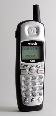
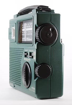
The phone and radio were shot just because they happened to be sitting around the kitchen. I used another light on the camera left side of the radio for better left-side definition.

When using two light sources, you can change the relative light intensity by dialing down one of the flashes on manual, or by moving one of your lamps further away or closer. Simple as that.


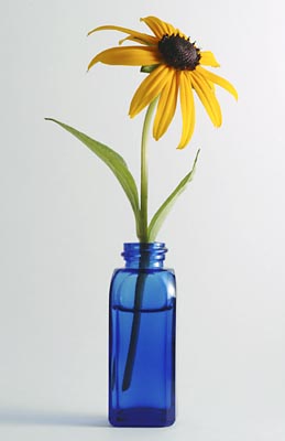
The flower you see at top of the post (a "Black-Eyed Susan") was shot with just one small flash (on 1/16th power) positioned on the camera right side of the box, with no fill other than the tissue paper. (I actually used tracing paper.)

IMO, that's some smooth overall light for just one small light source.
__________


UPDATE, July 2013: Literally millions of people have read this article since it was first written in 2006. And a little cottage industry has popped up around store-bought versions of my cardboard macro studio. If you want now, you can purchase a store-bought version, shipped via Amazon Prime in the US, for about $35.

For that price, it almost doesn't make sense to go to the trouble. But either way, your product photos will look great.

Saturday, July 8, 2006

Get 'em While You Can: $8 Gear Cases at WalMart

You wanna know what is most likely to kill your photo gear? Your trunk. Rattling around back there (you know, the way you drive) is pretty much tantamount to living in a rock tombler.

A poster on the Strobist Discussion Group on Flickr found something which is too good a deal not to bring up to the main board: $8 gear hard cases on the clearance shelf at WallyMart.

Says Photo_Jeffrey:

"They look like a Pelican case except I'm sure the quality isn't quite there and I'm pretty sure they aren't waterproof. Still though, it was a pretty good deal."

They aren't really photo cases. They are pistol cases made by Plano. (Hey, this is WalMart, after all.) But the middle layer of foam is the diced, pluck-out kind, so it can make whatever shape you want.

Besides, what could be better for getting your subjects in a coopoerative mood than to whip out a "gear" case with that "Saye haello to mye leetle friend," Tony-Montana-from-Scarface look?

Thanks for the tip, Photo_Jeffrey.

Friday, July 7, 2006

Interest Check: Strobist Podcasts

Having participated in exactly three podcast interviews in my whole life, I am now toying with the idea of doing it myself.

Many of the Lighting 101 topics in particular could use some fleshing out, and having the extra info would be useful to some of those readers who are not completely grasping the concepts.

That said, I would like to know what you guys think. Worth the effort? Would it be useful?

Here's what I have:

• Close to zero experience
• Sound editing software
• A microphone
• A face made for radio

Here's what I need:

• Some feedback as to what would be useful to you guys, content-wise
• Some good suggestions for a podcast hosting site

As far as the latter, I do not need anything fancy. I can upload generic .mp3's, and the ideal place would host them in a way that a simple URL would access them. I have no FTP access that I can use here at Blogger, so I am looking outside the fold.

Free would be very nice. I mean, if YouTube can do it for video, someone has to be doing it for audio. Bonus points for low pain-in-the-butt factor on the interface.

Please place any ideas and suggestions here.

Wednesday, July 5, 2006

Background Assignment Entries Arriving; Bits and Pieces

I see some of you are already putting up your second assignment, including this effort by Righteye.

(Click on the photo to pull up the tagged background entries so far.)

You still have plenty of time, mind you. But I do occasionally check on you guys.

Meanwhile, back in my neck of the woods, I hit the studio today with dreams of a cool, light-painted product shot dancing in my head.

As it turns out, a bottle of beer is perhaps the most ill-suited item for "light painting" on the face of the earth. All that curved glass gave me fits with my reflections.

So I dropped back and punted, bailing to plan "B." It involved a neat little double-diffused lighting technique that I will put up and explain when the photo actually runs next week.

On those times when you cannot control the reflective quality of the surface of the subject, you just have to create a light source which gives you exactly the gradient reflection that the glass needs. More on that later.

It was actually strange to be lighting in a studio, instead of on location. I used our fancy new Profoto gear, which cost more than my car is worth. Honestly, I'd be scared to cart this stuff around.

I just finished my first of two scheduled podcasts, this one being for StudioLighting.net. It's about a half an hour long, and will be broadcast (podcast?) in early August. I will put up a link when it is live.

I am also supposed to do one for a photo podcast site called "Tips from the Top Floor".

I'll link to that when it is live, too.

Tuesday, July 4, 2006

External Sync Mod for Canon Flash

Michael Bass is offering a neat little mod for you Canon 580 EX speedlight owners. He will add a miniphone jack to the flash for $59.95 plus shipping. For that price, you also get fast turnaround and a cable (shown in the photo) to connect the flash to a Pocket Wizard.

This thing works both ways - tied to a receiver to fire the flash, or with the flash on camera and hooked to a transmitter to fire it (to light up a second flash.)

This will, of course, void your warranty. But the electronics of adding an extra jack are very simple, so I would not expect complications form this particular surgery. But be advised.

There's more info here.

Monday, July 3, 2006

Varsity Flash Presentation

No, not strobe, but Macromedia Flash. (You'll need it to see the stuff.)

My paper put up a slide show of some of the Varsity covers (and inside shots) and it looks pretty neat. You'll recognize some of the pictures from having appeared here earlier.

I dunno how long they will leave it up, so give it a look. Almost all of these were done with just one or two small flashes.

Check it out here.

(Click at the bottom right of the pop-up slideshow to see photo captions and credits.)

Sunday, July 2, 2006

On Assignment: 5-Minute Test Shot

As I was heading home from work the other day, I was getting into the elevator at work as my boss and a features photo editor were getting out.

"I am down to one project," I mentioned to them. "You got anything?"

(I like having a few things going at once, in different stages of development. So I am not shy about asking what may be available to stick in the pipeline.)

"I got a food shoot next week," the picture editor said.

It's not a project, but it is a one-shot deal that I can hit with a little advance thinking, so I'll take it. I'd tell you what it is, but it's not cool to give any local competition a heads-up as to what we have in the on-deck circle. But it's a basic food item, which will need a tabletop illustration.

And for the purposes of this post, it really does not matter what it is, anyway. The point is that I spent the rest of the 30-minute drive home figuring out how I wanted to shoot it.

I decided to try out the technique of light painting for the first time. I've seen lots of cool stuff done with it, and this subject could use a little visual dressing up.

Long story short, after dinner I am in the darkened upstairs hall of my house with my camera on a tripod and a Nikon SB-800 speedlight in my hands.

The Nikon SB-800 has a neat "modeling light," which is really about a 100hz stroboscopic flash function. The flashes fire so fast that it effectively turns the flash into a very powerful flashlight that lights up for about a second at a time.

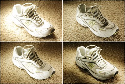
What I wanted to do was to very quickly test this modeling light function to see if it would work for light painting a small object. So I shot a tennis shoe in the dark at f/11 for 30 secs at ASA 200 and played with the strobe, aiming it at the sneaker and firing bursts from a variety of directions during the 30-sec exposures.

The goal here is not to make a great photo. It was to quickly test a "proof-of-concept" to confirm that the flash could be used as a light source for light painting small objects.

I made four frames in about 5 minutes, refining my technique every time. They are represented by the four-shot montage at top. They are in order -1, 2 are at the top; 3, 4 are on the bottom. The first shot was overexposed because (1) I was working without a meter, and (2) a meter would not have been very helpful anyway, given the number of variables in a moving lightsource time exposure.

The idea is to get it reasonably close, and then quickly zero in on what you want.

By the time I had shot fourth frame, I was confident that I could get a nice photo out of the technique by using the SB-800 as a light painting wand. It's surprisingly easy to get a cool, 3-d type of look with just the one small lightsource.

So I put my gear away and began the more difficult process of convincing my 5-year-old that taking a bath would actually be in his best interest for the evening.

(That's rather like presenting an argument before the Supreme Court.)

Getting the technique down enough to prove it will work left me with figuring out just what look I want for the final food shot, and how I will go about getting it.

Which is what I am thinking about right now.

Always think of a big problem as a series of easily solvable smaller problems. Just crank through the little issues, one by one, and the photos will fall into place.

I can't wait to play with the technique at length. And I will post the food picture after it is shot and published.

Next: Shiny, Pretty Things

Saturday, July 1, 2006

Boot Camp Assignment #2: Background Check

Okay, so you've got a headshot under your belt. It's a good start, and I hope it has provided the kick in the pants many of you needed to get up and actually start doing some of this stuff.

The vast majority of you did quite well on the first assignment. And I think most of the misses can be attributed to aiming too high, as far as complexity of the photo was concerned.

The most important lessons to have gleaned from assignment #1 would be:

1) Show up with your best effort. Even on those little, "try-you-on-for-size" assignments.

2) Aim for the headshot sweet spot: Keep it simple enough to look great it runs tiny, but elegant enough to hold as a cover.

3) Don't wait until the last nanosecond to start your assignment. (heh, heh...)

Boot Camp assignment #2 will require just a little advance planning. It will make use of one of my very favorite back-pocket tricks, and I hope that you will find some value in the technique.

But before we get to the background assignment, I would like to give you a little background on finding (and using) a suitable collection of backgrounds. (Can you tell I am writing this after a long day at work?)

When we did the sunset portrait in On Assignment, the idea was to think of a sunset as a unique, custom background delivered to you for free every evening.

But sunsets are unpredictable. The serendipity of an unpredictable sunset adds to its beauty, of course. But there are times when you need to know exactly what you are going to get. Sometimes sunsets just don't materialize very well. And many times they might not be appropriate for a particular assignment.

When most people think of setting up lights and shooting in front of a background, they tend to picture a photog in a studio, shooting in front of a big piece of paper. Savage is one of the most popular brands. I'll admit to having gone through quite a bit of "Savage Thunder Grey" in my day, before pretty much swearing off of the stuff.

I have nothing against paper backgrounds, per se. It's just that they are so, well, boring. It just fits right in with that "lighting-is-something-you-do-in-a-studio" ethic that I have come to see as needlessly constricting and expensive. And the background paper itself ain't cheap, either.

About ten years ago, it occurred to me that there were literally hundreds of much more interesting backgrounds within 30 minutes of my house, just waiting to be shot against. Not only were they free, but I didn't even have to find some way to store them when they were not being used.

After realizing that this resource was there for the exploiting, I began to look at many ordinary scenes in completely new ways. I began to shoot snapshots of brick walls, rock walls, old barns, public murals (I love those) and many other interesting, varied, textured surfaces that eventually became my own little private collection of layers of interest for my future photos.

I keep them all in a little folder on my laptop. I give them coded filenames that tell me everything I need to remember about them.

For instance, a filename for a nice, textured building surface photo might be:

N_820CharlesBalt_PU.jpg

There's a lot of info there. First and most important, the "N" stands for "North," which is my favorite direction for the background to be facing. I am in the Northern hemisphere, so a north-facing wall is in shadow anytime of the day (as the sun arcs across the southern sky for me.) You Southern hemisphere folks will perfer the south-facing facades.

East and West facades are most useful in evening and morning, respectively, as they are in shadow during those times. Shadow/shade is useful because the light will be even. And it'll be knocked down a couple of stops, which makes lighting much easier with low-powered flashes. And, if you warm up your flash, the cooler-colored light in the shade on the background provides another layer of color contrast separation in the photo,

Next is "820CharlesBalt," which tells me the address and city. (This address is made-up, for you Baltimore readers. No headstart for you.)

Last is PU, which is short for "public" - easy access. "PR" would mean "private," which is fine, but that is just another permission hoop to jump through. Some backgrounds are worth it, though. And if you ask nicely, most owners are flattered.

This brings up the point of whether or not you have permission to shoot in a city locale. Big cities like New York, Paris, etc., (and even many second-tier cities) have permit requirements for shooting on public streets. While it is another layer of hassle, I do not want to hear anyone moaning that they live in Paris/London/Tokyo/etc., and that this is a huge disagvantage.

You have tons more choices that the rest of us, so quit your whining. Be creative. Use inconspicuous lighting gear. (Maybe have someone hold your small flash instead of using a stand.) Shoot early morning. Head to the suburbs, out of the city proper. Be adaptable to your limitations.

Once you start cataloging all that your city, town or rural environment has to offer you as a thinking, planning photographer, you will likely be amazed at the possibilities. And you will wonder why you hadn't been doing this all along.

So now that you have a cool background or 20, what are you going to do with it?

The easy way is to use one softened light and shoot one or two stops over the ambient. Late even or early morning gets you lower ambient (and easier overpowering) if you need it.

You'll have a few decisions to make. Hard light or soft? Close enough to the background to incorporate the subject's shadow - or not?

And, if you have the ability, one light or two?

This is where that second light can really pay off. Lighting your subject and the background separately can give you loads of control.

To visualize this, (and I actually want you to do that right now) think of the background light first. Place the light right behind your subject. They will conveniently block it from the camera's view, providing they are not Calista Flockhart or one of the 23-lb Olsen twins.

Now, with the light firing just to the cool background you found, you have created a silhouette of your subject. Even here, you have lots of possibilities. Warm colored background light? Cool? Even? Zoomed-in-center-hotspot? You get the idea. And that is before you have started to choose how you will define your subject with the other light.

And using just one light can get you some cool stuff, too. How far above the ambient will you shoot? Or will you let the flash light the background, too? What about a hard-angled, snooted light to bring out the texture of a subject directly against a rough background?

Remember that the ratio of the flash-to-subject distance to the flash-to-background distance will determine how bright the background is, compared to the subject. Total control, even not taking daylight into account. Read through some of the Lighting 101 posts on balancing strobe if you need a refresher.

Want to completely nuke the daylight? Wait twelve hours after your little sunny problem and I assure you that overpowering the ambient will not be a problem.

And night street lighting provides enough light to focus by, while being easy to completely overpower with small flash.

"But Dave, where are the examples? We need some examples!"

Nope.

I am not trotting out five or six good idea just to have you guys ape one of them and not have to think on your own. That's kind of the whole point here.

Heck, I might even shoot this one myself. Haven't decided yet. (I do have so much free time, you know...)

So, Phil Phlashen, here is your assignment:


Need editorial portait of Pat Coolwall.

Will run full page in magazine, so shoot vertical. Photo will run on a left-hand page, so assume that when composing. Please light it.

We have color on the page, so color is highly preferable, but not required. If you shoot black and white, you'd better "wow" us.

Framing can be anything from waist-up to full body. No tight headshots, please, as it will run full page. try for high impact, good lighting, strong engagement between the subject and the viewer. The reader should feel that they know something about Pat after seeing this photo.

As always, if in doubt, keep it simple.

Deadline is 7/16/06, 11:59pm your local time.


Tags are:

strobistbootcamp
background
amateur (or pro)
(your country)

I have set up a during-the-assignment discussion thread, here.

I gave you a lot more info this time. And having seen the headshot process, you should have a good idea of what to expect.

Above all, have fun.

-DH

Share

Twitter Delicious Facebook Digg Stumbleupon Favorites More