Thursday, August 31, 2006

Review: The Best of Dean Collins on Lighting

To appreciate what a Lighting Rock Star Dean Collins was in the late 80's, you really had to be at one of his seminars.

Imagine yourself and a couple hundred other photographers sitting, mesmerized, in a hotel ballroom as a half dozen synchronized Hasselblad slide projectors took turns unlocking secrets and opening doors in their brains.

And talking non-stop at the front of the room was Collins, never standing still for a moment. His hands constantly gesturing, his delivery machine-gun fast. But somehow, your brain processed it all.

You were a rat and he was the Pied Piper, leading you out of the dark ages.

There was no time to take notes. It was enough just to listen and try to keep up with the guy. And you couldn't not pay attention. Because you were starting to get it.

And he couldn't slow down if he wanted to. Because he had so much to tell you.

Those of us who are a little older remember how his techniques took the commercial photo world by storm. He started out playing with PVC pipes to make his own gear. Soon, Bogen was marketing "Lightforms," which were designed right out of his "Tinker Tubes" notebook.

All of this lighting mania led to a series of books, and later, videotapes. Photographers watched them repeatedly. And they adapted their methods to embrace what they had learned.

Sadly, Collins passed away last year after a three-year fight with cancer.

Thankfully, his willingness to share his knowledge via books and VHS tapes means that he will be able to go on teaching future generations of photographers.

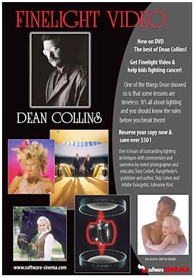
The Best of Dean Collins on Lighting is a new, 4-DVD, 6-hour compilation of the best of his VHS series.

And the one weakness in these DVDs stems from the state of the art in video production at the time the VHS tapes were produced. You'll notice a lack of the sharpness and resolution that we all take for granted in this day of HDTV and 10-megapixel consumer cameras.

But the weakness stops there.

The content of these tapes is timeless. The clothing styles may scream 1980's, but the lighting techniques are just as valid today as they ever were.

And unless someone repeals the laws that govern light and physics, they will continue to be applicable for the foreseeable future.

The "Best of Dean Collins on Lighting" DVD set began shipping this month.

Mine arrived via UPS as I was waiting to pick my kids up at the bus stop. I saw the brown truck drive past. I saw him pull up to my house. I knew what he had for me.

But when you have a five-year-old who has just started kindergarten, you don't bail on him to run back to your house to see the new DVDs. You pick him up at the bus stop.

About three years later the bus arrived with Ben and his older sister, Emily. We headed back to the house.

All four DVDs ship in one double-width clamshell case. The first three discs contain between eight and ten full, commercial shoot breakdowns. Disc number four is simply entitled "Basics."

It is disc four that you should watch first. In it, Collins introduces you to his philosophy of lighting by using one, small battery-powered flash. Before it is over, he will show you the big guns at the big shoots. But the principals hold true right down to the small stuff.

As you watch it, you learn about the different areas of a lit, 3-D object. If terms like "diffused highlight" and "specular-to-diffused transfer" mean nothing to you now, get ready for them to start popping into your head every time you hold an apple up to the light before you take a bite.

Collins takes us through several portrait shoots using one modestly-powered flash - and a high-powered brain. These are the early productions, and he was still using some home-fashioned light control gear.

That's a good thing, because the commercial Bogen versions are very difficult to find these days. Maybe on eBay, if you're lucky.

But that's okay, because you can make this stuff. I'll be making some panels and documenting the process on this site soon. More fun than buying it, anyway.

Your appetite whet by the basic concepts, you are off to the races.

There are 27 shoots broken down in the remaining three discs. Each one of them will leave you with a mixture of awe and a feeling of "Hey, I could have done that!"

That's because he was (is) such a good teacher. And he doesn't just teach you a bag of tricks, either. Along the way, you learn how to think about light. Midway through the DVD's you find yourself anticipating the solutions to the lighting problems he faces.

I would imagine it is very much like the experience of a fellow photographer I know who spent most of his childhood in his native Korea. Years later, he stopped in amazement while walking down a street in the US. It had just occurred to him that, for the first time, he was thinking in English.

There are far too many examples to do the DVDs justice, so I will run through some of my favorites:

• A pair of tennis shoes, shot on 8x10 film, and exquisitely lit from all angles (including underneath) for a catalog shot.

• A stunning, "in-motion" shot of a Yamaha street bike and rider shot on 8x10 large format and lit with four, small quartz lights. And 8-seconds of exposure time in which to do some quick, in-camera "Photoshopping." (The ubiquitous program was not yet invented when this photo was made.)

• Various, outdoor photo sessions that turn ugly, mid-day light into a beautiful environment using reflectors, diffusers and mirrors. So, yeah, magic is done with mirrors.

• And this annual report cover shot in five minutes (with lots of prep time) at an airport with two airline executives:
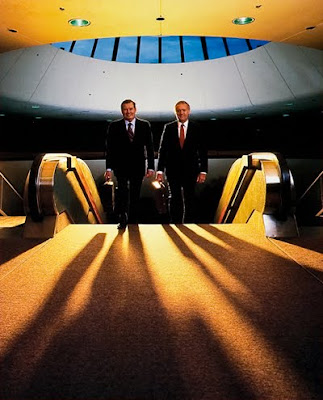


This image reminds me of a favorite story Collins used to tell.

This was one of those instances where he used about a gazillion watt-seconds to transform a large, ambient environment for a photo. As it happens, he was using optical slaves to trip the lights.

Well, they had everything all set up and were waiting for the execs when an elderly Japanese couple walked by with a small, point-and-shoot camera.

If you are a photo bug and walk past a setup like this, you're gonna want to snap a souvenir shot. Even though your camera only has a dinky little flash that cannot possibly ever hope to light such a big area.

Except for this time.

In the instant the the tourist tripped his shutter, thousands of watt-seconds were released as all of the strobes went off at once.

I would have loved to see the look on their faces. I would also love to see their picture.

They learned a lot about light that day, too.

Wednesday, August 30, 2006

Making a Good Idea Even Better

One of the coolest things about starting up a website has been getting a peek behind the curtain at how some of the normally hidden stuff on the web happens.

One of my strongest impressions has been that Google will someday own the world. They are an amazing machine.

They make available - for free - a set of statistics on the daily site traffic that just continues to boggle my mind.

I can see which are the most popular pages, and develop those to basically give people more of what they want.

I know that people are logging on daily from more than 50 countries. (Estonia? Who knew?)

I know where people are likely to spend the longest amount of time. (On the essays.)

And if you have a webcam on your computer, I can actually see you while you surf. To the guy in Spain who likes to read "On Assignment" at 3:00am wearing nothing other than a pair of hot pink boxer shorts:

Please. Stop.

Alright, so maybe I am kidding about the webcam part. But the stats really are amazing.

The most telling is the list of referring sites - where people come to Strobist from.

And site number nine on yesterday's list was a place called www.fredmiranda.com. Never heard of it. But, apparently, some of you guys have.

So, out of curiosity, I moseyed on over and took a look through Fred's site last night.

Now, Fred is just your typical guy, with a typical story:

Born in Brazil, studies Architecture Design and Computer Science, wins the national bodybuilding championship, moves to the US, becomes a model (LA, New York and Milan) and later goes on to study computer graphics at UCLA. And now he runs FredMiranda.com, a pretty kick-butt photo site.

You know, pretty much the typical web publisher profile. My story, as you can imagine, is much the same. Yawn.

(Oh, and ladies: He's taken. Married 12 years with two daughters. Sorry. My wife was bummed, too.)

So, in addition to a site that is worth checking out in general, there are also some cool articles on how-to and the like. Which brings me to the purpose of this increasingly long-winded post.

On this page is a tutorial on how to build a little softbox for your flash. It's a cool little idea, that could be made even better with a little evolutionary thinking.

First, you could GET THE FRIGGIN' THING OFF OF THE CAMERA! (Sorry, little kneejerk reaction to on-cam flash there. Please excuse.)

But anybody could do that. What kept me awake last night was trying to figure out a way to design this softbox to where it would be collapsible. That way, I could carry two of them (face-to-face, for protection) in a little notebook in my trunk. They'd be ready to use - and undamaged - at any time.

I had a dawn assignment today, so I fell asleep before it came to me. But I thought I'd also flip it to you guys, since many of you are also cheapskates DIY afficianados.

Take a look at the tutorial (and the rest of the site, for that matter) and see if you can come up with anything. If you get a good collapsible design, start a Flickr thread and lets see if it can be improved.

Get in touch with your Inner MacGuyver. And if you build it, use the thing off-camera for Pete's sake.

Tuesday, August 29, 2006

Starving Student Gear Too Rich for Your Blood?

You might want to take a look at Jesse Crouch's website, IFakedIt.com - especially his article on small-budget photography.

In it, you'll find tips on how to score a very cheap-but-good digital camera, using (continuous) work lights as a cheap sub for strobes and a cool, free alternative to Photoshop.

Thanks to PotownAl for the heads up.

By David H.

Monday, August 28, 2006

On Assignment: Shoot Your Shiny New Gizmo Like a Pro


About six weeks ago, I posted an article about how to make a darn-near free macro studio. I included photos of a flower/phone/radio/etc on white poster board.

What I saw afterwards was (mostly) a lot of small things on a white infinity sweep. But the point of the little el cheapo contraption was that it could be used to create many different lighting schemes.

So today, I wanted to do a shoot using a the same type of lighting box to get a completely different look. This is the typical type of thing you might need to shoot for a quickie product shot, to throw some shiny new gizmo up on your blog (in style) or for an eBay auction.

In case you forgot and missed the link above, here's how to make it.

For this shot, we'll be isolating the subject by using a black reflective surface. You might think a mirror would be better, but you'd be off base. A mirror reflects from the rear surface, unless it is an expensive and fragile "front-surface" mirror. So there would be a double reflection from this oblique angle.

Today, our gizmo will be sitting on 144 square inches of polished black granite, courtesy Home Depot's tile aisle.

Total damages: $5.49.

Gotta love scoring photo gear at The Big Orange Store.

The polished top surface will reflect the background nicely if we shoot from a low angle, allowing is to light the subject and everything else on two different planes.

This is pretty cool, as the subject is resting on something that can now hold a tone or color completely different from what would happen if the camera were sitting on, say, poster board. You'll want black, so the tile's color won't bleed through.

At top is a vertical photo of a Nikon Coolpix L4, which is my wife's garden-variety point-and-shoot digital camera. I chose it as a subject because it is reflective (which can make something more difficult to shoot) and has a complex surface.

I am going to walk through a series of photos, explaining the changes that lead to the progression of looks.


First off is a swap from vertical to horizontal orientation. And I figured it would be better to have the Freudian part extended for the shot, too.

The first stab at this is with a light coming in each diffused panel pretty equally.

You can adjust the lighting angle by rotating the whole box under the subject by up to about 30 degrees in either direction. Then simply turn the subject to compensate.

I like the way the left light defines the left side of the camera, making it look three-dimensional. But I have plans for the second light. So I have to illuminate the left side some other way.


This does it with one light on the right, and a fill card card (a folded piece of white paper) placed just out of the frame in the camera-left front of the subject.

A little counter-clockwise rotation helps me to pick up the reflection of the right diffusion panel in the front of the camera lens at right. Which now proves that there is, in fact, glass in there. Better than the black hole in the earlier frame.

So, now that I am doing all of this with one light (an ugly, hard light before we gussied it up) I am free to play with my background with the second light.


Here's a wide shot showing the overall look after adding a sheet of cheap blue craft foam (coulda been paper) for a background.

Total damages: $0.59 at local craft store.

Note that the diffusion is out in the left panel. I have the left flash dialed way down and it is lighting the background directly. You see the fill reflector piece of paper here, too.

It is important to mention that I could have done this with two plain old desk lamps, too. Just balance to tungsten, tripod the (shooting) camera and move the lights in or out to alter the lighting ratio.


We keep the background light from contaminating the subject with a piece of cardboard as a gobo, as seen here. The aiming is easy if you sight it from the direction of the background light, which is also what I did for this explanatory shot.

No modeling lights needed. Just use line of sight.


So, here's the effect with the background light added. Blue always connotes tech to me for some reason. But you could use anything.

IMO, this is fairly nuanced light for two small sources, a piece of tile and a cardboard box.

This little light box is a frugal, felxible, go-to piece of gear that works as well for small-product catalog shooters as it does for eBay'ers.

Long story short, if you are willing to learn to play with the $10 DIY Macro Studio, it'll earn its meager keep by delivering small object photos with impact.

Next: How To Light A Comet

Sunday, August 27, 2006

Hey, THAT Ought to be in Strobist...

We are 200 posts into this strange trip, with well over a milllion page views to date.

Up until now most of the posts have come from yours truly, save a couple of outstanding On Assignments where the photos were reader-supplied. And many reader-supplied tips via e-mail. And I have darn-near worn the keys off of my Powerbook in the last six months.

Here's something you probably never expected to hear from a control freak particular person such as myself:

It's time for a little diversity of thought.

Starting soon, the sharp-eyed among you will start to notice an additional byline or two. But that's not all.

I have found that some of the most obsessive loyal Strobist readers tend to hang out on the Strobist Flickr discussion boards. Lots of cool things pop up there, and many people miss out because they are too flippin' lazy busy to join up to Flickr.

And since many of the stalkers most helpful readers regularly send me tips via e-mails, I wanted to kill a few birds with one stone.

I am starting a "This Oughta Be in Strobist" discussion thread as a place to stick stuff that you think might be of interest for the broader readership.

We are all about credit here at Strobist. Because I am short on cash. (Ba-dump, ping.) So please credit where you found the info.

And if it is on site "A," but you found it via site "B," we'll want to credit them, too. If there is a photo, link to it so I can find it.

The result will be more neat stuff popping up more frequently. Especially when I am crunched during NCAA and NFL football season.

And since you have access to the raw feed on Flickr, you'll see the stuff as it is submitted. If for one reason or another, it doesn't pop up to the main site, it'll still get exposure there.

I want to say right now that I will still be pretty choosy on what to pull up. Strong preference will be to neat stuff that applies to off-camera flash.

But some other stuff is pretty cool, regardless.

Let's see how it goes for a while. Feel free to post here.

Now THIS is Cool, Off-Camera Light

OK, it ain't flash.

And it is already making the rounds.

But I am big into any creative use of off-camera light. And leave it to some Japanese performance artists to come up with this.

What is it? An animated series of light-painted time exposures, of course. This has to be difficult. If I had some free time, I would try it.

Scratch that. If I had free time, I'd get some sleep. But when I woke up, if I was well-rested, had nothing to do and it was dark, I'd try this.

See more examples from Pika-Pika on their website. Original tip via DSLR Blog.

And if you have 4 minutes you can devote to sitting at a computer with your jaw hanging open, check out this animated short film they made.

Absolutely amazing.

(Nice find, Chris.)

Saturday, August 26, 2006

Bits and Pieces, August 26, 2006


• Got an e-mail from a reader pointing me to "What the Duck," a rather funny serial cartoon about photographers. The one he sent was about, of course, off-camera flash. Which definitely earns WTD a "check it out" from Strobist.

I should have been offended at many of them. But I was too busy laughing.

Check out Aaron's other work on www.sweetjelly.com/blog.

(Thanks for the tip, John!)


• Yesterday, I discovered the Amazon Outlet, which is browseworthy enough to earn a direct link on the sidebar.

Not everything in there is a screaming bahgain. But the top seller today happens to be a Kingston 512mg SD card for $5.99. Schwing.

Think Woot, with a search function.

Tupperware and Trash Bags, Pt. 3 of 3

Wrapping up the series from the "cold food" assignment I shot for The Sun from a couple of weeks ago, I saved the toughest subject for last.

By this, I do not mean that I saved the toughest of the three articles for last. I mean I saved this shot of "tuna tartare" (yum... NOT!) as the last shot I would produce during the afternoon's shoot.

I did this because I had no idea in the world how I was going to escape being reflected in these spoons:


I mean, Geez Louise. Why not just give me a chrome gazing sphere to photograph while having to hide my reflection and be done with it?

Look at the reflections from a single umbrella above. Yeah, it has a kind of neat "melting-Terminator-bad-guy" look to it. But nothing appropriate for the food page.

I prided myself on not cursing (out loud) as I studied the spoons the designer had chosen for tuna props.

They're pretty, I guess. But the fact that they are both concave and convex means that they threw back the light's reflections on opposite sides of the spoon at the same time. I could hide the flash's reflection on the bottom of the convex part, but there is was on the top of the concave part.

Or vice versa.

And it wasn't as if I had a stack of white foamcore cards to use as a reflector tent, either. We were shooting in a small kitchen with a couple of SB's, making it up as we went.

I tried bouncing off of the ceiling. Nope.


I tried another Hail Mary lighting scheme - bare flash nuking - and that looked even worse. But those ball-bungee stand-ins sure do look delish, huh? (I like 'em braised...)

So, internal cursing mostly completed, I did what I always do when faced with a tough problem. I procrastinated let it settle in my mind a bit while I did the other two shots.

But in the process of shooting, I also used up the idea of backlit tupperware as a base on the soup shot seen in part one.

(Nice work, Dave.)

In short, the spoons would see everything. So what I needed was a clean, white background. And a soft, white light source - that came from everywhere.

If it had been cloudy outside, there would have been no problem. I could have shot the spoons with a long tele, far enough away to make the reflection a tiny speck.

Alas, there wasn't a cloud in the sky. But you see how I was thinking.

What I needed was a small, backlit, indoor, cloudy sky.

For the background, I settled on the top of the designer's stove, between the burners. It was also waterproof for the ice that she wanted to use as a theme in all three shots. One problem solved.

Here is a quick stand-in: A roll of half-width black gaffer's tape. The background was big enough to hold the subject and a nice, sweep horizon.

To say that I was glad when I decided how to light the spoons would stretch the limits of my already atrocious pun judgment. So I was merely happy to realize that I could make a light tent out of a kitchen trash bag.

Using a little of the gaffer's tape, we made a makeshift tent out of a torn-apart bag. After that, it was easy to just stick an umbrella'd flash over it.

And presto: Double-diffused light.

Soft, nice, easy transitions. And all-encompassing.

And cheap.

At that point, it was simply a matter of shooting low enough to disguise my reflection in the bottom edge of the spoon. You can still make it out in the top photo on the far left, but it is not obvious.

(I had the designer hold up my side of the trash-bag tent and I peeked the 55 macro lens through to shoot.)

In the vertical, my reflection is totally hidden by the bait delicious, raw tuna. (That's why I was playing with the ball-bungee stand-ins earlier.)

At the risk of sounding presumptuous, I would wager that this is possibly the first time in world history that a ball bungee has been used as a visual stand-in for tuna tartare.

(If anyone can find a link proving otherwise, I'll take it back.)

Again, this picture ain't the end-all. But it is a good example of understanding your lighting theory well enough to bootstrap some found objects into a solution for a vexing little problem.

And that is a very satisfying experience in itself.

Next: Soup Up Your $10 DIY Macro Studio

Friday, August 25, 2006

Well, Great. There's ANOTHER Night's Sleep Gone:

The PVC pipes pdf post (heh) has prompted a flurry of responses pointing to other DIY lighting/photo stuff.

Most of it resides at www.diyphotography.net.

At this point I would like to issue a sincere apology to the spouses of Strobist's readers. Especially those people who thought they had an actual garage in which they could park their cars.

Right up to a couple of days from now, that is.

Thanks, Rob. No, really. Thanks...

Home Depot, Your Lighting Improvement Store

A Strobist reader who has already received and watched the new Dean Collins DVD's has done some Googling around and come across an old gem that sure brings back some memories.

Collins designed a series of light control panels which were ultimately produced by Bogen and showed up in studios all over the world. But before they were commercially produced, many people were rolling their own out of PVC, bedsheets, Tuff Frost and bungee cord.

At the time, they were called "Tinker Tubes." It's really amazing what you can do with some PVC piping and about 174 points of IQ.

Fortunately, the .pdf plans show the rest of us dummies how to do it. The DVD's, of course, show you about a gazillion things you can do with this stuff.

I have to say, it's gonna be fun watching the knowledge from these DVD's ripple through you guys as a group.

(Thanks, Debbie!)

Download the plans.

Wednesday, August 23, 2006

Nice LIttle Portrait Lighting Tutorial

While Googling around for some info on Dean Collins, I ran across this web page from Canadian photographer Dave Montizambert who had benefitted from Collins' teaching.

He has a cool lighting tutorial from a one-light portrait session that gets into some lighting theory. This is especially relevant to Collins, because Collins studied in Europe at one of those "old school" schools where they only let him play with one light until he could do darn-near anything with it.

There are many, many shooters around the world who are consciously (or subconsciously) using techniques Collins taught them many years ago.

Styles change, but a good foundation in lighting theory lets you easily adapt to the new looks.

Click on either pic for a 10-minute diversion from a photographer who has a good grasp of the lighting basics.

(Thanks to reader Dominique for the tip on the photog's complete name!)

Stop Reading This Site

And go get this DVD series instead.

The Dean Collins compilation DVD's are out and shipping. I got a heads up from some of the site's readers who have pre-ordered and are already getting their copies in. I have not seen them yet, but I pretty much wore my old Collins VHS tapes out. I recognize every shoot blurbed on the order page, so I am very excited to get my hands on this stuff again.

I am so glad they are finally out in DVD form.

This guy was far and away the biggest influence on me as a lighting photographer. His stuff is done on a larger scale and with more powerful gear than most of our projects. But the theory is sound and very applicable.

In the videos, he creates some really cool stuff right in front of your eyes. And he leaves you realizing that you can be working on that level, too.

He will teach you to think about light in a systematic way that will enable you apply your knowledge to just about any lighting situation, using any gear.

Look past the 80's clothing styles (and haircuts) and see this stuff for what it is: The legacy of a genius who also happened to be an outstanding teacher.

As far as lighting instructors go, there are none better. If you are serious about learning this stuff, you want to learn as much as you can from Collins.

As far as I am concerned, this is the best thing to hit the lighting scene in recent memory. And if I am gushing, well, sorry. But this is where it all began for me, and I am excited to be able to spread the word for the next generation of shooters.

The six-hour, 4 DVD set is priced at $179, but they have an early-purchase special running until August 31 in which it is selling for $125.

If you have already received yours, please post your impressions here, on the Flickr group board.

Now, if you'll excuse me, I am gonna go get my copy.

Tuesday, August 22, 2006

Lose an Entire Night's Sleep on dg28.com

That's pretty much what happened to me when I first discovered British photographer Neil Turner's excellent site, www.dg28.com.

I am bringing this to the front from the links section because I know many of you never bother to wander off of the front page. (Why do I archive this stuff, anyway?)

Anyhoo, Neil is a staffer for a periodical that covers education in Great Britian. As such, pretty much every assignment he shoots is at a school, or related to education.

I know what you're thinking:

I'd end up eating a gun...

Well, Neil's site just goes to show you what you can do with a little batt-powered light.

And "goes to show you," it does. He has loads of techniques, examples and how-to's. The guy even puts up a fresh portfolio every month. Howzat for bravery?

If you already know about it, it's always worth a refresher visit. If you are a noob, you are in for a treat.

Let me know what you think, in the comments section.

Great Used Nikon Flash Source: K.E.H.

Way back when I was a photography-bitten college puke, I used to love to go up to Atlanta to visit my Aunt June and Uncle Percy, who still live in nearby Douglasville.

Uncle Percy, in particular, was The Man, as far as I was concerned.

Why? Because back when I was 7, he let me borrow his real, 35mm camera to take an actual picture. And I was hooked for life.

And the icing on the cake to visiting Atlanta was that Atlanta was where K.E.H. was located.

K.E.H. was a HUGE used photo gear retailer. And I was a salivating kid in a candy store. I simply could not leave the place without buying something.

Fast forward 20+ years. Sadly, they no longer have a retail storefront. But now, they are even bigger. They have grown into a web-based operation as the world's largest used photo gear outlet.

You see them all over the web with the "We Buy Used" banners. But whaddya think they do with all that stuff?

They sell it, is what they do.

The place is Used Nikon Flash Nirvana, for one thing. They don't have an SB-24. They probably have ten of them. In all different conditions and prices. They are a machine.

One thing to consider when viewing their prices: They grade very conservatively. I have always been happily surprised in that regard when buying from them.

So if you are looking to score a Nikon SB-24,25,26,28, etc., check them out.

They are a smorgasboard.

Nifty Little Flash/Umbrella Mount

This small little shoe-mount flash bracket is getting some notice in the Flickr Strobist discussion group, and I thought it merited a bump up to the main site.

Under $20, seemingly well-built and very compact.

Source: Alzo Digital.

Boot Camp Assignment #5: View with a Room

As summer (or winter, for you southern hemisphere folks) draws to a close, we find ourselves at the next-to-last Boot Camp assignment.

And you'll be pleased to know that this one will not require you to scrounge another model.

You'll be shooting a room.

First reaction: Why?

Second reaction: How in the Sam Hill do I shoot a room with one or two small flashes?

Well, I'll tell you why and how.

Lighting a room is an exercise in working with flash vs. the ambient. Since you cannot overpower the ambient on a scale like this with one small light, you'll need to work with it.

Not only that, but you'll need to work close to the ambient, if you want your photo to have any subtlety or elegance.

Photographers generally have specialties, if they reach any level of success. They can specialize in a genre (portraits, sports, etc.) or a style (slick light, artsy B&W, mangled Polaroids) or in any number of different ways.

So far, Phil Phlashen has been a People Person, who also grabbed a quick $10k by parlaying his flavor-of-the-day into a snazzy water shot.

But being a People Person also means having to know how to create an environmental portrait.

And to create a good environmental portrait, you have to be able to come up with a good environment. Which is why this assignment will veer into somewhat of an architectural photography direction.

Here are some guidelines to consider when shooting a room.

First, you'll want to keep your vertical lines vertical. Sure, there are exceptions. But for the most part, architectural guys (and gals) like to keep their lines correct.

How to do this? Well, you could use a view camera. But I suspect that is out of the question for most of you.

You could correct the lines in Photoshop. (Strictly for weenies in this case.)

Or you could make sure that your camera is pointed very, very close to horizontal when you shoot the photo. This will be your most likely solution.

As you might guess, this horizontal shooting requirement will affect camera placement in a very big way. You are used to walking around to find the best angle. Just be sure to consider the "Z" axis (the camera height) when you compose for this assignment.

Shooting a room is all about lines and light. Take shooting position into account (and use a tripod to nail down that variable) and you are halfway home.

Which leaves the light.

"All I have is an SB-24! I only have one light source!" You might whine.

Bullsh.. Poppycock. You have tons of light sources. You just have to balance them to make them sing together.

Tungsten (or, if you are evolved, CFL) lamps will be your most obvious contributor. You might want to re-read the Lighting 101 posts on balancing strobe and ambient. Ditto the piece on gels. But you do not necessarily have to color correct to get a cool-looking mix-light shot. And since you are shooting a whole room, you'll most likely consider the ambient as your main source and either fill or accent something with strobe(s).

But what about the light streaming in through the windows? I can't overpower (or even balance) that with my dinky flash!

Well, Hoss, I have made specific arrangements to ensure that the world will continue to rotate on its axis for at least the duration of this assignment. (After that, you are on your own.) So you will be provided with drastically varying exterior light levels coming through the windows at various times of the day/twilight/night.

If the room has a neat exterior environment, I would strongly suggest taking advantage of this in your photo.

Again, balance is the key.

So, you have three variables to control: Continuous room lighting, exterior light levels and strobe.

You know how to control them all using aperture, shutter speed, patience for the right time of day, etc.

If not, better get reading in Lighting 101.

Here's the assignment, followed by tags and a couple of hints:

To: Phil Phlashen

Assignment: Need interior of someplace in your town to illustrate a story on local area. Can be public or private. Completely your choice. Can be vertical or horizontal. Please shoot in color.

Photo could run full-page or double truck, so make sure it'll hold up.

Deadline: 11:59pm local time, Sept 5th, 2006.

Tags:

• strobistbootcamp
• room
• [pro or amateur]
• [your country]

Hints:

1. Time of day will be critical to the success or failure of the shot. Make sure you can contain the exterior light level and put it where you want it.

2. A strobe can sometimes make a nice accent light by firing through a door from an adjoining room.

3. You do not have to be inside a room to photograph it well. You do not even have to be inside the building. Using windows as frames works on both directions.

4. Work close to the ambient with your strobe. I cannot stress this enough. The elegance (or lack thereof) of your photo will be determined by how well you balance the light sources.

And just to be clear: Please use at least one strobe in lighting your photo. If the flash's effect is not obvious, please explain how and where it is being used in your Flickr description.

Rants? Raves? Whines? Complaints? Demands of refunds?

Talk about it here.

Lighting Boot Camp is sponsored by Midwest Photo Exchange.

Westcott Double-Fold Heaven

Well, what do you know.

At least someone knows how to get these things in stock.

Moishe at Midwest Photo Exchange just e-mailed me to say that he got in two hundred Westcott Double-fold umbrellas. They are not up on the website yet, but you can e-mail him at moishe@mpex.com or call at (614) 261-1264, and he will hook you up.

This is pretty much like parking right outside the gate of the fat farm with a couple of cases of Snickers bars.

He has 100 each of the white and silver. The last time he got a batch of 40 in, he sold out pretty quick. They are $19 for us - just tell him you are from Strobist. That's even cheaper than you can get them at Out-of-Stock-O-Rama. If you could get them there. At any time in the last few months. I'm just saying.

If you detect a hint of change in the air from the tone of that last paragraph, you'd be right. Actually, there are changes coming in several areas, and I will be announcing them soon.

Don't worry. They're good changes.

And speaking of soon, Boot Camp Assignment Number Five will be posted later today.

You may want to gather the supplies you'll need while you are waiting:

• A bicycle tire innertube, or 5 feet of Bungee cord
• A glue gun
• An old tennis racquet or a spaghetti strainer
• Some beige nylon stockings - not ripped


(Kidding.)

But I had you for a second, didn't I...

Speaking of kidding, kudos to Chris R., who e-mailed me after realizing that the apparent gibberish under the Strobist title wasn't gibberish after all. And please, if you have since figured it out, don't all go e-mailing me now.

Chris already won the new Nikon D200.

Kidding again.

I always wonder if you guys read that stuff.

Monday, August 21, 2006

Killer Pod People Band Together to Conquer Earth!

Okay, so maybe the headline is a tad alarmist.

But hey, we gotta sell papers, right?

The more pedestrian take on this breaking news is that Chris Marquardt, of the wonderfully effervescent "Tips from the Top Floor," and John Arnold, of "PhotoWalkthrough" have launched an association of photo podcasters, called Photocast Network. This means one-stop shopping to learn about a group of pretty cool photo audio sites. They officially launched today.

Chris's blog, and Lightsource, (both of whom had me on as their guests earlier) are two of the charter members. There are about a half dozen others, so far. If/when I get into the podcast thing, maybe they will let me sit at the Big Kids table, too. Who knows.

If you are into the audio learning thing, bookmark this site, and start the process of making more morning commute more photographic!

Another Kind of Flash

There is nothing more dangerous than a photographer with a new sandbox to play in creative outlet.

Witness you guys and off-camera flash.

Well, I have been bitten by a bit of a bug, too. And I though I would take a moment to share some info.

We are being encouraged to produce Flash gallery slideshows to go with our stories. It gives us a wonderful amount of space in which to work. We can also add music, natural sound, or both.

My first effort was on the Morgan State University band camp. In retrospect, I was so worried about getting sound that I ended up with way too much to use. Fear of something new will do that to you.

In the future, I will balance my efforts more between sound and pictures.

If you want to wander around on the page, I recommend John Makely's "Ravens Training Camp," Algerina Perna's "Smith Island," and Doug Kapustin's "Trophy Babies."

All are better examples than my first effort. But I am really getting into this and hope to catch up fast.

If you work for a paper (or just want to play around with it) this is far easier and cheaper than you might expect. In fact, you can try it out for free.

The Flash gallery generator is called Soundslides. You can demo it for free, but it sticks the word "demo" on your projects. The full version is only $39.95 US. Demo or not, be sure to download the latest version, as earlier ones are a little buggy.

For sound editing, you'll want Audacity. It is totally free in all versions, and is a fantastic little sound editing program.

For sound content, you can just record into your computer mic, or use pre-existing .mp3's. The latter would be just for playing around and learning, not broadcasting or web publishing. Please respect the copyright holders.

Since we are grabbing natural sound and interviews, most of the Sun photographers are now carrying around $88.00 Olympus DS-2 flash recorders. They are just a little bigger than a pack of gum and do just great for web audio.

You can increase the sound quality and reduce noise greatly with an external mic. Good ones are out there for ~$50 US.

It also helps to monitor the sound as you record. I use normal earbud headphones.

In short, you can try it out for free. Or be as equipped as you need to be for less than $200 US.

I know that we happen to have some sound professionals among the site's readers, so you might want to post an (OT) question on the Flickr discussion board, and I am sure they could point you to some neat resources.

In addition to web galleries, it seems to me that this would also be a great portfolio generator program for people wanting to add sound and or music to their presentations.

Sunday, August 20, 2006

Liquid Gold

I am going to take a small departure from the usual after-assignment discussion for the water shot.

What follows is a group of ten photos from the assignments. Your job is to decide whether the photo was taken by a pro or an amateur.

And this is not a knock on the professionals' pictures, either. All of these photos could easily have graced the pages of a magazine. My point is to show you all how you have progressed as a group.

To learn which is which, click on the photo to get to its Flickr page.


Okay. You get my point?

Now, here's what some of the other guys did:


I specifically let the photos do the talking here. And the point I am trying to make is that, with some training and a modicum of lighting gear, you can get professional results. Especially when you are lighting something on a containable scale, such as a bottle of water.

There is some amazing progress being made within the group, and I hope you are as impressed with yourselves as I am with you.

If you would, please take a moment to click on your favorite photo and leave a comment on the Flickr page.

And to you wallflowers out there:

You can either be a watcher of a participant. But life is not a dress rehearsal. You only go around once. There are still two more assignments to go.

The next assignment will be a little more challenging - and on a larger scale. But you still won't have to scrounge a model for this one.

And the final assignment brings together many of the concepts we have been learning throughout this process.

With a little twist or two.

Strobist Lighting Boot Camp is sponsored by Midwest Photo Exchange, a photo gear retailer who actually makes an effort to keep the cool little stands and umbrellas in stock.

Give them a visit or an email. If you can't find what you need, give Moishe Appelbaum a call. He'll do whatever he can to feed your lighting gear habit.

Share

Twitter Delicious Facebook Digg Stumbleupon Favorites More