Tuesday, October 31, 2006

A Good Place to Get Gear, and Why:

Midwest Photo is a mid-sized photo gear retailer located in Ohio.

They have expressed a strong desire to cater to the type of photographers who tend to read this site, and typically bend over backwards to keep the various pieces of small-flash lighting gear (and associated items) in stock. Given the challenges of dealing with the various suppliers, this is a more daunting task than you might think.

MPEX also ships internationally, which is very important for readers who do not have a good gear resource in their home country.

Sometimes thay can get overwhelmed with the order flow that can arise from this site, but they are honest and ethical people to deal with. That is not a given in this day of faceless internet commerce.

I recommend contacting them by phone at (614) 261-1264 as the most efficient means of ordering. If that is not practical from your location, you can reach them via the Strobist section on their website or by email.

(If you e-mail them, please add their address to your address book so their answer will not end up in your spam folder.)

Where to Get Your Gear - And Why:

Midwest Photo is a mid-sized photo gear retailer located in Ohio.

They have demonstrated a strong desire to cater to the type of photographers who tend to read this site, and typically bend over backwards to keep the various pieces of small-flash lighting gear (and associated items) in stock. Given the challenges of dealing with the various suppliers, this is a more daunting task than you might think.

MPEX also ships internationally, which is very important for readers who do not have a good gear resource in their home country.

I have found them to be honest and ethical people to deal with. That is not a given in this day of faceless internet commerce.

You can reach them here.

Flash, or No Flash?

Got this tip via e-mail from Micheal C., who interned at Patuxent back when I was a staffer there. He has now been at the WashTimes so long I feel positively ancient.

He sent me this link to a post from "Night Photography by Andy Frazer." It is a great comparison of two photos, one taken without flash, and one with. Can you tell which is which?

Happy Halloween, all. Get those punkin's in if you want a shot at the book...

(Thanks, Mike!)

Monday, October 30, 2006

Looking Into Business Models for the Emerging Pro

Given the level of interest in the various posts about the business of photography, I am going to be setting up a holding pen in the archives for business-related stories. (As soon as I can grab a few spare minutes, anyway.)

In the mean time, I would love to hear how you guys are using the web as a vehicle for digital photography commerce.

We have done the istockphoto thing to death, but that does not preclude it's validity for a subset of transitional pro/ams.

(See? My mind is partially open...)

But I know there are other models that allow shooters to do events and such (and even stock) that return far more of the money to the actual shooter.

Photostockplus, for instance, keeps a 15% cut and returns 85% to the shooter, while offering websites for them to display the photos and engage in e-commerce.

Apparently, a lot of photographers are using them. Is anyone here using their model?

If not, how are you doing it? Other sites? Face to face?

I know we have a large number of readers that fall into this part of the bell curve, and I would be eager to know your choices and experiences.

New companies are popping up every day. While many are very good models, some of them being downright predatory in their approach to photogs. I would like to try to get a handle on what is out there and do a series of posts on agencies, microstock, photo e-commerce engines and the like.

Please post your thoughts and experiences in the comments section. No names needed, if you choose. Just looking for info to pull together.

Muchas gracias.

Sunday, October 29, 2006

Assignment: Shoot Your Jack O' Lantern

Local PJ-in-Training Patrick Smith of Towson University posted a photo tonight which got me thinking.

The result? A quickie photo assignment that will be a good, small-scale lighting exercise.

Patrick used a strobe inside his pumpkin, but that's too easy for you guys. Much better to balance three, completely different light sources - two continuous and one flash.

If you are up to the task, here it is:

Shoot a candle-lit Jack O' Lantern in such a way as to balance the candle light inside, some ambient-lit background and the externally (off-camera) strobed pumpkin.

You'll need to be shooting into some directional light. I would start by having your camera's shutter set at max synch speed to get your correct aperture for the flash correct and locked in. Then, it is a matter of adjusting the shutter speed down to match your ambient background and walking the shutter speed down as it gets darker until the in-pumpkin's candle becomes a stronger light source in the photo.

If you can find a place to shoot into the afterglow of the sunset, you're in like Flynn. Otherwise, you'll need to get creative in finding an ambient background to work against. Maybe a lit window - shooting from outside.

You have three lights to consider:

1) The flash - It'll be consistent, and controlled via the aperture.

2) The background - It'll be quickly dropping and controlled by the shutter speed (assuming a constant aperture set with the flash in mind.)

3) The candle - A consistent, continuous light source.

And just to make this interesting, the winner gets a free copy of John Harrington's business book, shipped.

Deadline: Weds, 11:59pm local.

Just stick them in the Flickr Strobist pool. I'll see them there.

Please tag as: strobistpumpkin

Oh, and the quality of the light coming from the flash does matter, bucko...

If you have any technical questions, hit the Flickr discussion threads and ask/answer away.

Saturday, October 28, 2006

DIY Safe Voltage Circuit

For the soldering iron wielding tech-heads among you:

Flickr user and Strobist reader Crantastic has posted a link to a DIY circuit schematic to protect your camera from high voltage flashes on the Strobist Flickr group. For more information about keeping your digital camera safe from vintage strobes read Dont Fry Your Camera.

By Mike H.

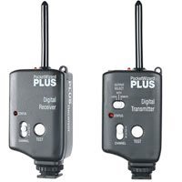
Pocket Wizards and the World Series

Baseball season once again comes to a close. But as the St. Louis Cardinals win The Series last night, at least one Strobist reader was ogling the photo gear along with the game.

This morning, he asked the following on the Strobist Flicker group discussion board:

"I'm not a baseball fan, but while channel surfing by the World Series I noticed a group of photographers in the background when the TV camera was doing shots of the dugout.

Several of these guys had two pro style cameras, one with a long lenses hanging around their neck plus a mono-pod mounted huge lens. I noticed that the handheld rig had what appeared to be a Pocket Wizard on the hot shoe, but I didn't notice any strobe lighting in view.

Since baseball diamonds are pretty well lit and I guessing that since most pitchers are pretty weird, powerful flash photography from the closest stands would be prohibited.

What were they doing with the Pocket Wizards?


Answer: The Pocket Wizards are being used as remote triggers.

The camera with the long lens is the "everywhere" camera. The camera with the 80-200 is the home plate camera (too close for the long lens.)

So, you mount a remote camera somewhere (or several) in a different location with PW receivers to fire them. Then you place the PW transmitter on your 80-200 camera. Now, when you shoot at home plate, you get simultaneous coverage of home plate from a different angle.

It's so nice of baseball players to always score every run in exactly the same place.

Friday, October 27, 2006

Reader Photo of the Week

This week's standout photo is by Strobist reader David Higginbotham who photographed his friend's brand new kid on his bed using a $7 piece of cloth as a backdrop.

David used a Nikon D1x and a 50mm 1.8 lens. For light, he used a Vivitar 285 flash fired into a Westcott Apollo softbox on camera left.

He says he is hooked on finding cheap pieces of fabric to use as backdrops. So I'd look for more pictures using cool backgrounds in his photo stream soon.

NOTE: This is the first of a (hopefully) regular series. Time permitting, I will be showcasing a standout photo from the Flickr Strobist pool each week.

Thursday, October 26, 2006

Full Review: Best Business Practices for Photographers

UPDATE: Harrington has just released the second edition of Best Business Practices for Photographers. And at 523 pages, it has nearly half again more information than does the first edition. In addition to being the standard photo business book of this generation, it has evolved to include a significant amount of timely new information.
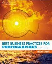
Added to the second edition are insights such as how to transition from newspaper shooter to freelance, how to wade through the new electronic copyright filing system, how and when to file DMCA notices -- and how to wade through and survive a full I.R.S. audit.

Normally when talking about a book, you compare it to other books in the genre. In this case, I know of no worthy peers to against which to measure this book. It is THE source for all things business when it comes to being a professional photographer.

It is written within the framework of U.S. law and business practices. But there is so much information there that people working outside of the U.S. will find it exceptionally useful, too.

If you are a professional photographer, or are contemplating becoming one, get this book. At less than $25, it is an absolute steal.

Think of it as ... stupidity insurance. My suggestion: Go to Amazon via the link above and use the "look inside the book" feature to browse it.

Even if you do not agree with everything it has to offer, you would be nuts to work without it as a reference. It has become the compass point for a generation of photographers, and it will get much use from any pro shooter.


David Hobby
October, 2009

__________


(What follows is the previous review material from the first edition.)


I finally got a chance to finish John Harrington's new book, Best Business Practices for Photographers. What follows is the full review I promised when I first wrote about it.

Is This Book for You?

Here's the short version. If any of the following describes you, you want this book:

• Full-time professional photographer
• Part-time professional photographer
• Someone considering making the leap to turning pro
• Anyone who wants to know how a successful pro shooter operates

If you are an amateur, are happy being one and will always be one, this book is not for you.

If you are a professional photographer who is already an expert in business, hiring, pricing, overhead, accounting, all forms of contracts, negotiations, copyright, infringement of copyright (and how to remedy it,) handling slow- or no-pay clients, writing business letters, using an attorney, storage, archiving, digital asset management, stock, the care and feeding of clients, ongoing education and balancing photo/family life, you might not need to spend $23 on this book.

But my guess is, John has something to teach you.


What's In the Book?

Here is a hard fact:

Most photographers who fail do so not based on their photographic skills, but because of a lack of business acumen. And for many working shooters, a working knowledge of what is in this book will be the thin line between making it -- and not.

Best Business Practices for Photographers the whole business playbook, from both the strategic and tactical points of view.

The first thing he does is to teach you how to think of yourself as a business. Which you'd darn well better learn how to do, ASAP. He gets into equipment and the planning and logistics of a shoot right off the bat.

From there, he's off to financial and personnel considerations - from assistants, employees and contractors (and the pros and cons of each) to how to price your work to stay in business. Again and again, he is about strategizing for the long haul. Do you even think about overhead?

I would wager that most photographers who ultimately fail did not think about things like that until it was too late.

You need to learn about your business costs as well as the salary - yes, salary - that you will be paying yourself. Fail to consider either, and it's game over for your photo career.

This book is a reference for photogs wanting the basics on insurance, accounting and legal info, too. And legal info is one of the areas where the book shines.

John goes so far as to include a variety of actual contracts for you to read and educate yourself. If you have been a long-time Strobist reader, you know that I am all about "no secrets." And John is there, too. In spades.

He really expands on the contracts. They do exist for your protection, you know. He has chapters on contracts for editorial clients, corporate clients - even weddings and other rites of passage. These are hard-won documents born of costly mistakes. They are there to give you a free pass on those mistakes.

(Don't worry, you'll probably invent completely new mistakes on your own. But at least you can skip the ones John endured for you.)

And speaking of no secrets, he also includes long threads of actual e-mail exchanges between himself and his clients on a variety of subjects. What an idea. The names are redacted, of course. But the point is he shows you exactly how he does this stuff. And how they respond. And what he said next. And so on.

From a no-holds-barred perspective, this book bares it all. You're crawling around inside the guy's brain.

He spends a lot of time on copyright, infringement, and the theoretical vs. practical remedies to the latter. That's critical info to a content producer.

Look, I know many of you eat and drink this photo stuff. You look at pictures all day long. You are gear wonks. You crave the next "fix" of making a really hot image.

But if you are gonna do this for a living, this guy is a Photo Business Rock Star, and he is laying his oversized brain bare to the world. For twenty frickin' dollars.

I cannot put it any more blunt than this:

If you follow his roadmap and still fail, you can take comfort in knowing it was probably because you sucked as a photographer. Because this book has the biz stuff covered.


-DH


Best Business Practices, by John Harrington, is published by Course Technology. The list price is USD $34.99, but it is available at Amazon for about $23.

Wednesday, October 25, 2006

Lighting Boot Camp: Continued

Are you in Lighting Boot Camp withdrawal?

The Strobist main-site version was a one-time, summertime affair. While it attracted a wide variety of participants, it was also very time intensive for one person to run. And there are many projects in the works at this point for this site that force me to choose where to deploy my time resources.

(Unless one of you wants to hire me to do this stuff full-time, of course...)

But if you are jonesing for more participatory lighting stuff, fear not. There is an ad hoc continuation of the ongoing lighting school concept happening in the Strobist Flickr group discussion board. They are calling it the "Strobist Challenge."

It will be what you make it. And of course, the more participants the merrier.

On a related note, I will be looking through the pool entries on a weekly basis for a reader photo of the week. And photos from the Strobist Challenge will definitely be in the pool for consideration.

The best way to learn this stuff - there is no other way, actually - is to do it.

Tuesday, October 24, 2006

So, Think You're a Hot Shot?

Are you crankin' those new off-camera flash skills?

Yes you are, by the looks of the stuff in the Strobist Flickr pool.

Strobist reader Pieter Pieterse sure is. That's his firey match photo - click on it for more info.

Starting Friday, and hopefully continuing each week, I'll be looking for a reader photo to showcase. I'll look through the last week's pool entries and pick something that really stands out. (To me, anyway.)

After all, if you make a hot photo, who better to show it to than 10,000 other photographers?

Sunday, October 22, 2006

Luke, I'm Your Flasher...

Want a ready-made fall model for your growing lighting skills?

Shoot your kid(s) in their Halloween costume. That's exactly what Strobist reader Resuggan did while playing with one, small flash.

He put it to camera right on 1/8 power manual, stuck a red gel on it and triggered it with a PC cord. The kicker that pulled off the idea was to use a time exposure to track the toy lightsaber as it moved around a bit.

Tres Hollywood, IMO. Click on the pic to see it bigger.

If you are not a member of Flickr's Strobist group yet, you should be.

And just to make it easier, take advantage of the Strobist Halloween special and join Flickr for free...

Pop-up warm-up

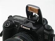
In the new Photo Tips column on Arizona Highways Magazine Richard Maack, Photography Editor describes superglueing a little 1/4 CTO (Color Temperature Orange) gel to the pop up flash on his Canon 20D warm the light.

By Mike H.

Thursday, October 19, 2006

Fourth and Long? Drop Back and Punt with a Plant.

A couple of weeks ago I was shooting a restaurant review of a joint that specializes in cuisine from the Dominican Republic. It has, well, homey decor. Which suits the cuisine just fine, of course.

But I just could not make the room translate into a photo with enough impact to carry a food review. I was trying to say "tropical," but all I kept getting was "cafeteria."

The lighting was mixed. And not in a photographically cool way, either. Tungstens and fluorescents were everywhere. Throw in some daylight for good measure.

The back walls were dark. And the the one wall that could have carried a clean shooting angle was completely covered by a mural that was too loosely composed to work well as a background.

Welcome to my world.
Normally, I would have defaulted to shooting the building front and a (well-lit) food close-up. But they needed a couple of photos and the facade had me shooting right into telephone wires (and the sun) with no time to re-sked.

First thing I did was to use the fluorescent-neutralizing switch, which left me with a more useable combo of tungsten and daylight.

(What, your camera doesn't have a switch for that? Of course it doesn't. The fluorescent neutralizing switch is on the wall...)

Then I reached into my trusty bag of tricks.

Every photographer should have a bag of tricks. The point is to use each trick very infrequently, so they are fresh and ready to pull out when you need them. So, you'll want a big bag of tricks.

Otherwise it is more of a cliche. Or a crutch.

(Hey, I know this cool lighting website...)

One of my favorite tricks is using a plant as a "cookie" to add a layer of interest to a photo.

Cookie, in this case, is short for "kookaloris," which is genuine photo jargon. It is generally a piece of black cardboard with a pattern of holes in it that you shoot a light through to get a cool pattern on a background.

The problems with hole-patterned cardboard are (a) it looks a little hokey to me, and (b) I usually do not have one one me.

And I could generally live with "A," if "B" were not a problem.

But there's almost always a plant. And plants make great cookies.

In this case, the plant was a palm, which would work great to cast a shadow that could subtly add an appropriately tropical feel to a photo.

And I needed tropical.

I decided to strip the lead image to the bare essentials - table, chairs, a vase of flowers and the pattern created by the light through the plant.

And for you PJ types, I did not arrange the furniture for the shoot. It is found, with added light.

And speaking of the ethics of adding light: If the plant idea worries you, you are already a little bit ethically pregnant when you light something. It is a restaurant/food shoot. I can live with a cool shadow just as well as cool light.

The result is what you see at top. When I am aiming for elegance, simplicity with a twist is usually the easiest route for me.
Here is the wide, tell-all shot. See how ridiculously easy this is?

Yes, you do.

From this photo, you should also see where my fill is coming from - the ceiling. I could have reduced (or eliminated) the fill be snooting or gridding the flash.

Here are some tips for the next time you are in a visual bind and you need to bake a cookie to get you out of it.

1) Find a plant. (Duh.) Or you can use a window. Bonus for finding one with blinds. But plants rock for this.

2) Use a small light source. I am talking about the size of the actual flash head here, not the power of the light. You want to project with some sharpness. Speedlights are ideal.

3) Snoot your flash (or at least zoom it out) for light beam-width control.

4) Wanna know where the highlights will be? Eyeball your projection surface from the point of the flash. With apologies to Stephen Hawking, light usually travels in a straight line. If you can see it, it'll get direct light. You don't need no stinking modeling lights.

5) You gonna shoot a person in this light? Why, yes, that is a very good idea... Make sure they can see the flash. Then the highlights will be hitting their eyes.

6) Also, for a person, you might wanna use a Sto-Fen (or small tupperware equivalent) to bounce some of the light off of the ceiling at the same time with the one source. That'll be your fill. Of course, you can do it with a powered-down second light, too.

And who's to say that this is your main light? Get enough space to light on two different planes. Think soft main light very close to the subject, who is far away from the background. This can be the back end of a killer, two-light setup.

So, next time you are in trouble, stick a plant between your light and a boring picture.

It'll make a true be-leaf-er out of you.

(Editor's note: I can make an atrocious pun like that because I am running out the door to safety en route to a four-day weekend in the mountains of Western Maryland. By the time I get back next week, you'll have forgotten all about it.)


Next: Shade is Your Friend

Wednesday, October 18, 2006

I Can Finally Exhale.

Just got word that the data on my dead only mostly dead, burnt-smelling Powerbook is safe and backed up on a local network. The computer itself is going to Apple.

Apparently, only Apple has the special sledgehammers needed to fix it.

Thanks for all of the advice, prayers, chants, spells and well-wishes...

Tuesday, October 17, 2006

DIY Collapsible Softbox

Strobist reader EMarc has posted a tutorial on how to make a DIY, collapsible softbox out of an inexpensive bug shield.

You can get the bug shields at any kitchen store.

This is a very cool use of a scrounged household item, IMO. But if you happen to find yourself at a picnic with EMarc, skip his carrot and raisin salad.

Those might not be raisins.

Monday, October 16, 2006

Free and So Easy: DIY Grid Spots for Your Flash

This is so cool.

I would love to take credit for this idea, but the props go to Strobist reader Gut Mann, who posted a note in the Flickr Strobist threads a ways back.

It sat on my list of (about 20,000) things to do until I saw a piece of thick, corrugated cardboard yesterday. Making these little grid spots really could not be easier. (Heck, the top picture pretty much explains it.) And can be done with things you are likely to already have around the house.

I made a few grid spots for my speedlights. Here's what I used:
• Some corrugated cardboard - the thicker the internal cavity the better, and you won't need much. Just keep your eye out for a biggish box designed to hold something heavy. That tends to be the thick stuff.

• A ruler.

• A box cutter or razor knife.

• Some glue

• A rubber band.

First a little theory.

The grids will give you a very tight spot of light - tighter than a snoot - with nice edge gradients.

The beam width is a function of the thickness of the grid vs the size of the internal spaces of the corrugation. I made a half-inch and a one-inch thick grid for each of my flashes, and they work great.

There are two things you should know about these grids.

One, they will eat some light. But that is not an issue, since they are used with direct flash and generally in pretty close quarters.

Two, they will warm the light up somewhat. This is actually a bennie as far as I am concerned, as they tend to get used to light people and the warm light on skin is quite pleasing.

That said, they are, uh, free, which compares favorably to the ridiculously expensive extruded aluminum models.


Time to Make the Grids

The instructions are to make one grid of each size (1/2 inch an one inch) for a speedlight. Adjust to your needs accordingly.

1) Cut a 1/2-inch wide strip of cardboard about 16 inches long. Cut longer if your cardboard is not the thick, corrugated type.

2) Your strip should be cut so when you look at the long side, you look through the little corrugation tunnels. Be careful not to crush the tunnels when you cut. Use a sharp knife, and not on a surface you can damage.

3) Repeat, making a one-inch wide strip in the same fashion.


4) Cut the long strips into sections a tad wider than your flash head.

5) Stack them without glue to make sure they are wide enough to cover the flash head when stacked.


6) Apply glue to them as shown. The last section will not need to have glue applied, as it will be held by the glue on the next-to-last section.

7) Spread the glue with a finger or piece of paper to get complete coverage on one side of each piece. You do not need to use a ton of glue.


8) Assemble them as shown.

9) While the glue is still wet, align them with a flat surface so they will rest properly on your flash. As long as one side of the stack is straight and even, they will work fine.

10) Let them dry. You can "clamp" them with a rubber band as they dry if you wish. Be careful not to crush the layers.


Attaching And Using Them

You're good to go. Attach to your flash as shown in the top photo. Use a neutral or warm-colored rubber band. You can get fancier with the mount, but this way works fine.

They will give a very tight beam spread. Mine grids approximate about a 300mm lens.


The fall-off is quite smooth, with a nice, hot-spot in the center.

You can put a nice cardboard border on them, like Gut Mann did. But it really isn't necessary to get the job done.

And there is no law saying you need to use cardboard, either. You could use corrugated plastic. But you'll want to use a dark, neutral color (black would be ideal) to keep the light from bleeding out of the edges.

White is going to have a very soft - maybe too soft - gradient at the edges. And a colored version, say red, is going to change the color temperature of the light. The cardboard works in this case because the color shoft is actually beneficial for skin.

I am planning to use these for some assignments soon and will post the results as an On Assignment piece or two. The effect will be similar to that of a snoot, but tighter and with more control. They will also take up less space in your gear bag. Both tools have their own uses, and give slightly different looks.

I wanted to show you what I was playing with so you could try it out for yourself in the interim.

Give it a try. We'll compare results later.

And if you just stumbled onto this place from Makezine or another blog, you see what we are all about here.

Friday, October 13, 2006

DSLRBlog Reviews eBay remotes

Chris Garrett, over at DSLRBlog.com, has gotten a set of "eBay remotes" and is blogging about his experiences with them.

If you are considering buying them, you might consider using Chris as your guinea pig.

There's also a long discussion thread about them on the Flickr Strobist discussion board, if you want to know more than anyone should ever want to know about them...

Bits and Pieces, Oct. 13, 2006

An Untimely Death

My laptop is dead.

Burnt up.

Not Dell-burnt-up, but any time you smell "burnt" coming from the inside of your laptop, it cannot be good.

I don't even wanna think about what I have had (hopefully, still have) on the hard drive. The first 5,000 or so frames from my time lapse multimedia project on a maple tree in fall were there. I shot some more early this morning, just in case the project still lives.

If you want to know how tied I am to my hopefully-not-former Powerbook, my wife refers to it as "The Mistress."

That's an exagerration. We're just friends.


The Book is Great

I have been reading a copy of John Harrington's book - the one I posted about yesterday - and it is great. I will do a full review on it in a few days.


"Use the FLASH, Luke. Trust Your Feelings..."

On the bright side, I have been getting plenty of assignments that lend themselves to lighting. I have three ready to go in the "On Assignment" hopper. Gotta wait till they are published, tho. They will go up soon.


A 30-Year Reunion of Sorts

As a kid growing up in a small, southern town in the 1970's, Thursday night meant watching The Waltons on TV with my family. Yesterday, I spent the afternoon photographing Richard "John Boy" Thomas, who is currently starring in the national tour of the Broadway play, "Twelve Angry Men."

It was such an interesting experience to meet a TV star from so far back in my life. He is a great guy - intelligent, personable, down-to-earth and full of many interesting opinions and stories.

I have a great job some days. Most days, actually.

Wednesday, October 11, 2006

So, You Wanna Turn Pro...

If you are like many of Strobist's readers, you are still an amateur. But you've gotten just enough knowledge and skills to be dangerous and you are entertaining the occasional thought about turning pro.

Well, I have some bad news and some good news.

The bad news is that if you just "kinda sorta" want to be a professional shooter you will never make it.

Why? Because if you do it half-heartedly, there are 100 people ready to compete with you who live and breathe this stuff. They will outlearn, out-hustle and out-shoot you. You'll get creamed.

Maybe not the first day, but eventually. And consistently.

Oh, and there's more bad news.

There are new companies popping up every day, trying to lure you into producing good work for them, so they can sell it for 20 cents (to you) a pop.

That's about 10 cents a pop after taxes.

You can argue "new paradigm" all you want, but that is simply not a sustainable, professional lifestyle.

In short, the market is ready to chew you up like a piece of cheapo gum, suck the flavor out of you, and spit you out.

And the news gets worse.

Let's say you have the drive. And let's say you are very talented. Let's even go as far as to say you are as good as you think you are.

Here's your main hurdle:

Most photographers who fail do so not from a lack of photo skills, but from sub-par business practices. The number that is commonly kicked around is 90%.

Ninety percent.

So, being a Certified Hot Shot just gets you past the 10% hurdle. If you cannot learn the business of the business, you will almost certainly still go down in flames.

So, to sum up: You have to eat and breathe the photo stuff. But you have to be a business type even more than a photo type.

Depressed yet? Had enough bad news? Well, here's some good news.

There are some very good books out there that can teach you not to do the stupid stuff that will otherwise whack your career.

Some have been around for quite a while, and are (or should be) staples on any professional-leaning photographer's bookshelf. I have a selection of several coming to the bookshelf page as soon as I can scrounge the time to update it.

But there's one in particular that stands out, and merits a post of its own.

I have a professional photographer friend in Baltimore who also happens to be a C-P-freakin'- A.

He knows this stuff backwards and forwards.

He has been raving about "Best Business Practices for Photographers," by (professional photographer) John Harrington since early on in the publication cycle.

The book, which was only just "officially" published, has been making waves among the professionals who have had early access to the info. I have heard nothing but great reviews about it.

Harrington is a business guru in the pro photo world. Shooters attend his seminars, keep his handouts and read them until the pages are dog-eared and falling apart.

And you can have access to all of his distilled knowledge for less than $20. That's like what you'd spend for just another compact flash card. A small one.

If you are even vaguely considering going pro, this is a no-brainer. If it helps to put it in perspective, consider it an essential piece of camera gear for your brain. A software upgrade, if you will. If you already are an (independent) pro, you'll definitely want to have it.

The book covers client interaction, negotiating contracts and licenses, and sticking to a good business roadmap. In short, it is about how not to be stupid as a professional photographer.

I first met John while covering Reagan's funeral in 105-degree heat in D.C. I was dragging butt and sweating like a dog hauling gear into position. John was on a Segway, toting his gear effortlessly. And had a case of ice-cold bottled water with him, to boot.

John's a smart guy.

Succeeding as a pro in photography is not easy under any circumstances. But trying it without the type of leg-up a book like this can give you would be nuts.

Even if you are only considering leaving your stinkin' day job to try your hand as a professional photographer, give yourself a fighting chance with a book like Harrington's.

Tuesday, October 10, 2006

To Gerard G.:

Thanks much for your generous donation to the site. I tried to write to you to say thanks, but the address connected to Paypal bounced back to me.

Glad to be of help, and more important, congrats on getting the catalog shoot!

Monday, October 9, 2006

Flickr Strobist Group Nears 2,000th Member

The Flickr group with it's photo pool and discussion board has been growing by leaps and bounds recently.

We are getting many new photos from a wide range of photographers every single day. You want to see what kind of detail good light can elicit? Click on that top photo for the larger size.

This constant flow of lit stuff is fantastic to watch. I especially like clicking through to the photo streams of some of the newer members as they pop up. (Always have been a bit of a voyeur.)

Anyway, we should hit 2,000 members any day now. Will you be number 2,000?

If you are just reading the main site and not participating in the Flickr discussion group and photo sharing, you are missing one of the best parts of this whole deal.

We showed you ours. Sign up and show us yours.

NOTE: The outbound link from that very cool top photo (by "Christopher the Photographer,") is a little hinky from the Flickr end.

If you want to see more of this guy's kickin' work, check out his MySpace page. He's got some strong stuff. Please note that while the photos are technically "work safe," they may be "work uncomfortable," depending on the corporateness of your jobsite.

Sunday, October 8, 2006

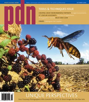
October Issue of PDN Kicks Butt

If you are a pro (or thinking of turning pro) you really should be reading Photo District News.

We get it at the office, and everything on my "to do" list gets bumped down a notch in favor of a quick read when it arrives.

The October 2006 issue is even better than most, featuring a section on four shooters who designed their own gear to help them make photos that were previously impossible to make.

John Brackenbury's macro-to-infinity-in-focus cover shot combines a half-second, hyper-hyper-focal landscape exposure with a high-speed-flash-frozen shot of the bug in Photoshop to create amazing scene as you might view it if you were 3 millimeters tall.

The macro-to-infinity lens is a combination of two lenses - a ~2mm ultrawide and a more normal lens. He has invented a new optic, and is being justifiably cagey about it.

This is a very imaginative approach to the normal "sharp-up-close, but fuzzy background" look of most macro work.

PDN only lets you view online content if you are a subscriber, but you can look right now at (also featured) photographer Igor Panitz's stuff on his site. See the transportation section to view some of the car shots he does with a moveable, programmable, continuous light.

Panitz apparently just moves that sucker around the car during a time exposure (turning it on and off via computer) to design a one-off, custom light source that lets him sculpt a car in exquisite detail with absolute control.

Yet another photog featured in this same issue is Scott Aichner, whose amazing, 270-degree surfing shots are done with a dual-camera, dual fisheye setup he designed for himself.

This guy rocks. And he shows you how he designed the special camera(s).

If you are really serious about this stuff, Photo District News should be on your reading list every month.

It's not cheap - PDN charges $65.00 a year - but you can get it on Amazon for $55.00.

Friday, October 6, 2006

On Assignment: Medical Illustrator

I am home sick today.

Which means that I only have one assignment - an afternoon sports portrait.

So I am taking advantage of my nose-running, house-bound status to catch up on some admin. I'm burning assignment CD's, gathering mileage/receipts, backing up the hard drive, etc.

While backing up my hard drive, I came across some old photos from my pre-Baltimore Sun days. The one at top is a circa mid-90's quickie illustration of a medical illustrator named Tim Phelps.

I was assigned to do an office portrait of Phelps for a cover story on him. Which meant that I would likely have to make something boring into something interesting with some light. Office portraits can usually been improved from "nothing" to "something" with a little light.

So, I am shooting this guy at his desk. Even with decent light, the photo was a yawner. Then I see a drawing he had done of a profile of a human skull.

As someone who was just learning Photoshop at the time even I realized that the two could be combined for a cool illustration.

And before you get started, yes, I know my PS skills were pretty darn rudimentary at the time. But gimme credit for the idea.

The point here is that off-camera light can give you the flexibility to try something new. Or to develop an idea that works within tight composition constraints.

In my case the drawing was obviously going to drive the composition of the illustration, and thus the photograph. So I shot him in profile with a white wall for a backdrop.

The light was coming from camera left, slightly behind his face, into an umbrella. The one light illuminated both Phelps and the wall.

I used a Nikon SB-24 on 1/4 power manual. It was positioned just behind Phelps to give nice modeling on the camera-side ear, eye and cheeks. Lighting from slightly behind is usually better than lighting from straight-on profile for this reason.

Once I had a nice profile shot of him, I used the same flash as a copy light to shoot the drawing.

Then it was an easy matter to (badly) combine the two in Photoshop back at the office. (Hey, I was new at this.)

For you ethics hounds: Yes, it ran with a "Photo Illustration" credit line. And it is pretty obvious this is not a straight portrait.

The office portrait was moved from the cover to the inside lead, where it could be horizontal and carry more information than if it were a vertical cover shot with room for type.

I rounded it out with some copy shots of his illustrations, most of which were far more detailed and realistic than the skull drawing seen above. (This guy was good.)

In each case, the ability to get one cheap, small light off camera made a huge difference in the quality of the various photos in the package.

Which is an important point. Much of the time, lighting well does not yield a home run. It turns strikeouts into singles, and singles into doubles or triples.

This tends to raise your minimum standards. And that allows you to swing for the fences more often on your daily assignments.

Next: Fourth and Long? Punt With a Plant

Dark Grey: The New Black?

OK, folks. I have gone through and made some changes to the footer nav bars, which were stupidly hard-coded in to every single one of the (300+) posts.

Yikes.

Long story short, I now have the ability to alter the color scheme of the site without a ton of additional effort.

Over the past few months, I have received a small number of e-mails from people who found light grey text on a black background very difficult to read. Does the new scheme (a dark grey background) help any?

My preference is to not swap to a white background, as a darker one gives the photos more apparent tonal range and "pop."

Is this a good compromise?

Lemme know in the comments.

Thursday, October 5, 2006

The Hot List, September 2006

What follows is a brief look at the most popular items Strobist readers ordered from Amazon last month.

Regarding number nine, one can only wonder if "Yeah, I read Strobist" is starting to used as pick-up line. Just keep 'em work-safe in the Flickr pool, and what happens in the garage stays in the garage...

In order, the September Hot List:

1. 25 Pack of 9in. Ball Bungee Cords

2. Kingston 512 MB Secure SD Card

3. Matters of Light & Depth

4. Secrets of Lighting on Location: A Photographer's Guide to Professional Lighting Techniques

5. Art of RAW Conversion: How to Produce Art-Quality Photos with Adobe Photoshop CS2 and Leading RAW Converters

6. Light - Science and Magic, Second Edition: An Introduction to Photographic Lighting

7. Master Lighting Guide for Portrait Photographers

8. Shooter

9. Garage Glamour: Digital Nude and Beauty Photography Made Simple

10. Photojournalism, Fifth Edition: The Professionals' Approach

-DH

Wednesday, October 4, 2006

Easy DIY Lighting Diagrams

Over at FredMiranda.com, Kevin Kertz has created a little "unfinished" Photoshop PSD file that can be used to easily create a professional-looking lighting diagram. I'd be using it here, except Kevin would prefer it be used for personal purposes only.

But if you, personally, are a personal kind of person, you can use it to demonstrate your lighting prowess (after the fact) for your fellow shooter.

Simply download and open the file in Photoshop, drag and drop the various items (they are still live, in different layers) and flatten that sucker into a jpeg.

Beats illegible scribbles on the back of a cocktail napkin any day.

Thanks to trappedlight for the heads up on the Strobist Flickr discussion group.

Monday, October 2, 2006

If You Like, Spread the Luv.

Wanna know a little secret?

Many of the "ads" that pop up on my site aren't ads at all. They are image links.

Case in point: That link to MediaStorm on the right sidebar.

Why would I do this? Because one of the cool things about having your own blog - and if you don't have one yet, you really should try out the medium - is that I can point people to cool stuff that I am into.

So, in addition to blogging about Brian's site, I am leaving an image ad up on the sidebar to point people to him on an ongoing basis. He's doing some kickin' stuff, and I want to introduce people to it for longer than his post remained on the front page.

It sort of a blog roll on steroids, and it is one of the things a blogger can choose to do "just because."

In the months that I have been publishing, (in addition to MediaStorm) I have image-linked to Nikon, Canon, XM Satellite Radio, (I love my XM) Monsterpod, even PSA's on getting your blood sugar tested as an early warning against still-preventable diabetes. (I had a high reading and was lucky enough to catch mine in time.)

So, long story short, Brian Storm, who is parsecs ahead of me in this Web 2.0 stuff, got the idea to take the extra step of making it easy to link to him in a visual way. What a great idea.

So I am ripping it off adapting the idea to my own site. Okay, so mine is way clunkier than his. So what. I am pretty sure I can, um, beat him in chess.

Or something.

I think.

So, if you wanna link to Strobist you can now do it with a little visual impact. To see the image ads and grab the HTML code, click here.

And while I am still thinking about it, get your blood sugar tested. Most people who have diabetes do not know they have it. Yet.

Don't wanna miss those grandkids.

Share

Twitter Delicious Facebook Digg Stumbleupon Favorites More