Friday, July 31, 2009

Dan Winters / WIRED Behind the Scenes

Apologies for the double-tap on WIRED, but Andrew Hetherington over at WTJ just dropped in a behind-the-scenes piece on maybe the coolest set of photos I have seen all year.

It's Dan Winters, shooting Brad Pitt for the current WIRED in a "New Rules" issue that is wrapped in the theme of Inglourious Basterds. It's a great walk-thru of just what all is involved in pulling a shoot like this together -- very quickly, I might add.

Link: what's the jackanory? UPDATE, NOV 2012: Sadly, the original post has been removed. Bummer.

Thursday, July 30, 2009

We Were Ring Flash When Ring Flash Wasn't Cool

I nearly spit Diet Mountain Dew all over my keyboard tonight when WIRED.com, who purports to write for reasonably normal people, uncorked a review of four different ring flashes.

What is the world coming to? Have we gotten... mainstream?

I certainly hope not.

I spoke to Jonathan Snyder, who shoots for WIRED.com and did the review. And he said since they use them all of the time, he decided to do a quick review.

Notably absent:

The Orbis (seriously, James, you gotta send them one) and Jedrek's DIY Tupperware version. Just sayin'.

You can catch the review here, and see more of photog Jonathan Snyder's work here.

One more tidbit from Jon -- WIRED has just started up a photo blog.

Sweet.

-30-

And Who Says Heathrow isn't Efficient?


(RSS and email viewers may have to click on the title to see the embedded video.)

Have you seen that giant "glad to see ya again" poster up at Heathrow Airport in London?

So, what kind of lighting goes into something like that -- Profotos? Broncolors?

How about a few speedlights.

Nick Turpin's snooted Nikon SB-800 street photography caught the eye of an ad agency in London who wanted to replicate the same look in a controlled, studio environment.

Only problem is Nick's fill light is normally the sun. But it turns out with a budget like that, you can rent the sun, baby!

The speedlights only get a cameo in this video. But it shows pretty much everything from casting (just soft boxes) to shooting, to the over-the-shoulder-looking-beverage-swilling AD, to installation of the actual, rather largish poster.

Hit the jump for a 13-min BBC 4 Radio interview with Nick, set to a slideshow of some of his street images.
__________


You can see more of Nick's work at his website.

Tuesday, July 28, 2009

Ox Eye Daisey


Boot Camp II: Assignment #3

For assignment number three in Boot Camp 2, your job will be to use light to create an interesting architectural interior shot.

And if you are as creative as this entry in a previous Boot Camp, you won't even have to completely make the bed. Details, inside.
__________


I expect that this one will bring a lot of entries. The introverts don't have to talk to anyone and the single-flash folks will be able to use other, ambient sources to augment their lighting. Then there are the cool prizes, of course. We turned this one up a notch in that category.

And for the amateurs, this will be good practice for what could very easily be your first $5-digit assignment.

How so? Let me 'splain.

How can I put this delicately, other than to say that the vast majority of real estate photography is a fetid, pile of steaming excrement?

I mean, why would you bother to take nice photos when all that is at stake is the first impression of the single most valuable transaction you will ever make?


My Experience

When we sold our house last spring, I spent a little time shooting the rooms and setting up a website showcasing the house. Not a lot of work, and zero expense. It also was kinda fun, and left us a nice package of photos to remember the house by.

To be fair, we still have no way to remember Ben's room as it really was because we had to clean it up to shoot it. Kinda like an overenthusiastic mortician. ("Wow, uncle Bob never looked THAT good ...)

But the upshot of going to this extra trouble was that in the spring of 2009 (The Great Potato Famine of Real Estate) we sold the house in three weeks for the full asking price -- twice.

(The first contract fell through on finances and we turned right around and sold it again.)

We priced it accurately, which you absolutely have to do to sell a house these days. And we put it out there with house shots that were far-and-away better than any other house in its price range. Which, believe me, was not hard to accomplish.

The result was an insane amount of buyer traffic from the moment the house hit the market. We basically could not go home except to sleep there. I am absolutely convinced the photos generated much of the traffic, as there was a huge inventory of houses in our price range on the market.

Shortly after that, I shot real estate pics for some good friends of ours, too. Their house also sold very quickly, for close to the asking price. In this market, that's a pretty big coincidence if the photos had no effect.

But then, it is hard not to look better then direct, on-camera nuclear flash in the other house photos...


Your Assignment

For Boot Camp 2, assignment #3, you'll only need to shoot one room -- any room -- but try to light it in a way that makes it look like something special. Light can create a moment, a sense of place or a feel. The photo at the top of this post is an excellent example.


[UPDATE: Someone asked in the comments if this can be a commercial space. In the sense of keeping the playing field relatively level for everyone, let's keep it to a residential space. -DH]


Try to go beyond merely recording the room and stretch yourself into making an artful photo. I say this, because you will be up against lots of very well-lit rooms, and the ones that stand out will have that little something extra.

No people in this one -- it's a room shot. The scantily clad eye candy on the couch is not gonna push you over the top.

For basic resources, consider the earlier post on doing my own real estate shots. For the spartan of gear, there is also another post from a ways back on shooting a log cabin (at left) with one SB-800. Lastly, there is the post from the hotel in Costa Rica.

Just some basics to get you started. But again, the ones who rise to the top will have some special sauce that seals the deal. And don't think you have to go over the top on this one either. The special sauce might be a perfectly sparse-but-elegant composition -- as in the photo up top, for example. Make a picture.


How You Can Help

If you are looking for the charitable component from this one, it could hardly be more obvious. If you have a friend selling a house, consider spending a few hours shooting it for them.

It will almost certainly improve their odds over the typical real estate photo dreck. And better yet, it should get you a pass on helping them move.

Besides, you might actually turn out to be good at it. And who knows where that could lead.


Prizes, We Gots Prizes

You can never be too rich, too thin or have too many light sources. So we are going to "plus two" the winner with a full LP120-based multiple-flash Strobist Kit courtesy the folks at Midwest Photo Exchange.

That is a $450 value, and features (2) very versatile, slaved LumoPro LP120 flashes, an 8-foot stand, an Interfit combination boom/stand, (2) white umbrellas, (2) shorty swivels, a Universal translator (to sync the flashes up any camera) lotsa gels, a 16-foot sync cord, gaffer's tape, bongo ties (similar to ball bungees) and a padded carrying case. Hit the link above from more info and pictures.

FYI, the LP120s have proved very popular and the second manufacturing run is expected to sell out within about three weeks. And the lead time on run #3 (in progress) means that they will be out of stock until late September. But as the winner, yours will of course be reserved and unavailable for purchase by the unwashed masses.

But wait, there's more.

As with the other prize packs, we are throwing in a set of Strobist DVDs, which themselves are currently out of stock in the US. (The next US run should be arriving in early September, and EU-types can still get them duty-free in the UK via The Flash Centre.)

And for those of you who clearly are not yet playing with a full deck, a set of Trade Secret Strobist lighting cards.

How's that for some cool prizes?


The Fine Print

Because someone asks in the comments every single time, please refer back to the first assignment post for the basic info on how to enter your photo and where to go if you have Flickr problems questions.

But PLEASE NOTE that the tag is different for this assignment. It is:


SBC2ASSIGN3


So don't screw up and repeat the tag from the first assignment. The photo must also be in the Strobist pool (so remember to add that lighting info) to be entered. If you are successful, your photos should appear in this search within a few minutes. Please, only submit one entry.

If you want to ask questions, or otherwise discuss this assignment, you can do so in this thread.

And you can check out some of the other bloggers following along, here.

The due date for this assignment is end of day, local time, August 14th, 2009. Don't be late.

And for the verification shot (which will be required of the winner to prove he or she took it after the assignment date) reach around that camera and make a second version of the same shot with your hand giving the "thumbs-up" sign in the foreground.

Just to keep it legal.

November 8-15: Workshop in San Miguel De Allende, Mexico

I will be teaching a five-day lighting class for the Santa Fe Workshops this fall in the colonial-era town of San Miguel De Allende in Mexico. I am totally psyched on the location, and very much looking forward to going. It'll be my last extended workshop of the year, so c'mon down if you are up for a five-day intensive in a beautiful destination.

Our focus will be on layering flash (single and multiple) with controlled ambient to create sophisticated photos with minimal gear. You can learn more at SFW's website.

We're gonna have fun -- hope to see you there.
__________

(Thanks Tricia Cronin, who will be assisting in Mexico, for the photo!)

-30-

Monday, July 27, 2009

Indian Paint Brush


Sunday, July 26, 2009

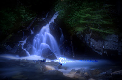
Madcap Falls


No Name Waterfall


This waterfall has no name, simply because it doesn't exist. It's not on any of the charts that I have or the USGS folks have. I was told that I may be the first person to photograph it and I may be the first person to see it, according to the USGS people at Mt. Rainier, but I doubt it.

Friday, July 24, 2009

Charity as Catalyst

When you can use your photography and enthusiasm as a force for good, it's a win-win-win:

Strobist reader Jeremy Sale details how he used a local fund-raising event as a vehicle to practice his lighting skills, while providing cool portraits and raising money for a good cause.

More info, pix, a vid and what he learned, here.

-30-

Wednesday, July 22, 2009

Inspired by Natural Light

Ever wonder how some people make those interesting, seemingly natural-light photos, but their photos have a quality edge that others don't?

In many cases, the photos are lit specifically to mimic the existing, natural light -- albeit in a very controlled way.

In a blog post, Seattle photog John Keatley walks through his process of working with natural light as his inspiration. First, study the natural light. Then design your key to mimic it. Then fix all of the tonal issues that keep your camera from seeing a scene the way you eye does.

John Keatley uncorks a full, OA-style post, here.
__________

[EDITOR'S NOTE: Strobist published an extended post on John Keatley, including walk-thrus of two portrait sessions, earlier this year.]


-30-

Monday, July 20, 2009

On Assignment: Playwright

I photographed actor and playwright Cameron McNary as part of my Howard County Arts Council project. Unable to scrounge a decent location, we ended up in the basement -- which meant shooting under 7 1/2-foot ceilings.

That's always a challenge, as it severely limits lighting angles from overhead. But if you can lower the subject -- as in a seated portrait -- it gives you a little more flexibility.

So we did just that, and played around with a little hard light while we were at it.
__________


Working With a Low Ceiling

Cameron was very cool, and patiently waited as I found a lighting design that would both work for him and fit into our impromptu, height-challenged studio.

Getting him to a lower, seated position allowed me to bring in the key light from a high angle. But even with the subject seated, a high key from a low ceiling height is impossible if the light is very far from the subject. It's just a matter of angles. So we brought it in tight and high and added a grid spot to control spill on the backdrop. (The key was an old WL 600.)

Problem is, being so close the light is going to fall off very quickly. So you are basically just sculpting your leading edges with light at that point.

One solution for the deep shadows left by this kind of key is to use on-axis fill to control the shadow depth. In this case, I used an ABR800 ring flash, set about 2 1/2 stops below the key. (Huh?)

The ring fills the shadows without leaving any telltale shadows of its own -- until you get to the background. Then it screams out, "Hey, lookit me -- I'm a ring flash!"


An easy fix is to hit the background with its own light. As seen here, it was just a splash -- via an SU-4'd SB-800 coming from back camera left. This kills the ring signature, and also adds a little bit of a lighting layer to the background.

Cameron is a D&D player from way back, and he happened to have his dice with him. (I didn't ask why...) But they added a nice, relevant detail as he is basically rolling the dice with his characters every time he puts pen to paper.


Long-Throw Reflector Key

For one of the other shots I went back to the 11" sports reflector I had previously used in this test, to work against the edge of the beam.

I like some of the atypical things you can do with this reflector, but sometimes the fact that it is super efficient can be a bit of a pain. These things throw out a lot of light, so at close range I am usually gonna be using the edge of the beam.

It's kinda sorta like a grid, but not really. It falls off differently, and can sometimes look a little strange. Not that strange is a bad thing -- I am always looking for strange, just in case strange turns out to work well.

In this case, most of the energy from the strobe is missing Cameron and hitting the floor in front of him. This gives a little reflected uplight from the carpet to work against the harsh angle of the top key. To further bring up the shadows I pushed a little ring flash in there, too.

The ring flash is dialed down so low that it doesn't even push any tone back to the dark grey backdrop. To add just enough light to separate his shoulder line, I used a domed SB-800 as a background light directly behind Cameron.


You can see the extreme angle of the key, here. This is not typical portrait light, but Cameron's work is pretty cerebral and intense. So I figured we could make his headshot a little atypical, too.

Notice his arms are totally blown out. That's okay, because his arms are not going to be in the photo. But it shows you how little of the beam is hitting his face.

This is a cool little trick in that you can have the light coming from the top, and yet the reflected fill from the bottom could actually be brighter than the key on the subject's face. It's all about the angle. And having a deep-dish reflector with such a strongly defined beam on your key helps, too.

Saturday, July 18, 2009

WIRED Video: Street Portraiture


It has nothing to do with flash, actually. In fact, it is all available light (in shade) and shot on taped-up white seamless. In this configuration, the open sun area behind you is almost like a huge, on-axis soft box.

But this isn't about the lighting. It is a good primer on overcoming your shyness of photographing others -- and how to interact with them in a quick, fluid environment. Something I suspect many people reading this site will appreciate.

FYI, the photographer is Clay Enos, and you can see more of his work here. And on top of that, he is a pretty consistent blogger, too.

Thanks much for the tips, Clay. And ditto to WIRED.com, for making the video embeddable.

-30-

Wednesday, July 15, 2009

Boot Camp II, Assignment 2: Results

First of all, regarding choosing food for an assignment subject while I am trying to lose weight:

Bad idea.

Be that as it may, a smorgasbord of finalists -- and one winner -- inside.
__________


Over. Eight. Hundred. Entries.

This time around, I streamlined the process to make things a little easier. First I threw out all of the vegetarian crap just to narrow things down quickly. Then I let Flickr choose by sorting the remaining pictures by "interestingness." Piece of cake!

(Kidding.)

Many rounds of winnowing were needed to get to this final ten. And on any given day, a completely different set of ten could have been chosen by someone else. But "someone else" wasn't here, so you were stuck with me.

FWIW, I got it down to a couple dozen photos -- all of which I loved -- and at that point invited some neighborhood cooks to help me choose the ten finalists. Thus, the following photos pass both the photo and food enthusiast tests.

Herewith, your finalists.


In No Particular Order

Because I have seen about a gazillion pictures of Coca Cola, and I have never seen this.

Because he kept looking until he saw a unique detail and lit it beautifully. (I'd throw some tracing paper in as a second diffuser to lose the umbrella ribs, tho.)

I would also note that Hipporage is now two-for-two in the finals. Kickass.


Because it is simple and beautiful.

Because it tells a story. (Click thru to see why he came up with this and how he submitted it.)

Because the lighting works without calling attention to itself. That is an admirable quality, and one at which I often fail.


Because while the photo is undeniably cool, it also presents the opportunity to use the phrase, "heiney smoke" in print, with absolute impunity.

And how often does one get to do that?

(Answer: Once.)

There you go, Ben. Mark that phrase off of the list.


A little aside: Legend has it there was an ongoing challenge between many of the reporters at The Baltimore Sun -- with real money involved -- to sneak the phrase "creamy white thighs" into a story in print.

Reporter Joel McCord is said to have come closest, in describing a painting over the bar at a joint on Maryland's Eastern Shore. Copydesk, also apparently aware of the bet, cut it at the last minute.


Because of the way the light works for the berries, the veggies and the knife.

Because of the way the knife ties it all together.

Because the photog used the assignment to give a shout-out to a very cool CSA. (I'd be all over that if I was in Massachusetts.)

NOTE: That CSA would be a great, long-term photo project for this photographer. I am betting there would be good food in it for you, too.


Because, well, holy-crap-it's-a-glowing-pineapple, fer Pete's sake!

I have never, ever seen that before. A melon, sure. But a pineapple? That had to be full manual on the 383 he has stuck in there. It looks awesome.

And the cross-gridded leaves up top rock, too. Little obvious on the dodge. But still, that backlit pineapple...

I dunno why, but it kinda reminds me of "the lamp" from A Christmas Story.

And I want a lamp like this. Seriously.


Because this looks like it could be a sculpture at MOMA.

Because the lighting is at once minimalist and three-dimensional.

Because of the way the garlic stands out as the only color in the frame. Beautiful.


Because of the layers of different textures -- especially the patina on the skillet.

Because it is old, evocative and suggests a story.

Because of the compositional air in the peppers. It would have been easy to put too much stuff in this one.

Note: I also liked this tilapia photo, which had a similar physical theme. They were too similar to both be finalists, and it was pretty close.


Because of the light and composition.

Because the reflection in the spoon is so cool it almost looks computer generated.

Because of the competing textures, all beautifully lit.

(You may remember Konstantin from this feature.)


Because of the perfectly executed theme.

Because of the way the ingredients were selected, composed and lit.

Because Missus Strobist lobbied hard for this one. (But she was pining for a little dribble of olive oil in there ...)


Because I do not ever think I have seen an Oreo photographed as appetizingly as this one.

Because of the negative space.

Because of the perfect control of tones.

Because of the way the logo is barely holding off the encroaching milk. There's actually kind of a moment in there ...


Let's Wrap This Up -- I'm Getting Hungry.

I'll get to the winner in a minute. But one non-finalist deserves mention for being so over-the-top, blatant Captain Obvious suck-up that it almost worked.

Almost.

He even had a time-lapse video of the shoot.

Paul Morton was among those who thought a Diet Mountain Dew shot was the fast track to Orbis City. (Nice try, bucko. But I was expecting that, so the resistance was strong.)

The video did crack me up tho, in its over-the-top-ness:


I am just glad no one knew my real weakness when it comes to food. It was formed back in the late 1960's by my grandmother, Thelma Hobby, in her small kitchen in Mulberry, Florida.

That would have been hard to resist.


So, In the Absence of Dumplings

The winner of the Orbis Ring Flash Adapter, the Lighting DVDs, and the Trade Secret Strobist Cards is here.

Monday, July 13, 2009

Robert Benson CEO Shoot


This is the kind of thing I would love to see much more of -- nice walk-thru POV videos from portrait assignments.

Photographers are visual people. And you can learn an awful lot, very quickly when other photographers are generous enough to have their assistants shoot these kinds of vignettes.

It's only a couple of minutes long. Take a look and think about what you get out of it. My thoughts after the jump.
__________


It's nice to see the lighting, which in this case is a quick, simple two-light setup that could be done just about anywhere. But the real value for me in this video is the look into Robert's subject interaction.

Even in this short clip you can get a good look at his bedside manner -- how he jokes around and keeps the CEO at ease even while shooting in the midst of her doing other activities. The hair flip was her quick way of getting ready, but Robert coaxed a few more out of her to try for a moment or layer to the photo that would not have been there before. That kind of reacting to the moment is important.

And even while he is being fun and going with the flow, he is clearly in control of the couple of minutes they will spend on this look. That is a bot of an art form -- especially when working with people like CEOs, who are used to being in control of others all of the time.

You can't draw up a simple back-of-the-napkin diagram for this kind of stuff -- you pretty much have to see it happen. Which is why this info is relatively hard to come by, compared to lighting.

Many thanks to San Diego photog Rob Benson for this one. And if you haven't already checked out his very RSS-worthy blog, head on over.
__________

Oh, and if you are shooting BTS vids on your assignments, give us a heads-up in the comments. We'll make sure the best ones get seen!

Saturday, July 11, 2009

Brent Humphreys' Hairpin Studio


Andrew Hetherington over at What the Jackanory has a great behind-the-scenes write-up on photographer Brent Humphreys and his Tour de France project. Humphreys put a boatload of effort into creating some great work for the series, including this multiple portrait grid of time trial riders.

He don't need no stinkin' studio. He just scouted his location -- a turn on the time trials -- set up his lights and shot 'em on the fly.

If you are interested in seeing still more of Humphreys' work, check him out at www.brenthumphreys.com.

-30-

Friday, July 10, 2009

Mind that Oven Timer

Don't forget, if you are participating in the the second assignment from Bootcamp II, your photo is due by the end of Saturday, July 11th, local time. That's today.

Hit the jump for a quick preview of some of the stuff that is already coming in:


Suffice to say, it is going to take me a few days to whittle this stuff down to finalists and a winner. Plus, I am sure there is going to be a little extra snacking involved ...

Wednesday, July 8, 2009

Creative Light Launches with Class

Creative Light has just debuted a full line of moderately priced lighting modifiers. Never heard of Creative Light? That's because they just launched the company, too.

They are a subsidiary of Profoto um, based in Sweden, so you have a pretty good idea the gear is probably not gonna suck.

But that's not what makes this launch cool. What I am excited about is this:

They are wrapping the company around solid lighting education -- which is exactly what every photo gear company should be doing right now.

If a company is willing to devote the time and money to producing good, educational content about their gear, the cost of distributing those ones and zeroes is pretty close to zero. Yet it adds a ton of value -- especially for beginning photogs.

Two videos -- and more info -- after the jump.
__________


The first video is an aurora borealis-themed fashion shoot featuring Baldomero Fernandez, from whence came the shot at the top of the post. I love the idea of using the reflector to catch the spilled overhead key to double it as an on-axis fill, too. That had never occurred to me.


And even though this site's readership is depressingly, overwhelmingly, ninety-four-percentingly male, I do try to keep an eye out for the rare lighting demo that is a little more suited for the laydees:


The takeaway for this one (for me, at least) was an affirmation of the idea of setting your light and then allowing for things to happen at the edges. Those areas around the margins are where the unexpected lives -- always a good thing.

There is a full range of boxes, octas, umbrellas, etc. And these guys are embracing the speedlight ethic, too, with hot shoe-based speed rings for their 'boxes in the immediate pipeline. Gotta like that.
__________


Every Company Should Be This Smart

Props to Creative Light for having good how-to material right out of the blocks. You can find more videos here. (The main website is here.)

If you are a photo gear company, how can you not be doing this in 2009? Heck, every company should be doing as much as practical to use the free, worldwide information channels that exist to create a mini knowledge university centered around your products.

It's not just good karma -- it is good business. Even more so with text-based info, as Google will happily bring people in search of that info right to your door. For free. Every day.

Way to go, Creative Light -- and keep up the good work.

Your Press Conference, My Studio

Is this the best photo of a Ferrari you have ever seen?

No, it's not.

But bear in mind that it was lit off-the-cuff at a presser with some quick thinking, two SB-600s and one very expensive light stand.
__________


Taking a cue from Kenny Brown's awesome gullwing shot a ways back, Strobist reader Mark Shannon (gently) put a Nikon SB-600 in each of the back seats of this brand new Ferrari California at a premiere event and fired them into the white ceiling. This created the nice, soft-edged light source that lit, and was reflected by, the car.

He triggered the flashes via CLS, with an on-camera SB-900 which did not contribute to the exposure. He placed the flashes so the light sensors were just visible on the seats, and they were strong enough to get him f/8 at ISO 200 even off of the ceiling. At a 250th of a sec, that allowed him to drop the background off nicely.

If you don't have a compact, 5-section light stand hanging around, it's always nice when you can support your precious speedlights with a $200,000.00 light stand that cradles them in soft, butt-hugging leather.

Not a high-end studio shot by any means. But quick thinking to elevate a not-so-great photo at a live event into something that at least begins to do this car justice.

Robin Masters would be proud.

Sunday, July 5, 2009

New, Extended Dave Hill BTS Videos

UPDATE: After a small outage earlier today, Dave Hill's website is back on track...
__________


Nashville-to-L.A. alt-shooter Dave Hill has done a major refresh on his website, with lotsa new pics and a half dozen behind-the-scenes videos -- some of which are nice and long.

Hit the jump for two BTS's and links to the photographer whose post-processing volume control knob goes up to "eleven".
__________

(RSS/email readers may have to click on the post title to get the movies, depending on your reader.)

Kudos to Dave for giving the BTS camera loose rein. He just lets them roll, catching a lot of useful info for people who like to watch over his shoulder.

In fact, just about the only thing he doesn't show you are final shots. But if you are interested, you can find those with a little quick dig through his portfolio, linked below.


The first vid (above) from a shoot of Martha MacIsaac for AP magazine, is a good 4-minute lesson on how to control and shape sunlight in the foreground without losing consistency with the background.

He silks it to smooth out the harshness and put the subject in shade, then builds it back up by firing a huge octa through the silk. The light mimics the natural light in direction, but the quality is much better. He also can now totally control the relative light levels between the subject and the background, as her ambient is below that of the buildings in back.

Add a right-back rim and his ever-present ring/fill (which Dave recently had surgically attached to his left hand) and you are good to go.


The "Adventure Girl" BTS is a magnum opus, clocking in at 11:24 mins. It's worth a watch, however, as you get several shoots and a lot of non-lighting stuff (like, when shoveling dirt on your subjects, be sure to tell them to close their eyes and their mouths...)

He uses a lot of VAL'd lights in this one, with the idea being that you do whatever you need to do to get the light wherever it needs to be.

These vids both serve in HD, so click over to that format if you are running them full screen.

Big ups to Dave for all of the rich content on the new site. Be sure to check out his new portfolio to look for finals from the above. And you can watch several more videos, here.

Thursday, July 2, 2009

Boot Camp II: Assignment #2

UPDATE(S): Added picture link to the haggis. Think twice before clicking. Also, for those of you who follow Strobist on Twitter, I will be dropping in more food photography resources there.
__________

The second Boot Camp II assignment will be easier than the headshot assignment, logistically. But calorically speaking, it will be far more dangerous.

And since you will not have to wrangle a model for this shoot (not a living one, at least) we are going to up the difficulty level by tightening up the deadline a bit.

Hit the jump for the details -- and some internal and external resources to help you out.
__________


A Little Belt Tightening

It's probably safe to say that many of us are eating out less often than we were at this time last year. But that is not the kind of belt tightening of which I am speaking.

For me, it is not so much the belt itself that is getting smaller, but rather that the job the belt has to do has gotten larger. Me and food, we were made for each other. And we have had an especially close relationship over the last six months or so, when I have been on the road more than off. So this summer I am practicing a little girth control.

Which is why I am already questioning the wisdom of the second BCII assignment -- to photograph a gastronomic subject so well that it will cause me to go off the wagon.

The vast majority of you are using small lights, and they are especially well-suited for this kind of an assignment. In fact, as we showed last week, you can create very elegant light for food with one bare speedlight and some household paper products.

But don't settle on a thrown-together quickie of some tomatoes -- those were just done as a convenient example to work with the light. For this assignment, you should be looking to create a mood -- to make a photo that would look at home on the cover of a high-end food magazine.


Complicate Things at Your Own Peril

The trick, of course, if to balance the mood-setting stuff with what is probably the most important axiom in food photography: Keep it Simple, Stupid.

Before you even choose what you are going to shoot, spend some time looking at a lot of examples of food photography and see what you like. It's not like there isn't a lot of inspiration out there, so your first stop will probably be Google.

Don't try to shoot a whole turkey, or a crown roast or anything like that unless you are insane. You'll do yourself a big favor by aiming for something you can pull off with style and simplicity.

Lighting-wise, whether you use an umbrella, a soft box or a DIY "lunch box," you will want to at least consider lighting your food from the top/back. It creates depth and texture, and gets you a long way toward a nice photo with little risk. Not that that style is required, of course, but many people who have not shot food before will make the mistake of assuming you would light it from the same angle you'd light a portrait.

Also, be sure to be in control of your shadow detail. Not that it has to be flat -- and there is no rule that there has to be any shadow detail, to be honest. But you want to be in control of it. The easiest way will be through the use of small reflectors.

Again, the scale of the subject works for you here. They can be folded sheets of paper, aluminum foil, whatever. If you are from the UK, maybe the mere act of standing near your subject will suffice. (I can say that, because I wear shorts all summer and am still pasty on Labor Day...)


Food for Thought

I did promise an opportunity to do good with each assignment, and this one is no different. The following is not a requirement for the assignment, but rather a chance for your effort not to go to waste -- even if it does end up going to waist.

The fact that you are probably eating out less frequently probably means that some local restauranteurs in your area are feeling the pinch, too. So, you may wish to double up on this assignment by shooting your favorite dish at a small, independent restaurant.

The owner probably does not have the excess cash flow to be funding food shoots these days, and you might be able to be of help. Sometimes all a restaurant website needs is one, killer food shot. That could be you.

What's in it for you, other than an excuse to go out to eat? Well, I am thinking that food is gonna styled pretty well when it leaves the kitchen. Probably better that you would have done it. And no stylist's bill to deal with, either.

A little advice -- call first and let them know what you are up to. Try to sked it in the middle of the afternoon, when you won't interfere with meal rush time and will have your pick of tables to shoot at. We used to shoot all of our restaurant reviews at The Sun in the 2:30-3:30pm neighborhood.

If you explain what you are doing (and why) and offer to share your photos with them, you will probably find yourself in a very collaborative situation -- with a nice environment in which to shoot. Especially of you are a regular there who genuinely wants to make an image of some value for the restaurant.

I am starting to feel like we are putting Roberto's kids through college, as often as we eat at our favorite Italian place. And that is exactly where I would head if I were doing this assignment.

Again, the restaurant tack is not required. But it could solve some problems for you very symbiotically. From experience, I would suggest that the chef keep things very simple, as their first instinct is to throw in every visual thing but the kitchen sink. Bring some examples of food photography that you really like (it will probably be simple and sparse) and show it to them as an example.


Home-Grown is Okay, Too

You are more then welcome -- especially you foodies -- to do it all in-house, so to speak. No brownie points or demerits either way.

And for clarity's sake, let's make this one pretty broad. If it is food, or drink, it's eligible. Some of you international types might even take this as a point of pride, featuring something that is a special delicacy in your country.

(Please -- no haggis.)

But whatever you do, keep it simple. Consider the photographic shelf life of your food. Grilled and roasted items are especially hard -- typically significantly undercooked and sculpted with char-marks by using a blow torch. Don't make it harder than it has to be.

Non-frozen desserts are pretty stable, for example. Don't make things harder on yourself than they have to be. Simple comfort foods can be great subjects.


Resources Abound

A quick Google of "food photography" brings up lots of useful stuff:


DPS: Food Photography -- An Introduction
Still Life With: Food Photography Blog
Vegan Yum Yum: Food Photography for Bloggers


Those were right off of the front page of Google results, so there is no shortage of information if you are willing to look.

Of course, photographers are visual people. So sometimes it actually helps to watch a seasoned professional at work:


(Lest you take yourself too seriously.)


How to Enter

As with the first assignment, you enter the photo through Flickr, by placing it in the Strobist Flickr Group pool, and by tagging it thusly:


SBC2ASSIGN2

If you need technical help on the Flickr stuff, try this thread. Please read the thread before asking any questions, lest someone reply that "your father smelled of elderberry" (or words to that effect.)

(UPDATE: They have already started in with the general craziness, so you can skip to the more relevant stuff by jumping to this point if you like.)

If you are successful, your photos should appear in this search within a few minutes. Please, only submit one entry. As we are hoping to create an inclusive slideshow, please do not tag photos which are not appropriate to this assignment with the SBC2ASSIGN2 tag.

For the same reason, please do not turn in any photos which are NSFW.

In fact, the more I look at this Cheeto shot, the more inappropriate it is starting to look. But maybe that's just me. As we noted yesterday, breaking these rules will get (at least) your photo removed from the Strobist pool, and thus, this assignment. Thanks much.

Please note that your photo must be tagged correctly and in the Strobist group pool to show up in the search.

And please, this is a lighting blog. So even tho you obviously can do a lot of amazing food photography with natural light, use flash for this one. You are free to combine it with ambient, tho. And, as always, put your lighting info in the caption of the photo.

If you want to ask questions, or otherwise discuss this assignment, you can do so in this thread.

And you can check out some of the other bloggers following along, here.


And the Winner Is ...

One winner will be chosen from qualified entries. That person will receive the following, shipped anywhere:


• One Strobist Lighting Seminar 8-DVD boxed set (more info)

• One set of Strobist Trade Secret Cards (more info)

and, I am very excited to say that our external prize this week is:

• An Orbis Ring Flash Adapter, which turns just about any speedlight into a ring flash.

Not coincidentally, the latter is something I have found to be pretty darn useful for small object photography, including food shoots. (Think awesome, shadowless fill to smooth out your edgy, sculpted light from other sources...)


Don't Overcook It

Since this shot is the simplest of the four (deceptively so, some might say) the deadline for completion will be end of day, your local time, on Saturday, July 11th.

You procrastinators will want to make sure you get started by about dinnertime on that date...


And, Just to Keep Things Honest

While it is very possible that you may have some beautiful, pre-existing food shots in your portfolio, we are not interested in those. So just to make sure we get the one you shot after this assignment was released, the winner will have to produce a shot very similar to the winning entry -- with two coins somewhere in the foreground of the shot.

So, don't forget to make that additional 2-coins verification shot -- just in case you win...
__________


Full, "On-Assignment" posts for the food shots featured above can be found at:


:: Lemon Cake ::
:: Flavored Vodkas ::
:: Macaroni Shells ::
:: Cheeto (and various other Munchie Porn) ::

Wednesday, July 1, 2009

How Niche is the Web? This Niche:

[UPDATE: The site has clearly started to catch on, with A-listers among those dropping in their tests. Excellent!]
__________

A new site dedicated to photo assistants' uploaded lighting tests. Not sure whether to roll my eyes, or RSS it.

(Who am I kidding -- I'm gonna RSS it. I love this kind of stuff.)

Via APE.

-30-

Share

Twitter Delicious Facebook Digg Stumbleupon Favorites More