Wednesday, October 28, 2009

Brain Food: Three New Offerings

Over the last two weeks, three new educational items of interest have popped up on the radar. There are new video tutorials from Dave Honl and JoeyL, and John Harrington has evolved his Best Business Practices book into a magnum opus, 500+ page second edition.

More on all three, and which ones may or may not be for you, inside.
__________


Best Biz 2.0
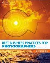
Harrington's new edition of his book is far more than your typical update. He basically recast the book to reflect the changing landscape of the business of photography. Also included is a first-person walk-thru of a full I.R.S. audit.

That's right, John took one for the team. And thanks to him you now have a pretty detailed version of exactly what to expect when they come knocking. (Kinda the financial equivalent of a cavity search.)

And, of course, you get a Harrington-esque game plan for wading in and riding it out. (John, for the record I hope this was just happenstance. Because if you asked for the audit just to write about it, you are insane.)

There's lot more new stuff, too. The book is half-again bigger than the first edition, which was already no slouch.

John and I are not always in agreement on how we approach things from a monetary/business point of view. But do not let that fool you. If you are a pro shooter (or are considering becoming one) you should absolutely buy this book. I have updated the review of the first edition with a second-edition topper and more details, here.

Thanks, John, for the tremendous effort you clearly put into this major update. It's 523 pages of CYA for less than $25.00. This book is a must-have for any working -- or prospective -- pro.


Dave Honl's Light Fare
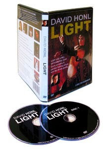
Next up is a 2-DVD set from David Honl, who designed the entire line of HonlPhoto snoots, grids, gobs, speed straps, etc.

Watching this, I almost got the impression I was watching a photo-version of HGTV. Dave has friends in Hollywood, which really helps when it comes to putting together a DVD set.

And like HGTV, it is not so much a hard-nosed tutorial as it is a roadmap/confidence builder, allowing you to be a voyeur as they work. Essentially, it's a low-pressure, learn-by-watching romp through a series of small-flash shoots. Dave uses his line of light modifiers (along with some other items) but gets full credit for not turning the video into an infomercial.

Through the video you hang out with Dave and (Babylon 5 star) Claudia Christian as they bounce from small-flash shoot to small-flash shoot. They even do a food segment -- cooking, shooting and eating with USA Today shooter Bert Hanashiro.

The focus is more light placement and light shaping than nuts-and-bolts, f/stop-naming exposure balance techniques. And he is assuming some familiarity with the process. Most of his shoots use three speedlights (his go-to setup) and various small light shapers.

Much like I do, Dave shoots from the hip in manual mode with respect to exact metering, etc. Basically you will follow as he starts off with an ambient exposure, knocks it down, and builds it back up with light. It is a tried-and-true formula, and he works it well. The takeaway is not so much the exact process as a general confidence builder on how quick and easy this gets to be with a little practice. And he does go back and diagram each shoot as he finishes it.

The pace is quick, bouncing from shoot to shoot, with the exception of a 20-min talk-and-shoot with Christian and fellow Babylon 5 co-star Bill Mumy. I am not much of a TV watcher, so the 15-min talk before the shoot was kinda lost on me. But Dave then did a nice job of knocking down a very bright ambient room only to build it back up with sculpted light.

Here's a quick preview:


David Honl LIGHT is a two-DVD set that will play as a video on your computer or in your regular DVD player. It is $39.95 and available in many photo retailers, or on the web, here.


JoeyL's Full Mind Dump
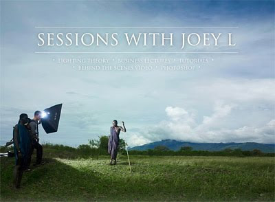

First of all, don't let the bombast and photo rap songs fool you. It's all a branding head fake. Joey Lawrence is one of the smartest, most focused, centered and talented people I have ever met. And the fact that he is all of this at 19 years old just pisses me off.

When I first sat down with "Sessions with JoeyL," I sort of expected a higher-volume version of the Photoshop and shooting tutorial he released last year. What it turned out to be completely surprised me. It is a full rundown of his workflow, thinking, shooting methods, pre-planning, lighting, post-production -- everything.

A little perspective: Most people would have gotten a pretty swelled head to get the assignment to shoot the Twilight movie poster stills. He did it as an 18-yr-old. And even then, he primarily saw it as a way to finance his trip to the Ethiopian hinterlands.

That trip is a vehicle for the Sessions videos, as Joey uses it as an example for lots of various tutorials about everything that surrounds his shooting process. But there is lots more, too.

The sessions are broken into five categories: Lighting theory, photo shoots, business, travel and Photoshop.

In lighting theory, he has separate lessons on vision, basic and advanced techniques, tools and modifiers. His light is fairly simple when it comes down to it -- it is just a part of a holistic approach to building interesting photos. And he treats it as such. And frankly, thinking of light as only one of many good tools and qualities with which you make pictures is a good thing.

In the next session, takes you along on five different shoots -- a magazine shoot, an advertising shoot, two bands and a model test. Lots in here -- lighting, subject interaction, theory, etc. It is all very fluid, and for the most part uses big lights.

In the business section he goes at length into his business practices (which, BTW, differ somewhat from those of John Harrington, above) and also includes examples of how he builds trust both with his clients and his subjects.

The latter is a thread all through the sessions. Seriously, can you imagine the pressure of working on some of his shoots -- for some of his clients -- as a teenager? Honestly, I would think it is quite a handicap in the eyes of many of the people around him. He just assumes that he will have to work a little harder -- and faster -- to gain their trust on set.

In travel, he uses the Ethiopia trip to walk through how he approaches travel, gear, logistics, finding a guide, getting off the beaten path, etc.

Lastly, the Photoshop section is not as layer-blending specific as was his first tutorial video. He mixes general and specific techniques, including how he got his luminous tonal ranges from the Ethiopia photos. (I assumed that was a Phase One thing, and was very pleased to see that it was more of a post-processing technique.)

The sub-sections in Photoshop are: Compositing, using color curves, swapping skies, using blending modes, black and white conversions, tonal colorizing and fixing blown highlights.

Here is a very short preview, which honestly does not begin to cover the depth of the 4-hour sessions:


Ready for the catch? (There's always a catch.)

It is expensive. It is $300 (actually, $250 until November 1st, and further reduced to $200 if you have purchased his previous tutorial.)

That is a lot of money. And the $300 question is, of course, is it worth it?

Here's the thing. I can't tell you that. Well, scratch that -- I can tell you this: Whether these sessions are worth the money depend entirely on what you will do with them.

If you are just looking for 4 hours of "teach me how to be JoeyL" entertainment, I will say that there are a lot of things that you can do with half a day and $300 that will be more entertaining.

But if you truly take what he is trying to teach you to heart -- and use it to try to close the gap between what you are doing and what he is doing -- then it is cheap.

To his credit, my constant feeling during the entire series was that he appears to be holding nothing back. What you see is what you get. It is a full and sincere attempt to help people to see how he thinks and works, and to aspire to that level.

And I will also say that I am about 100% sure that he will not be blowing the proceeds of this video on liquor and women, as would many a 19-year-old I have known. For those of you who can afford it, I would consider it not only an investment in yourself as a photographer but also an investment in a future project for a young man who is trying to make an impact in the world before he is old enough legally drink.

Sessions With JoeyL is available as a data download or as a data DVD ROM. It runs only on your computer in a browser format and will not play in a standard DVD player on your TV. More info, including how to purchase, is here.

[UPDATE: JL just added a promo code for the readers of this site (no commission or anything like that coming to me) to extend the discount, which was set to expire just a few days after this post. Use the code "SESSIONSSPECIAL03636" (no quotes) when ordering to get the discount.]

Tuesday, October 27, 2009

A Filthy Language Primer, Courtesy Chase Jarvis


At first glance, this appears merely to be a very cool behind-the-scenes look at the high-speed flash shooting Chase did last month in New Zealand. Lotsa high-tech flash talk, impossible sequences, killer pics -- yadda, yadda, yadda.

But the real takeaway here is of the etymological variety.

To wit, the adjective "sick." Which, of course, means "good." (Back in my day we went with the much less confusing "bad" when we meant "good.")

But what if something is really sick. As in, sicker than sick? That calls for the word, "filthy."

And if it is filthier than filthy, then of course you'll want to go with, "nasty."

More, including resulting pix, diagrams, and the obligatory lively discussion in the comments, at Chez Chase. I am heading over to read it now, as I sit down for lunch with a slice of filthy, nasty pizza. Which is prolly gonna make me feel sick

-30-

Sunday, October 25, 2009

Ray Flash vs. Orbis vs. AlienBees ABR800 Review, Pt. 1

Ring light has, for me, gone from a curiosity to what I consider to be an essential part of my lighting kit. I do not always use it when lighting people, but I always bring it. And I frequently end up using it -- but rarely as a main or only light.

In this first of a two-part series comparing ring flashes, we'll be taking a look at the two direct competitors in the bunch: The Ray Flash and Orbis ring flash adapters. The ABR-800, in all of its different iterations, will get its own post next week.

As most of you already know, the Ray Flash and Orbis are not actually ring flashes but rather are passive light modifiers that convert your existing speedlight into a ring flash. This process has advantages and disadvantages, and there are also relative strengths and weaknesses between the two.

The straight dope, inside.
__________


A Little Background

I have been planning this post for awhile, as one of a pile of "evergreen" type posts that I keep tucked away for a rainy day. In the interim, Dave Honl and Bert Hanashiro over at SportsShooter came up with a video of their own comparing the three.

It's fantastic in that it shows the relative size and ergonomics of each. It sucked (yeah, bros, I'm calling you out) in that it did not really get very deeply into the most important facet: What does the light look from each like in an apples-to-apples comparison?

I kid -- mostly.

But long story short, Dave and Bert's video is a good 4-minute primer on seeing how they each work. So if you have not seen that video yet, I would suggest watching that first. You know, to save me some typin'. (Note: They used a Zeus, which is the ABR800 equivalent in a pack-and-head configuration. Same difference.)

It is here. I'll wait.
__________


Leading Off: The Ray Flash

The Ray Flash mounts to your camera with the flash attached on the hot shoe. The camera, flash and Ray Flash all become one unit.

At first, you'll worry that it puts too much pressure on your shoe-mount flash foot. That has never been a real issue, tho. And it does flex a little and takes some getting used to in general. But the latter is true for any ring flash.


Here is how it mounts, which should be pretty self explanatory.

And if you have trouble holding these guys, the studio versions will only feel clunkier and heavier. This is as light as it gets. There is a physical learning curve to dealing with these, but it is worth the effort.

The Ray Flash is available here (or at many other camera stores around the world) for $199.95.


…followed by: The Orbis

The Orbis Ring Flash Adapter, which also sells for $199.00, is similar to the Ray Flash in that it channels your speedlight's output into a ring of light. But the similarities end there.

The Orbis mounts from under your lens, with the flash stuck up inside it. Normally you would connect it to your camera with an off-camera TTL cord (not included, but something many DSLR shooters already own.)

Your choices until now have been to hand-hold it or to use a light stand, both of which have advantages. But it could not fuse with the camera to make a single unit like the Ray Flash.

That changes with the upcoming release of the Orbis Arm, shown below:


I have played with a production model and have found it to be built like a tank -- a very lightweight tank, thankfully.

It is thick, rigid, powder-coated aluminum. And the two, double-screwed L-brackets are solid as a rock. I would note that, like the Ray Flash, there is some flex involved in the end. But that comes from the Orbis' connection to the flash head, and is in no way related to the Orbis Arm.

I have found it to be adjustable to any camera/lens combo. (I marked mine w/Sharpie to assemble it exactly to the right distance every time.) And it folds into a "spooned L" shape that fits into your bag without taking up any appreciable room. Nice design.


Stepping into The Ring

So, there are the basics for each one. From here on, it is Orbis against Ray Flash -- and may the best ring light win.

Which one will you like best? That depends. Because as similar as they are, they stack up totally differently depending on how you prioritize their features and qualities. So let's get to Round One.


Light Efficiency

Winner: Ray Flash

Here is an apples-to-apples comparison. Everything is the same except for the adapter used to mod the light.

On the left is Orbis. On the right, Ray Flash. Neither are optimal because I left them flat and split the difference on the exposure.

Some tests were, IMO, subjective. This one wasn't. If you are working with closed down apertures, low ISO, or outside, give the Ray Flash a good look.

But even with the increased efficiency, neither of these are overpower-the-sun machines. For that, you'll want an ABR800. You can fill with the speedlight models, but you cannot dominate the sun outdoors in full daylight.

That said, the vast majority of the time you will be working with these kinds of lights in moderate and/or controlled ambient light levels. And they both are more than sufficient for indoor use.

Exposure-wise, it is also worth noting here that both will pass through the TTL information -- it is just your normal flash after all -- and can be used with high-speed focal plane sync for wide aperture work. Gels are also a breeze to use with either. Just gel the flash as you normally would.


Universal Fit

Winner: Orbis

Again, no contest. The Orbis fits most every camera/speedlight combo (except for big honkers like Vivitar 285's.)

The Ray Flash is camera and flash specific. You need a different model number for variances in camera depth (prosumer or pro-sized body) and flash. And brand.

If you shoot with the same model camera(s) and flash(es) all of the time, this is a non-issue. Otherwise it is something to consider.

As a small consolation, I have found that I can mount an SB-800 on a D3 with the Ray Flash model meant for the SB-800 and D300. But it is a little off center on the vertical axis.


Run and Gun

Winner: Ray Flash

First, it comes ready to rock without the added bracket. And even considering the bracket on the Orbis, the Ray Flash is a more compact, self-contained setup.

If you are working in a pack of photogs, the Ray Flash is going to be a little tighter and more compact. This follows through to packability, too. The Ray Flash is thinner and smaller, but inherently "L-shaped". And FWIW, I have found that I can usually work that "L" around a corner somehow in a bag.

But that size efficiency comes back to bite you when it comes to …


Quality of Light

Winner: Orbis

Okay, this is one of those "IMO" types of things, as quality of light is subjective.

But the physics add up. The Orbis, being bigger and less efficient, also appears to be softer and more even in it's light distribution. This is a design point, and Ray Flash just went for more compactness and efficiency.

But being subjective, let's go to the example pics so you can judge for yourself.


Here is the Ray Flash pic. And these are both as apples-to-apples as I could make them. Just one ring light and a gray wall. And Dasha, of course.

It makes since that, since the Ray Flash is smaller it is going to produce a little harder light quality. Just physics. But, you get efficiency and compactness back in return.

It is my opinion that there is also some "lensing" going on in the Ray Flash, which means that you are going to get a bit of vignetting if you shoot wide with it. It is more efficient, in part, because it is somewhat of a "zoomed" ring flash.

This is something that is not very apparent in these two comparison photos, which were shot with a portrait length lens. But you can see it in a wide-angle lens shot, as in this example.


And here's the Orbis, in the same conditions as the shot above.

Right off of the bat I get a little softer shadow on the wall, which is obviously the result of a bigger lighting surface area. But in addition, the light is less "lensed" in the design of the Orbis, so it is also more evenly distributed around the circle. (Again, this will mostly come into play with shorter focal length shots.)

The Orbis is a softer, more even light. And thus, a little more flattering. And as I said, that comes back to bite you on the butt when it comes to lighting efficiency. You choose the factors that are more important to you.


Both are Better as Fill

Actually, let me be more clear: Any ring light is better at fill. So while the Orbis may win out on single-light quality, I do have to say that I rarely use ring lights this way.


Take this picture of Dasha, done at the same time with the Orbis.

In this setup, the Orbis is acting as a fill to a gridded SB-800 coming in from camera right high. This is where I think the Orbis, the Ray Flash and just about any other ring light (or adapter) shines.

Using a ring for what is essentially contrast control is where the fun is, because the ring actually allows you to be more edgy with the design of your key light and take more chances. I see it as being sorta like "layer blending" in Photoshop. Except for you do it in camera.


Because some will ask, here is the setup shot for the photo above. I just popped out of the ring (it was on a stand) and shot from above.

You can see how simple this is, but the result looks very sharp. And, depending on the fill level of the ring and the angle of the key, can give you a thousand different final looks.

The splash of light on the background also hides the effect of the ring light back there if the key light doesn't reach that far back. Which would be the case in this setup, probably.
__________


So there you have my best effort at a comparison between the two main, speedlight ring adapter contenders. It should be noted that there are some others, too, which are essentially cheap knockoffs of one of the above designs.

But a warning to those who would save a few bucks: Just because someone's ring light platic mold might have "fallen off of the truck" does not mean they went out and coughed up the bucks for the best internal optics materials.

In fact, if they were going for low price, they almost certainly did not spend that money. I have had reports of several tests of the various cheaper "Ebay ringflash adapters," and have heard stories so varied on color consistency (um, not) and hideous efficiency (including one report of a six-stop light loss) that I am not even gonna go there.

Look, if you want a super cheap ring light, just DIY your own from one of many different designs here and elsewhere. Save your marginal dollars for another flash.

Next week, get ready to go into full retina burning mode with the 320 watt-second AlienBees ABR 800 monobloc ring flash. We'll be doing comparisons there too -- same conditions as above, so you can compare all three. And with its various included and a la carte attachments, the ABR is a pretty variable light source in its own right.

Comments? Questions? Hit us below.


Next: Ray Flash vs. Orbis vs. ABR800 Pt. 2

PocketWizard Wraps Up Canon RF Noise Problem

If you have purchased (or are considering purchasing) one of the new PocketWizard TT5/TT1 remotes for the Canon system, keep reading.

If not, save the electrons ...
__________


Surprised by not only the magnitude but the variable nature of radio frequency interference put out by some of the Canon flashes, PocketWizard has addressed the Canon flash RF issues with the release of the AC5 RF Soft Shield.

It's basically an RF-blocking cloth shield which muffles the Canon flash noise and allows the TTL/HS sync-capable remote units to do their thing. It was a Canon-specific design problem, and there were reports of signifcant levels of interference from some Canon flash owners.

Today's news is that PW is going a step further and making the AC5 shields available for free.

It was a rough hand to get dealt, from an engineering/design standpoint. But kudos to PocketWizard for doing the right thing and making them available gratis. The offer goes live today, and runs through Jan 31, 2010.

Future units are reportedly going to include the AC5's in the box according to Mark Wallace at Snap Factory, for whom we also have to thank for the range demonstration video shown above.

Sign-up page for your free AC5 is here. And check out Mark's post for more specific info on range and reliability.

Wednesday, October 21, 2009

On Assignment: Weed Eaters

I spent Tuesday afternoon shooting a fleet of all-terrain mowers in Herald Harbor, MD.

Using goats instead of herbicides to clear land is growing in popularity, especially where runoff and watersheds are involved. And you have to admit, it is a pretty cool way to clear a monster patch of kudzu that has taken over a cliff.
__________


Brian Knox is the supervising forester for Eco-Goats, a Davidsonville, MD company that specializes in ecologically friendly land clearing. Okay, so the goats do a lot of the work. But Brian takes care of them, moves the temporary fences and is a much more articulate spokesperson for the business than are his charges.

If you have the right kind property to be cleared, it is a smart way to go. Not only does it save herbicides getting into the ecosystem, but it is low-carbon. The goats are just recycling the carbon in the topsoil biomass rather than burning petroleum.

Heck, Google does it, and they are the smartest people I know.


We were out in the afternoon on a clear day, with sun raking over a kudzu-covered cliff that acted as our backdrop. For this wide shot and the picture up top, we used two speedlights -- one on-axis for fill and another on a voice-activated boom. The "VAB" in question was Erik Couse, who also helped out on a shoot for Rivals.com earlier this season.

I exposed for a rich-looking ambient, then keylit with Erik's flash and filled with an SB-800 in a Ray Flash. I used a Ray Flash rather than an Orbis this time, as the Ray Flash is a little more efficient.

They both have their relative strengths, as I have been finding out while shooting with each. I have a two-part, in-depth comparison slated to begin next week.

In this case, Erik's SB-800 was high and camera right, and set on 1/4 power. You can see how it hits Brian's face and also sculpts the goats from high up. It is doing the same thing in the photo up top, only the ratio to the ambient is a little tighter so the light is less dramatic. When shooting closer to the ambient and lighting from a high angle, the look is more of a crisp, 3-D feel than anything else.


Here is Erik in action, showing just how easily he can drop that flash in just about anywhere with little effort. If you have a second person (even just a bystander) you can work really fast like this. No need for a fancy-pants boom, either. You can just use an extended light stand with the legs collapsed.

In the wide shot of Brian and goats above, the boom light works against the hard, streaming backlight coming from the sun. But given our ambient exposure, this would be way too contrasty without the use of the fill. The Ray Flash with the SB-800 was set to 1/2 power. Remember, the Ray Flash is going to eat up some light. So the net effect is a pretty good balance between the two because the fill-to-subject distance is also greater than that of the key.

One quirk about the Ray Flash is that it gives up a little angle of coverage to get its efficiency, which in this case is doubly helpful. I was able to feather it up a little to keep from overexposing the foreground goats.

And as long as Erik keeps his flash to a constant distance from my subject, this setup travels very well using manual mode all around. Light stands would not last five minutes with these guys. Who knows -- those flashes might be tasty…


Using this setup, we were also able to follow the goats as they wandered around in what would have otherwise been extreme patchy ambient backlight. Here we just went with Nikon's built-in CLS/TTL. (See? I can be flexible.) We used an on-camera flash as both the on-axis fill and the master light, combined. Fill was set to -2.0 stops from full TTL, with the boomed key light running at full TTL. Worked pretty well, too.

The important thing is the key light location. You'll be nudging your VAB into the lighting locations you want until they start to get it intuitively -- which Erik did pretty quickly.


We wanted to do something with a different look with Brian, so we turned around and shot him using the river as the backdrop.

He would be in full sun, if he were not being shaded by the trees behind me. And by keeping the key light and ambient light all coming from a similar direction, you can build a nice, logical lighting scheme. (Of course, you can cheat it a little with fill and a kicker, too.)

Use the shade to knock out the sun, then build the key and shaping lights until he looks the way you want. That way, the light in the background has a directional consistency that makes it look kinda natural, but juiced.

We placed the lights in this photo one at a time, starting with the ambient. First we went to a low ISO and set the shutter to a 250th. Then we dialed in the aperture that made the background look nice and saturated. I think we were underexposing it, like, a stop-and-a-half maybe.

This, of course, places Brian in a black hole. So we just build him back up one light at a time. (All in manual mode here. Everything is locked in -- the light is not gonna change.)

There are three lights going on -- all SB's. Try to reverse them before reading further if you want. Spoilers ahead.
_________


Key is kinda obvious, I guess. It is coming from high camera right, about 5 feet away. Power level? No idea. Maybe around a quarter or so. Doesn't matter -- the idea is just to dial it in until he looks good. We set it on a 105mm zoom and feathered it up a little, which gave us a nice falloff down his torso.

Second light is subtle, but important for shape. It is a back/right kicker, also zoomed to 105mm and dialed down until it just skims Brian's head and gives it a nice, 3-d look. Not too much power on this light is the secret. (Look at the photo bigger to see the subtle kicker at work.)

The third light needs to fix the shadow depth from the key, so it is coming in from low camera left. Erik is just holding it. We PW'd the first two lights and slaved (using SU-4 mode) the fill. It is subtle because it is set to a nice, low level. (Again, just add salt to taste.) But if you just look above Brian's camera-left collar you can see how much of a black hole the shadows would be without it.

Controlling the shadow depth from the key light is what makes those hard, sculpting lights look good. This also give us power to burn (at reasonable working distances) with the SB's. You could not do this very well with light-sucking umbrellas.


"Cue the Fill Goat!"

This last one is a straight ambient shot, using the streaming sunlight from back camera right and a very convenient fill goat from from camera left. I was amazed at how much she filled Brian's face from that distance.

But I'll sure take it.

Most of the day was handled with patchy backlit ambient and just two SB's. Nothing real fancy, and we did not use a single light softener the whole time. That was possible because we were mindful of the fill light, which allowed us to lift up the shadows cast by the hard key.

And I am already thinking of using these guys to go after that big patch of poison ivy (goats love it) that will otherwise make the woods in our backyard all but unusable next spring.

Sunday, October 18, 2009

Kevin Winzeler BTS vids: Big Lights, Small Lights


Got intro'd to Park City, Utah photographer Kevin Winzeler by a mutual friend last week and got a look at a couple of behind-the-scenes videos from his site.

Nothing heavy today, no tutorial stuff. (Hey, it is Monday.) Just good block-and-tackle examples of what every commercial shooter should be doing as standard marketing in 2009. (And, of course, a little lighting pr0n for us.)

The first one, above, is big-lights shoot of several MLS players in Salt Lake City. You have to pause the vid periodically to get an extended look at the results. But this high-dish/rimlight wrap really combines well with a little sweat-in-a-bottle for epic athlete stuff.

Hit the jump for a small-flash video, links to Kevin and results of these shoots.
__________


Speedlit Triathlete


In the second video, he works in close to a triathlete (in swim mode) with ziploc-baggied speedlights to up the drama from the hazy sunlit ambient.

Seriously, look at the difference between the ambient on the video and the final results.

Underexpose that ambient and it becomes dramatic. Your subject becomes a black hole, of course. But when you fix that with a pair of small flashes (plenty of power up close) it all comes together.


Here are links to the results, in Kevin's portfolio:

Soccer player
Triathlete


You can see more of Kevin's work via his website, and/or his blog.
__________


(Thanks much for the videos, Kevin!)

International Gels; OCF Mags Galore at PhotoPlus Expo

Two quick updates on previous Strobist items today:

First, the international rollout of the Strobist gel kits, and second, how to score one of many free Strobist OCF magnets at PhotoPlus Expo in New York this weekend.

(More on both, after the jump.)
__________


First, on the gels, many of those of you who were looking at usurious international shipping rates now have have options. If you go to the product page at Rosco, it should detect your location and direct you to a dealer within your country if one exists.

If that does not work, there is a full list of global outlets here. (The Flash Centre, for instance, in London, has already sold out and has since restocked.)

More and more countries are coming on, so keep checking if you want to get them without getting yanked on shipping charges.
__________


The finest things in life -- happily, some are affordable. And in the case of OCF magnets, they're free if you know where to get them.

For those of you who have been following on Twitter, the "magnet drops" are starting to pop up all over the world. There's even an OCF Google Map, which is linked at the bottom of each post on this site.

PhotoPlus Expo is being held in in New York City this weekend. The whole city will be crawling with photographers -- except, sadly, for me, as I had a previous commitment. But I am sending a pile of magnets up to the Javits Center to make for easy pickings.


Broadsword Calling Danny Boy, The Eagle Has Landed

The magnets will be at four booths: ExpoImaging, LumiQuest, California Sunbounce and Zenfolio. Between them, they will have over 300 to give away.

Links are to the PPE floor map locations. Zenfolio and California SunBounce are at MPIX and BronImaging's booths, respectively. And because I am a doofus and sent them late, California Sunbounce will not have their until Friday. So if you are late to the others, try them.

We just can't leave those things lying around for the unwashed masses, of course. So they will be hidden, and there will be a coded way to ask for them:


You: "Pardon me. Would you have any Grey Poupon?"

Them (if they have any left): "But of course."


(And because many of you who read this site are international readers and/or under 30…)


Enjoy PPE. Wish I could make it.

Friday, October 16, 2009

Lighting 101 in German and Polish, And a Solution for Blogger-Blocked China

Two more lovingly, hand-translated Lighting 101 .pdfs are linked after the jump. And in addition, a solution for readers in China, where the entire blogger platform is blocked in most areas.
__________


Dziękuję, and Danke!

Polish is long overdue (these guys have been done for a while now) but I try to gang up language release posts for efficiency.

Thanks to the polish translation team of Piotr Bizior, Bernard, Norbert Dąbkowsk, Michał Dulemba, Maciej Gajewski, Robert Grubba, Tomasz Kołtys, Adam Mikosz, Marcin Retecki, Jarosław Sikora, Piotr Slopnicki and Paweł "Chińczyk" Zapiór, Lighting 101 is now available as a .pdf, here.

The German team wrapped up their translation last month, thanks to the efforts of Carsten Arnold, Martin D., Nina Miller, Gerd Orfey, Danish Puthan Valiyandi, Nicolai Wiegand, Albert Bloch and Jens Aue. You get download it here.

Strobist Lighting 101 .pdfs are available in English, French, Hebrew, Spanish and Japanese.

That last link, to the Japanese version, also contains info on how to help translate L101 into other languages. All of the .pdfs are free, and you are free to post them on other sites as long as you do not alter or sell them.


Making Strobist Accessible to China

Sadly, China is prone to block the Blogger platform (upon which Strobist publishes) for political reasons. We are not big into politics around here, but neither do we see that as a reason to deny people lighting info.

I have partnered with Strobist reader Andrew Strauss, who is building a Chinese version of Strobist. It is a work in progress, but I hope that you will help spread the word if you hang out in places on the web where Chinese is spoken.

To help avoid some unnecessary emails, please do not read this as a solicitation for other language partnerships at this time. I am pedaling as fast as I can, and trying to do this in a deliberate, sustainable way.

Thanks for understanding. And even more, thanks for the translation efforts on the part of Strobist readers. Your multilingual talents make this info accessible to many more people.

Wednesday, October 14, 2009

Rob Galbraith Posts Full AB Einstein Spec Sheet

I have been in the email loop with Paul Buff on the upcoming "Einstein" monoblocs. And FWIW, they look to be pretty hot. But I was operating on the assumption that we were dealing in privileged info.

Well, darned if Rob Galbraith didn't just let the cat right out of the bag. (I am pretty sure Rob checked it out with Paul first, 'cause Rob is a pretty ethical guy.)

But just to be safe, I am gonna be a weenie and just hit the high points before pointing you to Rob's site...
__________


• 640 WS, and runs on 95-260VAC, autoswitching. No word on availability to you shifty-eyed foreigners, but the worldwide voltages is promising.

• Power goes down to 2.5 fricken' watt-seconds -- that's less than 1/16th power on a speedlight -- in 0.1-stop increments and a 1.7-sec recycle at full power.

• Modes for both CONSTANT COLOR (minimizes shift to +/-50K) and ACTION (very short pulse durations). More tech on that here.

• 250W quartz modeling light. (Yay.)

• Removable dome unifies flash tube and modeling light for exact, WYSIWYG modeling.

• LCD display, digital controls with lots of menus and features -- and a "back to factory preset" button for menu idiots like me.

• Now takes light mods with bigger shafts. (Shut up.)

• Can set to beep when recycled. ('Bout damn time.)

• Slave cell (180-degree field of view) is now on top, where it should have been all along.
__________


Looking like December '09 release (translation: ~March '10?) for $439.95 (translation: almost certainly $439.95.)

Lots, lots, lots more info on Galbraith's gun-jumping post. He is even ahead of Paul Buff's site as far as I can tell. So head on over if you are into AB's.
__________

[UPDATE: They are already discussing it on the Strobist boards, here.]

Monday, October 12, 2009

Consider Your Palette


As a lighting photographer, you have a significant amount of control over the tones and colors in your photos. How does that control affect your photography?

Do you know?

Do you care?

A few thoughts, after the jump.
__________


Use of Color as a Signature

How many times have you walked past a magazine at a newsstand and somehow knew who shot it before you even took a closer look?

You might have recognized the palette of colors as being the signature of a particular photographer.

Greg Heisler uses a rich, deep colorful palette. Annie Leibovitz used to be Miss Superaaturated, but has become much more subtle in recent years.

Dan Winters is fond of those muted blue/green/grays, which is one of the ways you can spot him from a mile off. Ditto Joyce Tennison and her desaturated hues.

Have you ever taken a moment to try to figure out your palette? You likely have one, whether you know it consciously or not. And it goes a long way towards defining your personal style.

If you are not conscious of it, you might be settling into something you don't really want by default. That is what was happening to me. Or you might be all over the map when what you really want is to develop a signature look. And that's not very productive, either.

Using light brings with it the ability to drastically alter the color palette of a photo. Between using gels for your various sources, and the backdrop or locations you choose, that whole extra layer of control is one of the best reasons to be a lighting photographer. And if that control is evolving in a happenstance kind of way, you may be shortchanging yourself.


Taking a Step Back

A little while ago, I took a look at my recent work and came to the conclusion that I was defaulting towards rich colors and saturation. It's not something I necessarily wanted to be doing, either. But things were just ending up that way.

I think it was most likely because of my background as a newspaper photographer. Back then, when we had the ability to control a scene (portraiture, illustration, etc.) we tended to crank the color to make up for the fact that we published on what was essentially toilet paper. I can't ell you how many bad newspaper illustration I have seen that looked like they just stepped off of a Cyndi Lauper video from the 1980s.

And not that there's anything wrong with trending toward saturated colors in general, either. That's just not necessarily where I am wanting to be right now, if I take a moment to approach it consciously. Maybe it is the long-term reaction to leaving newspapers, where 'subtle' was not in our vocabulary. On the web, it starts to look heavy-handed.

And one photo at a time, my tendency toward heavy use of color is not something that would have been noticeable to me. It's one of those things that sneaks up on you, like when your brakes go bad. But in looking at my photos as a group, I am starting to make some different decisions both in how I am lighting and (to a lesser extent) my post processing. I have been trending a little more towards neutrals when designing and lighting photos. No definitive new look has evolved that I can see. But at least I am not always turning the volume up to eleven all of the time.

Maybe this is the first time a photographic color palette has even entered into your thinking. If so, you might want to spend some time looking at the work of photographers who you admire and seeing what you can learn about them -- and yourself.

No great truths being dealt here. Just an offhand reminder to be aware of -- and in control of -- your overall approach to color and tone. And to make sure you keep an eye on the big picture (and not just all of the little ones) if it is important to you.

Thursday, October 8, 2009

QnA: Big Group in a Big, Dark Room

Laaaate Wednesday night, Strobist reader Vicki Madden asked, via Twitter:

"Need advice on big job on Friday -- large group in high school gym?"
__________

First of all, not even 48 hours before a "big job" is not the best time to be asking for vague advice. And using @Strobist on Twitter probably is not the best venue. (Try the Strobist Flickr group for that kind of urgent stuff.)

But the question happens to set up a good exercise in pre-thinking your lighting for a scary environment -- not to mention getting into the psychology of doing a large group shot. So even though it is short notice, what the hey.

(Also, my "On Assignment" previously slated for today had to be pushed back. Which always makes a reader lighting question way more appealing to me.)

So, Vicki, hit the jump for a detailed walk-thru on how to approach your shoot, with a minimum of gear.
__________


First Things First

The minimum lighting setup I would use for this would be three bare speedlights and stands. So I sent Vicki a direct message via Twitter yesterday morning to make sure she could scrounge at least that -- and that there was a full walk-thru was coming on Strobist at 12:00am eastern time.

Here are my assumptions:

One, that she can get ahold of three off-camera sync-able speedlights. Two, that the gym is scary dark, just to make things interesting. Three, that she can scrounge one helper onsite for some help pre-setting the light. And four, let's assume 60 people in the group.


The Gym is Big and The Gym is Dark

And that's the good news.

No, seriously, that is good news. Because with a big group, you're gonna need some distance to light them evenly. And you want dark, too. If this were being done outdoors in the full sun, you'd have no hope of competing with that light level with a few speedlights at any distance. (As in, beyond six feet or so.)

So the dark is working for you, too.

More good news from the gym: Built-in elevation for both you and your lights. Call ahead to make sure the bleachers will be set up for the group shot -- on both sides. Don't leave it to chance, and don't ask meekly, either. (Asking meekly is tantamount to leaving it to chance.)

Call up and say something to the effect of, "Hi, this is Vicki Madden. I am going to be doing the group shot of (whatever) in the gym on Friday, and I need to make sure that both sets of bleachers will be extended at least an hour before the shoot, so we can set up the lighting. Thanks very much."

Call the office, and sound like you make this call every day. The person who answers the phone will not be the person who takes care of the bleachers. But your urgency and authority will be conveyed in their message to the person who will get your bleachers opened up.

And still, arrive a little more than an hour before, and expect to find the bleachers closed. Just expect it and it will not be a stressor when it happens. Track down the gym guy and explain that these are supposed to be open within a few minutes, just to make sure he is on track for your setup time.


Setting Up

You'll be shooting from halfway up one of the sets of bleachers. (The home set, if an emblem is coming into play on the floor.) You'll be halfway up to get some elevation, and to leave some space above your vantage point for your key light.

So, imagine your group in front of you. Place your helper at dead center of what will be the middle of, say, three rows of people fairly tightly packed on the gym floor. Estimate your group and figure out the lens you'll need now, from your shooting position.


Place Your Key

Let's say for the sake of argument, that you are going to key light from over your left shoulder. Set your flash well above you (maybe at the top row if in a high school) in the bleachers. Actually, use the foot rest for the people that would be sitting in the top row. Close the light stand, slide it down in there and open it up, wedged in the foot area. Nice and sturdy.

Set your speedlight on 1/2 power, and zoom it to a telephoto setting -- say, 85mm or 105mm. (The 200mm setting on an SB-900, if you are so blessed, might be a bit tight.) Aim it a few feet over the head of the helper in the dead center of your future group. You are doing this not because of poor aim, you are doing it to evenly feather the light left to right, front to back.

Set your camera to a relatively high shutter speed, say at 1/125th or 1/250th. I am assuming you have crappy weird gym light and that we are doing this all with flash. Let the gym go dark or darkish on the ambient.

You should get about f/2.8 or f/4 on your center group guy. If you cannot get that, raise your ISO to 800 if your camera makes really good files at that ISO. Otherwise, go to full power on your speedlight. (The former is preferable, as it buys you a faster recycle time so you can get more frames shot before wearing out the group's attention span.)

If you have enough light coming from your speedlight, go to f/5.6 and buy yourself some depth of field. Don't believe your speedlight is capable of that? You might be surprised.

Obviously, if you are using monoblocs in this setting, you'll have power and aperture to burn.

Test your key light for a good exposure on your group area in three different places: Dead center, back row furthest away from the key, and front row closest to the key. Since your flash is on a tele setting, you have real control over your beam of light. By firing it over the front row's heads and a little towards the right side of the back row, there will be an angle that give you nice, even exposures all over your group area.

This is called feathering the light, and it is a good way to light large areas evenly. This is because the near areas fall at the edge of the light's beam. So they receive less light, which compensates for the fact that they are closer. Plus, it will light the gym floor around your subjects, feathering it darker as it gets closer to camera the camera position.

Congratulations, your key light is now set.


Place your Separation light

Now, we are going to the bleachers on the other side, caddy corner, up top. We are going to repeat the exact process to create a light that will separate everyone from the dark background, and light up the gym floor in areas missed by the key light.

(Note: Your remotes will have to be able to reach across a gym. If not, you'll need to slave your lights to each other. This should be very easy and effective, as they are essentially pointed right at each other.)

Aim this light over the heads just like the key, and test your exposures while you are at the light. Use that tele zoom setting and there will be an angle that places the entire group at roughly the same exposure. You might want to gobo the front of that light to where it can see your whole group, but not your camera. This will kill any flare from that light coming into your lens.


Now, the Fill

So, that was easy. Now you have hard crosslight evenly lighting your large group. But there are gonna be wicked shadows because we are not taking the mystery vapor ambient into account. We'll fix that with on-axis flash.

This light, like both of your others, is gonna be bare. Why? Because unless you have a 15-foot parabolic reflector, you are not going to do anything with a light softener at this distance other than rob yourself of light intensity. So we are going for hard, efficient and crisp. Those hard shadows created by the key and separation light will be just fine if we can keep them from falling too far.

So get in your eventual shooting position, center bleachers and half-way up. We will place your helper guy in the center again, and dial in your fill light so his shadows look good -- probably about 1.5 stops down or so. No need to get technical -- just do it until he looks good.

You will need to adjust your flash beam to match your lens, so you will get full coverage on your group. Also, feather this light up a little bit, to make for an even fill exposure front-to-back. Makes sense now, huh?

You are closer than the key at your shooting position, so I would expect that 1/8 or 1/4 power might do the trick. Start there and adjust your power level by eye until it looks right. The shadows should look like natural, legible shadows instead of black holes. It's like cooking -- add salt to taste.

Place your fill light on the opposite side of your lens axis as is your key light. For us, that would mean just to the right of your camera lens -- in very close. This way you will get no double shadows, as the key will erase the fill shadows nicely. And the fill will see everything that you can see which would be in the shadow of the key light.

Now, walk your light helper around the group area and test middle, front right, front left, back right, etc. Admire your handiwork.


Your Light is Set. Now What?

Now the group. For our 60 people, I would divide them into three or four rows. Make each row have one more person than the row in front, to make a nice fan and to be able to stagger people. For example, instead of three rows of 20, you'd go 19, 20 and 21.

Before everyone gets there, know who the most important person (or people) is in the group. They go front and center. Or mid-center if they are very tall. Before you shoot, introduce yourself to the Big Cheese and explain that you will probably have a little fun at their expense to keep the group relaxed and engaged. It works.

You are now officially the emcee of a three-ring circus. Work fast and keep people loose. Bring them in and concentrate on four things, quickly:


1. Arrange by height -- short in front row, tall in back. Help people divide themselves by saying something like, "Everyone 5'6" and under in the front row, everyone 5'10 and over to the back row." Adjust as needed for your own numbers as mentioned above.

2. Everyone with glasses goes on the side of your group from which you are using your key light. In our case, camera left.

3. Now, have everyone turn their bodies in toward center on both sides. This not only looks better than straight on, but will naturally kill your key and fill reflections in peoples' glasses on the left-hand side. (Even the fill should miss the glasses, as people will naturally face a little away from the key and fill while turning toward center. It works.)

4. Ask everyone to make sure they can see your key light (tell them which light that is) so everyone will have a lit face. If you can see them, they can also see your on-axis fill. No modeling lights needed. Pop a quick test frame and very quickly check to make sure there is not a major problem. Now is not the time to find a problem. You had testing time for that.


Shoot Fast

Focus on the center of the group, about a third of the way in. That'll maximize your minimal depth of field. At this working distance you should be fine. But keep the group tightly packed, just to help yourself out.

Keep the group engaged at the expense of the Big Cheese. If you are comfy enough to joke with/about that person, the group will be a lot more relaxed and loose. I once told a VP at Northrup Grumman who was surrounded by his subordinates that it was great to see him back in men's clothing. (That's why you give them a heads-up first.)

Give them notice as to when you are going to shoot. As in One, Two, Three (pop). But jump the gun occasionally to miss the anticipatory blinkers. As in, One, Two, (pop) Three. Some people just plan to blink for flashes. Beat them to the punch.

Work fast, mind your recycle time (which you tested) and shoot at least a couple dozen frames. Crack jokes the whole time. Be ready to jump on any reaction with a frame. Don't warn them that this is a last frame. Warn them that "We only have about 30 minutes of this left," and shoot when they react. They will.

Use a big, booming authoritative voice (like in Bert Stephani's excellent group shot example) and be in control the entire time. They need you to do that. Get in, get out fast and have fun.

Good luck, Vicki.


Have a Question?

Shoot it to me in a comment on this post. I will pick the best ones and try to answer them in a future Q&A.

Tuesday, October 6, 2009

A Simple Idea to Improve Flash Photography

This is something that has been bouncing around in my mind for the last six months. It's simple, yet could improve the flash photos of every pro (and serious amateur) shooter.

The beauty is, it even could be done retroactively for pro and prosumer cameras already in circulation via a simple firmware upgrade. And it could help Nikon flash shooters, whether they use SBs, ABs, Profotos or whatever.

How to integrate white balance and flash, inside.
__________


So, Here's the Idea

Both Nikon and Canon (and Sony, Pentax, Olympus, Holga and Lomo, for all I know) do a very good job of manual white balance, based on the ambient environment. If you are shooting available light, you just shoot a white (or grey) card and set a new white balance to match your mystery ambient light. That'll get you pretty darn close.

But with flash you 're screwed if the weird ambient is not daylight, incandescent or "30CC green" fluorescent. Because whatever weird white balance you shift to is gonna leave your flash out in the cold. Or the warm. Or the too cyan-ish magenta. (You get the picture.)

It shouldn't have to be that way. Since the camera can balance in just about any color of light, it knows the exact difference between white light and your ambient environment. Wouldn't that be a handy little piece of info to have at your disposal?

It would be a simple, in-camera calculation to convert that offset into a color-correction (CC) filter pack. Then the light coming from your flash would be color-matched to the weird, ambient environment. Now, your camera's white balance corrects for everything. And Rosco already makes that gel pack. (It's about $45 for enough material to last you forever with speedlights.)

Imagine walking into a mystery-vapor high school gym, doing a quick white balance and being able to gel the strobes to exactly match the ambient color. I'd be all over that. And this would be especially sweet, now that fluorescent light color temperatures have all gone to hell in a handbasket. Adding 30CCs of magenta doesn't correct for jack anymore.

So, Nikon -- you already have the ambient offset color information available in the camera, and it works great. How about you just give us a downstream menu option to know how to CC gel our flashes so we can match the ambient without buying an expensive flash color meter?

I dunno what we would have to do to get this noticed by anyone at Nikon Japan (plus-sized strip-o-gram, maybe?) But if you are onboard for the idea, please leave a comment, tweet it, blog it -- whatever.

Maybe we'll get their attention somehow.

Monday, October 5, 2009

Alexx Henry, on Magazines and Motion

This whole convergence thing kinda makes my head explode a little -- especially with the lighting ramifications.

We get a peek at exactly that in this "Living Magazine Spread," by Alexx Henry. In it, the whole crew -- continuous light and all -- has to keep up with a triathlon runner. Yikes.

But for those of you interesting in the convergence of still and video, it's certainly worth five minutes. And if any magazines are still around in five years, they are gonna be awesome.

-30-

Nuthin' But 'Net


This one's gonna make the rounds.

Kelby and McNally, apparently having way too much free time on their hands, went and made a spoof of the classic Bird-Jordan McDonald's commercial.

As for CLS believe-ability? They lost me at the Pepsi machine.

But then, it is McNally, whose flashes work amazingly well -- unless he is trying to demo them for more than 50 people. Heh.

And if you are under 30 and have not seen the original classic commercial, hit the jump (so to speak).
__________


These guys were amazing. Shame about Jordan's whine-athon Hall of Fame speech…

Thursday, October 1, 2009

On Assignment: Open Shade Opera Singer

I did a headshot of opera singer Curtis Bannister recently as part of my project with the local arts council.

We worked outside in the shade to make a quick, makeshift studio -- using the ambient as our first light source.

Shade, shade plus flash and my secret weapon for black-and-white conversions, inside.
__________


Shade is Your Friend

I know I am broken record on this, but it bears repeating that shade is your friend.

It does two things for us, as lighting photographers: It creates diffuse light and it knocks the ambient level down to where we can more easily mix it with flash.

But there are different kinds of shade. And my favorite to work with is open shade, or what some people think of as "north light." Honestly, it does not matter what direction the light is coming from. You just want to have your subject in shade and use nearby full sunlit areas to light them indirectly.

In this case, Curtis is standing under an alcove in the middle of the afternoon. An area of open sunlight is directly in front of him. So the ambient light is effectively turned into a huge, on-axis source. It has direction -- and that direction is pushing right into Curtis' face.


By itself, this makes great light in which to shoot a portrait. Remember the WIRED video on street photography? Same kind of thing.

The light is not completely diffuse. It actually has some direction. Your subject is in shade and his face is seeing a large, sunlit area in front of him. That area becomes the light source.

The two photos above were both shot all ambient, in this configuration. (More on the B&W conversion, below.) The background is a 5x7 foot collapsible white muslin, to erase the context and focus attention on Curtis. But if I pull that background out and rotate the shooting position 90 degrees to camera left, you can see how much direction that "shade" really has.


And when you start to think about open shade as a light source, and not the light source, you quickly see how versatile shade is as a building block for added light.

Normally, I will start with just the directional shade light. And remember, you can add negative fill to shape this kind of light very effectively. So typically, I'll shoot with only the open shade before adding other sources. When (and if) you are ready to move on, simply change your camera's setting to underexpose the shade. The shade now becomes the fill light.


When you add a key light, the shade is already acting as your on-axis fill. And it is set exactly where you want it to be.

Since the fill is continuous light, you can vary its level either with the aperture or the shutter speed. Limitations are that your shutter cannot go above your camera's sync speed, and you cannot use an aperture above that at which your flash can light your subject.


Here is a setup from right when I added the key light. It's an old WL 600 with a beauty dish and sock passed to me by my friend Cliff Owen. (It only fits the old WLs and not the new AlienBees. So it'll go on to whoever ends up with my White Lightnings when the time comes.)

The beauty dish is a little hot on Curtis' shirt in the setup shot. I ended up feathering it up a little to knock the shirt down. But you get the idea.

It's a one-light setup, but two lights are actually being used. And the amount you drop the ambient defines the contrast range of the photo. Ambient is always the first light, whether you use it or not.


Moving over a few feet to the left for a more textured wall, we yank the white muslin and go for a lower keyed background. To increase the contrast, we work a little higher above the ambient light level. To get more shape, an SB-800 is added as a kicker from back camera left.

Interestingly, this shoot is in the exact same location -- and time of day -- as in this shoot last summer. Same principles regarding building on shade, too -- but very different looks.

Again, two strobes -- but three light sources. Heckuva lot easier to use the ambient as fill than to employ a huge Octa with a ton of watt-seconds as an on-axis light.

But starting with an open shade studio, it is easy and natural to work a quick progression through a lot of different lighting looks in a short amount of time. Your complete setup becomes the baseline for each new variable you add.


Black and White for Dummies

The B&W conversions above were done with a Photoshop plug-in called Power Retouche Black/White Studio.

If you are an old fart like me, you will love it because it takes you right back to the darkroom. There are two conversion screens -- film and print. The settings and sliders are very familiar to anyone who has ever used B&W film or has worked in a B&W darkroom. It has filters, film stocks, multigrade paper -- the works. Even I can understand it. And it makes much better conversions than I was getting in CS3.

You can download a demo for free if you are interested. It watermarks your conversions, but otherwise has full functionality.

It sells for USD $63, but I noticed they had an affiliate program. So I emailed them and reworked what would have been an affiliate commission into a discount. If you like it and want to buy the plug-in (or their full suite) enter the code 548ABA04 at checkout to get 25% off of either. The code is good until November 11th.

I have been using it for all of my BW conversions, and love it. All I miss now are brown-tipped fingers from the Dektol and old movies in the darkroom on the red-gelled 9" black and white TV we used to use as a safelight.

Team Strobist


First of all, thanks for reading!

The fact that you are here is kinda critical to the whole process. And as such, I thought you might like a look into the ecosystem in which this blog exists.

I started Strobist in 2006 as a way to pass along what I have learned about lighting to photojournalism students and young professionals. I had been a staff newspaper shooter for 20 years, and it seemed a logical thing to do.

There was no way of knowing then what would happen with the site, and suffice to say that no one has been more surprised by its growth over the last few years than I have.

It has evolved into a focal point for the discussion of lighting techniques, tools and trends all over the world. Strobist now averages about 100,000 pageviews a day (via the blog, RSS and email) from readers in nearly every country in the world. (We're still working on North Korea and Zimbabwe.)

The site, which was originally supported mostly by my wife's patience, has since grown into a self-sustaining community of readers, one pretty frazzled writer and a small but dedicated group of business partners.

I say partners because some of them have gone to great lengths to nurture this group -- even as much as continuing to be supporters during early time periods when it didn't make sense in a purely financial way to do so. In other words, some continued to support the site as advertisers at a net loss simply because they felt strongly about the value of the information.

I can't tell you how much that meant to me at that point, and fortunately it is no longer the case. Strobist is a strong, healthy, symbiotic community. But I have long realized that the readership and partners are a very special group.

Some might be surprised to know that the advertising space on Strobist is not allocated by price but rather by the appropriateness of the advertiser. At any given time, there are many more companies who have expressed an interest in the site than there is space to display them. And when space opens up, I try to choose the company among them that is most closely aligned with the interests of the readers.

Our current crop, most of whom are long-time supporters, includes:


Midwest Photo Exchange (AKA Moishe and crew) who have focused their business in large part around the needs of small flash shooters. Not only do they now sell complete, self-contained small flash lighting kits, but they have gone as far as to create all-new items specifically for us. Those include the Universal Translator and the LP 160 manual flash.


• MAC Group US (whom you likely know as Profoto, Creative Light, PocketWizard, and many others) is one of the largest photo gear distributors in the US. From their association with this site, Matt and the guys have refocused their efforts on the broad introduction of high-quality educational material to support their various gear brands. This is an exciting development for such a large commercial group.


• HonlPhoto, created by the appropriately named David Honl, an agency photojournalist who started out hand-sewing speedlight modifiers between news assignments in Turkey and Kazakhstan. HonlPhoto's gear resonates so well with photographers because it is designed, tested and continually improved by photographers.


LumiQuest, who has been making their wide array of collapsible, small-flash lighting modifiers since I was a greenhorn -- and I am no spring chicken. Quest Couch, of LumiQuest, actually uses the Strobist Flickr group as a focus group for new products.


California Sunbounce, who brings German engineering to a system-oriented range of super-light, super-strong collapsible light bouncers and shapers. And even so, Peter will happily show you how to make your own DIY light shapers for free. (Somewhere, a business school grad is scratching her head…)


Orbis, who manufactures one of the two leading speedlight-based ring flash adapters. Now a world-wide company, Orbis started as an idea in the head of Strobist reader James Madelin, who was not previously connected with the photo gear industry in any way. I think that's way cool.


• And Amherst Media, who specializes in publishing a wide-range of photographic "how-to" books. You'll find a steady stream of them featured on the footer bar at the bottom of any page. Kate and her crew are constantly looking for the next great teacher, and some of their most popular books have been proposed and authored by readers of this site.


So, if you find the information on this site valuable and want to help to sustain it, you could hardly ask for a more appropriate group of businesses to thank with your support.


While I'm At It...

There is no monkey business going on behind the scenes. I do not do paid posts, reviews in exchange for free stuff, etc. Not dissing people who do -- just not my thing. It should go without saying that we do not sell your address if you sign up for emailed posts, either.


Thanks again,
David Hobby
Strobist.com

Quick Heads-Up on the Mexico Workshop

The economy being what it is, full-week photo workshops are in general seeing slow sign-ups this season. And Santa Fe Workshops is certainly not immune to that.

That said, I have just received a commitment from them that my small flash intensive is on for November 8-15 -- no matter whether we have a dozen people signed on, or half that amount. Props to SFW for that.

While they might not be thrilled with that thought, I kinda am. Because that brings with it the possibility that we could end up with a very small, very tight group. Which, from a teacher/student perspective, would totally rock.

So if you are, shall we say, liquid, this could be a very cool week. Just sayin'.
__________

(Thanks Tricia Cronin, who will be assisting in Mexico, for the photo!)

-30-

Share

Twitter Delicious Facebook Digg Stumbleupon Favorites More