Thursday, November 30, 2006

TGIF - POTW 12/01/06

Congrats to Strobist reader Ruth D., whose wonderful photo of a boy seeking an adoptive family was picked up by the TV show, "The View."

This, of course, will greatly increase the young man's chances of hooking up with a family. I could not be more pleased to see that one of the site's readers is using her new skills for such a great cause.

For many good reasons, The Heart Gallery asks that the kids' photos not be placed on other websites. So to see Ruth's photo click here.

More info on it here.

Nice job, Ruth.

With This Flash, I Thee Wed...

Strobist reader Kevin Yong put his new-found lighting skills to work for his first wedding shoot.

Uh, I'd say he had some pretty okay stuff for his first wedding.

Even better, he posted a nice little tutorial on his various photos for all to see.

Check it out if you get a chance.

More on Kashi's Kurdistan Process

I love the web. I'm pretty sure I was ADD before ADD was cool, and the fact that the web is just an endless stream of tangents is darn near irresistable to me.

While checking out the reaction to Ed Kashi's Iraqi Kurdistan piece today, I came across the following:
• A behind-the-scenes look at MSN's acquisition process and business model on the story.

• A great discussion about it on Lightstalkers.

• An in-depth statement on the process and motivation by Kashi himself.

Yeah, I know this does not relate directly to off-camera strobe.

But bigger picture, you guys are the next generation of visual storytelling. And this medium is just too juicy not to sink your teeth into.

Put differently, once you learn how to light you have to point that energy and capability somewhere. You could do a lot worse than this.

Must-See Multimedia: Iraqi Kurdistan

If you haven't seen this, you are in for a treat. Mediastorm's new piece is something photographers can watch on multiple levels.

While we are constantly saturated with coverage from Iraq, we only see the things that make news on a given day. Ed Kashi's Iraqi Kurdistan is an expansive kaleidoscope of imagery showing the real Kurdistan people, their daily life, and their culture.

It is less like viewing a story and more like visiting the region yourself.

In addition, this is a unique chance to see Kashi's entire shoot the way a picture editor would see it. There are literally thousands of images, shown rapid-fire in a flipbook style.

We no longer shoot in chunks of thirty six frames. In a world limited only by memory cards and batteries, you will see how Kashi generously spends pictures on developing situations as he works.

He shot the photos over a seven-week period while on assignment for National Geographic. You want to know what is expected from a Yellow Book photographer? Here's a good look at what it takes to cover an assignment.

I'd recommend seeing it twice: First as a consumer, and then as a photographer.

Also worth seeing is Kristen Ashburn's new piece, Bloodline: AIDS and Family, which looks at the AIDS crisis in Africa from the perspective of the people affected by the disease.

This presentation combines stunning black-and-white stills with video and audio to create a package that immerses you in a way that no print-based story could.

If you are a visual journalist - or hope to be one - you should think of Mediastorm as an evolving classroom that merits a regular visit.

This stuff is not just the future of photojournalism. It is what is happening now.

Tuesday, November 28, 2006

On Assignment: Zebra Fish and Zygotes

For whatever reason, I tend to get sent into laboratories on assignment pretty frequently.

Maybe they have taken a good, long look at my sports photography and decided that scientists might be easier for me to get in focus. I dunno.

About a month ago, I was assigned to photograph a scientist who was studying zebra fish zygotes to gain insight into their brain formation.

It was pretty cool, actually. The little suckers are not only completely transparent at this stage of their lives, but you can modify specific genes to fluoresce so you can track the genes' positions in the various developmental stages.

Along with the typical shots of the scientist and her assistant working in the lab, I wanted some close-ups of the cute little fishies and their new new little bundles of joy. At least the one the parents didn't eat.

But these guys are pretty small - an inch or so - as an adult. So you can imagine how small they are just 22 hours after conception.

In the process of figuring out a bootstrap solution, I came across two techniques that I will definitely use again. And I wanted to pass them along just in case there were any other zebra-fish-zygote-shootin' photographers out there.

The photo at top was lit with a off-camera Nikon SB-24, synched with a Pocket Wizard. I tried various ways of lighting the aquaria from the back, as the containers were blue and had a cool look when backlit.

They were all failures. The fish were too backlit and showed up as being too dark. If I had brought a second light with me, I would have had no problem. But I was on a college campus and parked the better part of a mile away.

(Boy, I do not miss those days.)

Besides, it was raining cats and dogs. So we were just going to have to do this one with one strobe.

After deciding I really needed a broad, close-up light source from the side, I set about creating one that would not reflect from the side of the aquarium. After scratching my head for a few minutes, I realized that I could make the side of the aquarium into a light source.

I took the sheet of paper on which my assignment was printed and slipped it between two aquaria, like this:


Then I used it to diffuse the light from the strobe by shooting through it. Presto, the aquarium becomes its own soft box. Here's a shot of the same scene with the light going off, adjusted for the proper flash exposure:


You can see how much better the fish are defined. In addition, the flash gave me all the aperture (and depth of field) I needed to keep the little buggers in focus as they swam around.

This last part was harder than it sounded. So I used what I call the "direct mail" approach. I just fired off a couple hundred frames - no kidding - in the knowledge that I would get good focus and positioning on several of them. Simple math.

The flash was pumping plenty of light out at even 1/16th power on manual, so shooting a gazillion frames was not a problem for the flash head overheating. Nor was I limited by recycle time - even with just AA's as my power source.

Having an acceptable shot of the adult fish in the can, the zygotes were next in line.

The scientist had them set up under a stereo microscope, and I hoped she had a Nikon adapter ring for shooting specimens with a camera.

She didn't. Oh, well. I didn't really expect the solution to be that easy. But I always ask. You never know.

So I took my lens off and gently tried to line my bare camera up to the eyepiece. (I have had success like this with telescopes on astronomy assignments.)

Close, but no cigar.

Next, I removed the eyepiece and tried the same thing.

Nope. Not even close.

On a whim, I replaced the eyepiece and put on a 50mm lens. Then I sloooowly lowered my camera down until the front element of my lens gently rested on the eyepiece glass.

Bingo:


I couldn't believe how clear it was. I don't know if it was the specific optical designs of my lens and the scope's lens, but it sure worked.

I'll remember this technique for later, too. If you try it, just be careful not to screw up your front element.

As it happens, I would be back in the lab within a couple of days, this time to photograph something even smaller: E. coli bacteria. (No biggie - tastes like chicken.)

But that's a different assignment, and will be the subject of a future post.


Next: Stainless Steel and Cookies

WSJ on Companies' use of Nonexclusive Stock Images

Update: The article is available in the free section of the WSJ. Link at bottom of the post. Thanks for the heads-up!

The Wall Street Journal has a great article today on what happens when two (or more) companies choose the same stock image for a campaign.

They talk about all levels of stock photography, but note that the $1 web image (microstock) is a big factor. They specifically mention iStockphoto, whose contributors were actually classified in the articles as amateurs.

Many companies are being embarrassed by the fact that they went the nonexclusive route - at the cost of unique brand recognition. They are apparently working on technology to trace where a picture has been used online, which seems to be where people are most likely to skimp on usage rights.

But that could do more harm than good, IMO, as anyone could go on a $1 shopping spree specifically to try to dilute a competitor's brand.

If you are reading the dead tree version, it's on the front of the "B" section. Or you can read it online - for now anyway - here.

Thanks for the tip, John.

Friday, November 24, 2006

Everything But Photo

On a whim, I decided to blogroll the non-photo blogs and message boards that I visit regularly. There were too many photo sites to list, so I nixed those in favor of the other stuff. You'll find the remaining (non-photo) sites at the bottom of the sidebar on the right.

What non-photo blogs and boards do you like? Hit me in the comments section.

TGIBF - POTW

Nope, that's not a typo. It's not just any old Friday - it's Black Friday.

And this week's outstanding shot comes from RanManDX, who transformed an old, abandoned shack into a work of art with some off-camera flash and careful balancing of strobe to ambient.

At first I thought the light coming from camera right was strobe, too. It balances so well with the ambient sky, it looks too good to be mere serendipity.

As it turns out, it was streetlights and passing cars that provided the extra light during the exposure. Excellent time choice for shooting the photo, I say. He pretty much nailed balancing the sky, strobe and incandescents.

The photo would have been fine with just the continuous light sources. But the strobe hidden inside the shack kicks it up several notches.

RanMan used a Canon 580ex, with an Omnibounce (a $20 little piece of tupperware) and popped it manually several times while hidden behind the boards.

The Omnibounce was a nice - and necessary - touch, as it made the strobe a "bare bulb," giving nearly 360-degree coverage. Those things eat light, though. Which accounts for the multiple pops needed.

(Of course, we know that we can use any old white or (neutral) frosted Tupperware, right?)

Nice work.

Back to the Black Friday part, I apparently pissed someone off, er, drew the lucky straw and got to shoot the 5:00 a.m. after-Thanksgiving shoppers this year.

Again.

"Just think how early you'll be done!" they always say.

I love getting up at four o'clock in the morning. Not.

Anyway, there's what was mentally left of me by about 8:30, when I was reduced to snapping reflection shots of myself in the escalator.

Turns out my mall was not very well trafficked. The shoppers were all at the Big-Box-Cat-Killer stores.

And speaking of Black Friday, if you are going to be doing any holiday shopping of your own at Amazon this year, please remember to click through from any Amazon link on Strobist.

It's a painless way to help support the site. And it is soooo much appreciated.

Especially if you are, say, Bill Gates and you are going to surprise your (lovely) daughter with a Ferrari for Christmas.

Or maybe a small, Caribbean island.

(And yes, I am pretty sure they sell small, Caribbean islands on Amazon. They have everything else...)

As always, thanks much for your support.

Wednesday, November 22, 2006

Happy Thanksgiving, Folks

Fall is my favorite time of year. It brings beautiful colors, non-stop football and roasted turkey. Who could ask for more.

This fall I spent many evenings photographing a wonderfully cooperative subject - the beautiful maple tree seen above. I was working on an experimental project for The Sun. What I did for this project was to shoot about 5,000 still camera frames of the maple tree, starting in late summer and working through the fall.

As is usually the case with these kinds of things, it's shoot, shoot, shoot; wait, wait, wait; wait some more..... then rush.

Today Baltimore Sun fellow shooter John Makely and I worked quickly together to produce the time-lapse movie I envisioned when I shot all of those frames.

(They wanted it up for the holiday weekend.)

Okay, it was more John than me on the production end. But he was a tremendous help in piecing together pretty much what I envisioned as I shot it. And I got to stir the pot some.

It's my third multimedia project - I'm a total noob - but my goal is to go out of bounds of "normal" for a newspaper and try new things. There's a link to the project at the bottom of the post.

For you far-flung international readers out there, November 23rd is Thanksgiving Day in the USA. We pause to give thanks by sleeping late, watching a big parade on TV, watching some football, stuffing ourselves to the point just shy of explosion with turkey, and then watching some more football.

If that sounds weird, don't even ask about Black Friday. That's the day after Thanksgiving, when we all wake at at 4:30 a.m. to stampede into Best Buy to shop.

And we honestly consider ourselves to be perfectly normal.

I am thankful for my wonderful family, my health, the fact that my University of Florida Gators are ranked in the top five in both football and basketball, and of course all of the wonderful new people I have met as a result of starting this website this past April.

But Thursday I will not be posting anything. I'll be pretty slow to moderate comments, too. And Moishe from Midwest Photo Exchange will probably not be returning e-mails. We'll be spending time with our families. If you are celebrating T-day, I hope you'll get a chance to be with yours, too.

The time-lapse movie is far from perfect. But I learned a lot through the process that I will be able to apply to the next project. Which I hope will be as nontraditional as this.

Click here to see it.

If you would, let me know what you think either on the still photo's Flickr page or in the comments section below. Please be gentle with respect to the many instances of clumsiness. I'm learning.

And while you're at it, take a look at what the other Sun shooters are doing on the multimedia page. We're working hard and learning as fast as we can.

Have a great holiday. And please drive safely if you are traveling.


Oh, and because I am a flash geek, the tree was lit with two speedlights. One was at back camera left behind a hedge on 1/2 power and the other across the street on full power at camera right. The cops even showed up during my night tree-flashing marathon. Gotta love Howard County's finest.

-DH

Monday, November 20, 2006

The Lighting Journey: Where Are You?

A few days ago, a reader whose opinion I value greatly made an impassioned argument for limiting the content of the Flickr Strobist pool to just professional-quality images.

It was a macro shot that he felt was inappropriate that set him off. But the gist of the discussion was that people were throwing many things up that he thought were of little intrinsic value.

I gave it some thought and came to the conclusion that the sheer diversity of the group's effort was its primary strength. We have seasoned professionals, rank amateurs and everything in between.

But the meat of our bell curve would be the very excited advanced amateur who has just discovered off-camera light and is going nuts with it. And for me, that stuff is great.

Twenty photos of you girlfriend in a week? No prob.

Macro shot of a bug? Yessir.

Skater boyz at dusk in every photo you post? Keep 'em coming.

I absolutely love seeing the ways new-found lighting enthusiasm expresses itself in people's images. I think the kick, for me, is not about where you happen to be on your personal lighting journey, but how hard you are crashing up against your ceiling as you try to get better.

That said, I believe that all photographers experience a fairly similar series of growth phases as they strive to improve at lighting. Some people may blow through the phases, while others get to a wall - or comfort zone - and camp there for a while.

And once in a great while, someone seems to transcend this process and become the lighting equivalent of Yoda, able to snatch the X-Wing fighter out of the swamp with the sheer power of will. These guys have no predictability to their lighting other than extreme quality.

I love to look at magazine covers and try to guess the shooter. There are a few people who stand out because of their style of light. But very rare is the photographer who is both gifted and versatile to the point where sheer quality and elegance are their only calling cards.

That's always been my goal. Whether I will ever reach it remains to be seen. But the journey is its own reward.

To that end, I worked out a list of what I see as the Seven Levels of Lighting. These are not set in stone. They are simply one person's map of a journey, partially completed, and the road that is visible ahead.

So here they are. I'll spell them out, then tell you where I think I am. Think of your own station, and more important, the growth path you are on.


1. Available Light is Best

Many people work under the theory that available light is the only way to photograph. Or maybe they have been burned by bad flash. Or maybe they just do not know.

In many cases a lack of knowledge of quality light (or a fear of flash) leads to a defensive position that backs them into the corner of not creating it. In theory, this has nothing to do with strobe. But since continuous light is visible as you are shooting, the "math anxiety" feeling tends to center on strobe.

For many years we could get away with this as photojournalists because we shot black and white. But color, with various (and mixed) light temperatures has ended that as a crutch. And the web's cheap access to color photography for publication has meant that B&W is a style, not a comfort zone.

There are people who spend entire lives (and careers) here. Which is fine, I guess, if you disregard the potential of what you could be doing.


2. Competent On-Camera Flash

Here is where you'll find the TTL-flashers, the on-camera bouncers, the Gary Fong-ers, the Lumi-Questers, the flash bracket hounds and the vast majority of perfectly happy amateurs.

These are the wine lover's equivalent of folks who are perfectly happy with a bottle of Sutter Home White Zin because they have never really experienced the good stuff.

There are many who make a fine living shooting in this zone - weddings, events, candids, team shots, etc. It is comfy and predictable - which is not necessarily a terrible thing.

Warm milk is not a terrible thing, either.


3. Overdone Off-Camera Flash

At this stage, quality os defined by watt-seconds and f/stops. Pump it all into two umbrellas - at 45-degrees on each side - and a backlight for good measure. Add a hair light while you are at it.

Just nuke it till it glows, dammit. They want f/16 and they want everything visible.

I have worked with guys like this, and I have never really understood them. For growth, they need more watt-seconds. Maybe f/32.

It's not a very rewarding place to be.


4. Experimentation

If I had to pick a level where many Strobist readers live, I would choose this one. As often as not, it is because they may lack the f/16-light-everywhere arsenal.

But that is a good thing. Necessity is the mother of invention. Ergo, you are resourceful. And you share notes constantly. As a group, you are like the Borg, learning to light.

It's a fascinating, organic process to watch from my position as gatekeeper of the Small Flash Geeks. I believe it would be all but impossible to be a steady participant in the Flickr Strobist group and spend much time mired down in level three.

Where level three is comfy and predictable, level four is error-prone, and sometimes random in its quality. Which I will take over predictable and boring any day.


5. The Bag of Tricks

Most competent magazine / agency shooters live here.

He knows what works, and he can make money with it. She experiments, but a has a collection of techniques that she can choose from to craft almost any situation into a beautiful photo.

Grid spot, soft box, flash drag, you name it. They know them all and can cycle them to the point where their pictures do not appear to be cliches of themselves.

To someone in level one, two or three, they appear to be the ultimate destination.


6. Personal and Unique Lighting Style

From the bag of tricks, a technique is chosen and carved in stone. The shooter and the technique marry, and live happily ever after.

Often with this style comes huge financial success - and rampant, blatant imitation from others. Think William Coupon's softbox-painted-background icons of the '80's. Or Aaron Jones' Hosemaster images of the same era. (People are still copying him.)

Or Timothy Greenfield-Sanders' elegant, painter's light and subtle, large-format detail.


7. Subject-Driven Light

Level seven is defined by absolute mastery of the craft to the point where it transcends into art on a regular basis.

The command of a wide array of techniques leads to a pure versatility unmatched by other shooters. The key is a variety of styles - singular or combined - from which to choose The Appropriate Response to a given challenge.

It's the difference between a very good cellist playing a piece, or that same piece being owned by the late Pablo Casals.

It is being so far beyond the mastery of technique that "how-will-I-light-this" is replaced by sheer, instinctive vision. It's craft to the point of genius. It's Dean Collins in his prime.

It's Gregory Heisler, now.


Quoting Heisler, from his website:

"The work is primarily subject-driven. All decisions flow from there. The photographs are all made in response to a unique subject in a particular context at a specific moment in time.

The thoughtful preparedness that defines my working method actually facilitates spontaneity and allows me to embrace surprise.

I always have a game plan but view it merely as a jumping-off point."


That's it, folks. That's the gold standard.

If you think he is BS'ing you, look at his photos.

You want a compass point for your own lighting journey? Get that mantra tattooed onto your forehead. In reverse, so you can read it in the mirror in the mornings.

If I can get there, I will never ask for anything else. I promise.

But I am not there.

I see myself at the Bag of Tricks level on an average day, sometimes resorting to random experimentation when my bag of tricks fails me.

I want to be at "Subject-Driven" every day. I get a glimpse of it once (maybe twice) a year. Photographically, nothing makes me happier.

I want to work and learn and feel until I can be there consistently.

Where are you?

Where did you come from?

Where are you going?

How are you going to get there?
__________________________

( The wonderful photo of the Tibetian Monk at the top of this post was taken by Reznorsedge, in Pakistan, in 2002.)
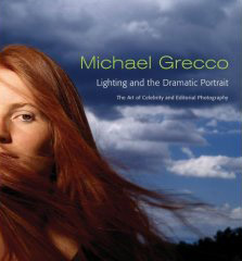

Thanks. No, Really...

Yeah, I know it's a great book. But do you have to sit there and torture me in my own message forum?

I already promised I would wait until Christmas.

Of course, I could always get one for the office...

Sunday, November 19, 2006

Bits and Pieces: Nov 20, 2006

• New Post-Processing Blog

For all you Photoshop noobs out there, UK newspaper photographer and Strobist reader Michelle Jones has started a blog on various post-processes. She has some QuickTime movies tutorials and such, too. Pretty neat.

As if that isn't enough, she has started a forum for off-camera flash folks, so check it out if you are so inclined.

(What the heck - what's one more website to check in the mornings...)

This is not a replacement for the Strobist Flickr Group discussion threads, mind you. Just something Michelle is starting up to help to spread the word.

It's a good thing. The more, the merrier.


• Mr. 3,000

Speaking of the Flickr group, someone will soon be the 3,000th member.

You'll know you are the lucky one if you sign up and blue flashing lights start going off in your house, confetti drops from your ceiling and scantily clad supermodels with lavish prizes immediately show up at your door.

If these things do not happen to you, most likely someone else was 3,000th. Please be gracious and wish them well.

I am Glam. Glam I am.

Arizona-based photographer Don Giannatti has produced a multimedia DVD entitled, "Lighting Essentials 1".

Basically, he shows you how to make the lighting version of stone soup out of a couple of Home Depot work lights, some translucent material and some foam core boards. He moves to speedlights and bigger strobes, but the reflective and diffusion techniques are pretty much universal.

If you are into shooting models' headshots, senior portraits or anything of that ilk - or aspire to be - this would get you well on your way to being able to make some very cool-looking people shots on an utterly draconian budget.

He's talking under $100.

You're using the foam core to turn the small hot lights (or a speedlight) into a huge bee-yu-tee-ful light source - the kind that spackles over the wrinkles and hides the zits before you even open the portrait in Photoshop.

The scope of the material is centered around that classic, soft, "glam" lighting.

You basement portrait shooters would do well to get some big sheets of foam core and learn how to use them. Yeah, they're big. But they are thin and you can store them under your bed. Foam core really can do neat stuff.

Don also shows you some good Photoshop techniques and gets into Photoshop actions, too.

As for the DVD itself, it's a browser-based maze of short movies, j-pegs and tutorials. There are also folders filled with extras such as fonts and Photoshop actions.

The movies gave my browser fits. But then my computer is so old you start it with a crank in the front. When I just opened the folders and dragged the movies into my Quicktime viewer, they worked fine.

The QT movies are a low-budget, camcorder-on-auto-exposure affair. Lighting-wise, they do not do the final stills justice.

But that's not the point. The main takeaways from the DVD are (a) that you can do some very Hollywood-looking stuff right out of the electrical aisle at Home Depot, and (b) that foam core, properly placed, can work lighting magic.

He gives seminars out in sunny (but beautifully fill-lit) Arizona, and these lessons are taken right from those seminars. For people looking to move into the glam lighting scene, the principles are sound to teach you to create that beautiful, wraparound lighting that can pay the bills.

Just be ready to bail on the browser interface and explore the movies manually if you need to.

:: Don's main site ::

:: Lighting Essentials 1 page ::

Friday, November 17, 2006

Strobist Goes Mobile

That's right, folks. You can now read Strobist on your iPod or Palm handheld, if you are so moved.

How, you might ask?

I would be happy to tell you. If I had any earthly idea how to do it, that is.

(Heck, my VCR still blinks "12:00.")

But fear not, because some readers on the Strobist Flickr group discussion threads have figured out the secret handshake.

Sorry to be such a luddite, but I never have gotten into the mp3 thing. I'm an XM kind of guy.

TGIF - POTW 11/17

It's Friday, and that means it's time for another reader Photo Of The Week.

This week's image is by Mark Lewin, who posts on Flickr as Markmyshots.

Mark used two lights, both on manual. He aimed one at the background and a second at the tomato. Because of the translucent quality of the water, it was the background light that set the tone (and the base exposure) for the photo.

Base exposure chosen, it was just a matter of adjusting the front light until the tomato glowed all red and purdy.

He rotated the photo 90 degrees counter clockwise, as tomatoes do not tend to fall sideways.

Nice shot, Mark.

Those liquid "light transmission" photos are greatly improved by a frontal light to bring up the opaque areas and reduce the contrast range so you get something other than a silhouette.

Using two lights - or one light in combination with a carefully selected ambient exposure - yields new levels of control over any image.

If you are not a member of the Flickr group, please join up and show us your best work.

You only learn this stuff by doing it.

Thursday, November 16, 2006

More Grecco: Martin Scorsese Time-Lapse


It is not often you pick up a watershed tip from a BTS vid, but this Michael Grecco time lapse of a Martin Scorsese shoot was just that for me. The tip is all about using a grid spot to selectively compress the tonal range of a subject. And in this case the black overcoat being worn by Scorsese does not stand a prayer of reproducing any texture -- until Grecco fixes it.

He underexposes the ambient and lights Scorsese from camera right with a warmed-up softbox. Nothing new there. But at camera left, there is a low-and-tight grid-spot flash that is there solely to bring up detail in Scorsese's black coat and give dimension to the crates at the bottom.

That's great attention to detail (no pun intended.) It brings the coat well into the reproduction range, and gives tone and texture where there would be none. The photo would look fine without it, frankly. But that's a good example of the nuanced thinking that separates the Greccos of the world from the other guys.

He inserts several finished still photos in at the appropriate times. Pause it and check out the coat to see what I am talking about.

Merry Christmas to Me

I cannot tell you how hard it was to not just click the "Buy it Now" button and snag Michael Grecco's new book, Lighting and the Dynamic Portrait, off of Amazon tonight.

I mean, less than $20? No brainer.

Why didn't I?

Because I am a dad. And dads need things on their Christmas list that fit within very modest budgets. Besides, knowing there is a good chance that Santa will leave this under my tree will make anticipating Christmas that much nicer.

(And if I do not get it for Christmas - so help me - I will have the thing ordered before the last piece of wrapping paper hits the ground. Next day shipping, too. A man's patience only stretches so far...)

Why am I this excited?

First, and no offense to many "how-to-shoot-portraits" authors out there, but it is rare to have a book written by someone who (a) is widely respected for being among the best in his field, and (b) knows how to communicate his thought process.

Michael Grecco is one of the most dynamic and versatile guys working in the portrait genre today - and has been for a while. Don't believe me? Check out his website. And don't miss his downloadable advertising and entertainment portrait portfolios.

If he is generous enough to dish up his considerable knowledge for nearly 200 pages under $30 (under $20 at Amazon) well, I am gonna be right there with a portrait of Andrew Jackson in my grubby little hands for him.

He did another book, but it is out of print and goes for over $100 in the used market.

Don't just take my word for it. Here's one of his Amazon reviewers:

"Don't read it cover-to-cover. Just flip though this book and stop at the first picture that grabs you. Grecco is that rare photographer who can actually put into words the creative process behind his images. He is smart, honest, funny, and frank about what it takes to make the beautiful, unique, and skillfully executed portraits that lavishly illustrate this book. There is a wealth of detailed, specific information about how the photographs were created (lighting diagrams, actual cameras, lenses, and lights used, etc.), however, most valuable is his emphasis on WHY he made his various creative and technical decisions.

This volume would be worthwhile for the pictures alone, or for the diagrams, the behind-the-scenes anecdotes, or just for the insights into the technical, practical, strategic, interpersonal, and financial components that contribute to the successful outcome of what is typically thought of as a simply artistic endeavor. Rather than regarding it as a book of recipes to be rigorously replicated, he suggests using it as a jumping-off point; as an opportunity to facilitate and fine-tune your own creative process."

And who is the reviewer?

Nobody special. Just, uh, Gregory Heisler, whose nose I am not worthy to pick. Who has more lighting knowledge in his pinky than I will ever have in my greying head. Who I really wish would follow through on his threat to do a book of his own.

(Go, right now, and check out Heisler's site, along with Grecco's. Go on. Do it now.)

I cannot wait to read Grecco's book. But I have to.

Thanks much to Strobist reader David Higginbotham for the heads-up.

Wednesday, November 15, 2006

Behold: A Light... With a Diffusion Panel.

Strobist reader X-Pose has posted a neat little tutorial showing how he made his DIY PVC light panels. Better yet, he shows how he uses them to light his Christmas card photo, too.

FYI, I am working on a pretty in-depth multimedia project for Strobist that will show many really cool things that can be done with these easy-to-make panels. They are a natural fit for speedlight users.

But you'll definitely want to check out what X-Pose has going on, too.

And while you are at it, a little thinking exercise:

How could he have done the whole thing - diffused light source and "cookied" trees - with just one flash?

Yak about it here.

Tuesday, November 14, 2006

Sometimes it's Not the Photo, it's the Process

On some photos, you take satisfaction not so much from the photo itself but from the process that got you to it. Such was the case a couple of weeks ago, when I was assigned to shoot an up-and-coming rap artist in Baltimore.

I arrive at his house a couple of minutes early for the assignment as he is finishing up the interview with the reporter. He tells me he is very tight for time, and offers to e-mail the paper a handout photo in lieu of the assigned photo.

Well, my editors are not exactly gonna like that, I think. So my first thought is to come up with an idea that I can pull off quickly.

To make matters worse, after talking for a few minutes with the guy I get the feeling he is just not really into being photographed on this particular day.

Alrighty, then. Time for Plan B.

At this point, you have to recognize a decaying situation for what it is and circle the wagons a little. You have to remind your subject how, with just a little time, you can work together to make something that looks cool and unique. I tell him I brought lights - I always have lights - and have a good idea for a photo in his home studio.

This much is true. I always try to preconceive a photo if for no other reason than to have a foundation on which to improvise.

Turns out he is not interested in having a shot done in the home studio. So I backpedal a little more and find out what he might be interested in doing.

Mind you, all of this is happening in real-time, over the span of about 30 seconds. I don't want to lose this guy. But I do not want to come back with a lame photo, either.

Parked outside the rapper's house is a conversion van on which he has painted with his logo and the logo of Virgin Records, who has recently signed him to a recording contract.

The van is not my first choice for a photo. Or my second or third, for that matter. But it is clear that it is somewhat of a point of pride for the guy. So I do not resist when he repeatedly steers the conversation to it as a possible backdrop.

(Hey, at least we are talking about actually shooting a photo at this point.)

So I tell him to go ahead and get ready to leave, and to meet me outside at his van in five minutes for about a two-minute shoot.

Now all I have to do is to come up with an idea (and a way to light it, and to set up the lights) in 5 minutes.

No prob.

First step is to put your lights, stands and syncs together in one fell swoop. While you are doing this, you assess the scene and try to visualize a finished photo.

The van is black, so I decide to go with a dark key for the photo. Luckily, it's cloudy, which gives me more light ratio options on the small flashes. Thank goodness for that, at least.

I quickly decide on something overly-lit and a little theatrical. I am going to shoot him leaning against the van and light him from two directions.

The strongest light - and the one that will determine the look of the photo - will be a direct backlight. I decide to use direct flash, (a Nikon SB-800) on full power, with a CTO gel for color separation.

So, I set that light up and pop a test shot at 1/250th (max sync speed) to see where me ambient ends up with the very small aperture (f/16, I think) that the full-power flash gave me.

Remember, the flash is aiming back at me, so I shield the light with my hand for the test shot. The ambient goes to darn-near black while the light rims my hand and lights the van at the same time. Great. I have all of the lighting control that I need.

Now to light the front of him.

With my working aperture at f/16, I bring another manual flash (a Nikon SB-24) in from upper camera right. This one is set to 1/4 power, which is what it took to light my hand to the correct exposure using the already established exposure of f/16 @ 1/250th. Again, a couple of test pop verified it. After a while, you get pretty close on the first try, then you fine-tune it with a shot or two.

I set the flash zoom setting on 105mm, to control the beam spread of the light. Now, by aiming the flash a little high, I can get a nice falloff on the bottom of the guy and seal off the photo a little with the darkened bottom.

Here's the setup:


And here he comes, right on cue, walkin' fast and lookin' late.

But I have him all ready to go. One quick test confirms that my exposure is on target. (If it wasn't, a quick adjust and another test shot, and I'd be in business.)

I then shoot about 20 frames, so I am covered if the guy really has to bolt. But I want to get a little more time out of him to try two or three variation.

Here's one of my favorite tricks for squeezing a little more time out of a subject.

Up until now, my demeanor has been one of efficient professionalism: Shoot quick. "Look this way." Got it, thank you. "Chin up a little." Thank you. Etc.

To try for the extra time, I stop and make a point of taking a look at the back of the camera.

Now, all of the sudden, I am "surprised" by how well this is turning out. (Not really - I knew exactly what I was gonna get. But he didn't.)

"Cool! Check this out - this looks great!" I tell him.

Of course, he'll wanna look. It's a photo of him. Yeah, it does look good, he agrees.

(I mean, how could it not, with such fine raw material to work with, right?)

And, in an instant, here's the deal as it now exists:

If he loves it, he'll almost certainly find a few more minutes to keep shooting. Why short-change the viewing public, after all?

If he hates it, he'll show you with his expression. Even if he lies and says it's okay. Just ask him what is bothering him, and introduce a variation to fix it with a few more minutes' shooting time.

He's not editing you - you already have what you were gonna get in the can. But you are bringing him into the portrait process in exchange for what is almost certainly going to yield more shooting time.

I have had five-minute corporate CEO shoots turn into 30-minute sessions this way.

They all want to look good.


In this case, I got a few extra minutes to play with different shutter speeds and try some flash-drag-camera-jerk stuff.

I preferred the original setup, and we went with that.

But the important point is that I went from "sorry, no photos today please," to multiple shooting setups, lit for effect and quickly produced - with variations on the visual theme as a bonus.

It's not enough to know how to light. You need to have a selection of techniques that you already know, and can go to quickly. And that includes setup time.

But beyond that, you need to cultivate the interpersonal skills to bring someone along (while you quietly panic on the inside) and work to make something out of nothing.

Always remember that for most people, the thought of being photographed - especially for publication - is a bit of a head rush. Sometimes you have to use that, and appeal to the person's ego, to overcome the natural shyness and self-consciousness that we all have to some degree.

And if you can do it quickly and smoothly, that's just bonus points for you.

Next: Zebra Fish and Zygotes

Updater on the Canon Flash Mods

Michael Bass has set up a website describing, among other things, his Canon flash sync sub-mini jack mods.

They have been well-received by Strobist readers, and will (hopefully) prompt Canon to include a PC sync on future flash models.

Anyway, he is no longer confined to eBay. Check out his page if you get a chance.

Monday, November 13, 2006

Apparently, The Books are Way Better

First of all, thanks much to those of you who were actually taking up a collection to fund a sub to Commercial Photo magazine for yours truly. That kind of thoughtfulness is much appreciated, but not necessary. Yeah, it looks great. But $300 is a lotta ball bungees. if you know what I mean.

I am actually looking for a Strobist reader budget-friendly alternative, and it looks as if someone may have found it.

Got some info from Strobist reader Jon, and I am passing it along in what I promise will be the last post about Commercial Photo.

(At least for a while.)
"... Commercial Photo is a great magazine, but I don't think the pages on lighting setups you may have seen are representative of the magazine as a whole, and this might have a bearing on whether you wish to spend $300 on a subscription.

Unless the magazine has changed since I left Japan a year ago, only a very small section is dedicated to a detailed breakdown of a photo shoot. The overwhelming majority of the magazine will be unintelligible to anyone who can't read Japanese, although it usually has some decent photos to peruse (although there are much better magazines for that purpose such as 'Phat Photo' and 'Dejitaru Shashin Seikatsu"). In short, a $300 subscription may not be the best value for money.

What might be, is the Commercial Photo Series set of books published by the same company. These books are about 150 pages long, cost 2,340 yen (c.£10/$20) each, and 90% of that is strictly photos and lighting diagrams. I've included some links to photos from their fashion photography edition. ..."

Check Jon's Flickr stream for some page grabs. Apparently the books are pretty much non-stop pix and lighting diagrams. I have done some looking, but have not found a source for the books in English/$US.

Any ideas? Post 'em in the comments section.

And click on the pic for a selection of the books at an auto-translated page.

OT: I Want One.

Not gonna get one. But boy, are they cool.

I'm talking about the Segway HT, which I got to play with for four hours yesterday on a tour of Washington, D.C.

Yeah, $4,000.00 is a chunk of change. But for $70, we got to have a lot of fun. And I think I have gotten the Segway jonesin' out of my system. Maybe.

They have branches in six other cities. Highly recommended as a gift for a loved one. Or for yourself.

Saturday, November 11, 2006

Bit and Pieces, 11/12/2006

• Inside Commercial Photo

If you want to peek inside the pages of the $300-per-year Commercial Photo magazine, there are three pages up on Flickr. In addition to the picture at left, you can click here or here to see a couple of other setups.

I am seriously thinking about subscribing. Life's too short, not to take an occasional flyer, ya know?


• Why Can't I Have This Much Free Time

Our own Christopher the Photographer channels a little late-night Duane Michaels with his 4am 1-8 series. Follow the link to see it as a slideshow on Flickr.

I would like to congratulate Christopher on making it all the way through eight whole photos without the inclusion of a single beautiful woman. I'm pretty sure that's a first for him.


• eBay Remotes: The Magnum Opus Review

Strobist Flickr group member Gisle Hannemyr has posted the "eBay remotes" review to end all reviews. If you are considering buying them, you'll want to read it.

(Thanks for that info, Gisle!)

• Out of Town Sunday and Monday

Me and The Missus are hitting the road for an anniversary weekend getaway - without the curtain climbers. Got a great deal on Priceline for Sunday night at the Westin Embassy Row in Washington DC, and we are touring Capitol Hill on Segways (woo hoo!) for four hours on Sunday.

The laptop - or as The Missus refers to it, "The Mistress" - is not invited. So I will neither be answering e-mails nor moderating comments for the next two days.

If you post anything, it will pop up late Monday afternoon.

Low-End Theory: One-Gallon Modifier

Flickrite Muzzlehatch has constructed a diffusing reflector (or is that a reflecting diffuser?) from a winshield washer fluid bottle for his macro work. A complete how-to photo set is here. It looks to me like this would work well off-camera, perhaps at the end of a monopod.
By Mike H.

Friday, November 10, 2006

TGIF -POTW!

OK. First of all, sadly TGIF does not mean jack to me, as I work on Saturdays.

But in the fall, Saturday means college football, and I will be shooting the Maryland vs Miami game. So I am not complaining. At least until 2nd quarter, when the daylight goes away.

But Friday also means reader photo spotlight on Strobist, and today's Picture of the Week was shot on assignment by Patrick Smith, who is a student photographer for Towson University's paper, The Towerlight.

Take a look at Patrick's photos (scroll past the election pix) and tell me if you would not be happy to be getting sports features like this from your PJ student photographer if you were the Towerlight's editor.

Why, yes. You would be happy.

Patrick is cranking some serious sports portraits for a college puke. He is way ahead of much of his student competition, for whom lighting means only studios, big flashes and lots of unanswered questions.

If I could impress just one thing on all of you college PJ students out there, it would be to distance yourself from the rest of the young herd by learning this stuff ASAP. You have so many years to just get better and better at it.

And as for the overall quality and quantity of the pool photos this week: Wow.

This is what I'm talkin' about.

You guys rock.

Thursday, November 9, 2006

More on Commercial Photo Magazine

Thanks to Alert Reader EssPea, who posted a link in the comments section for Google's on-the-fly translation of the Commercial Photo website, we can all read the nuances of Far Eastern lighting in plain old English.

Sort of.

The bots are decent, but they won't win this year's Booker Prize. Here's a typical line of English generated by the translator:
"... Recently, the occasion where the work is photographed, three keywords, “sizzle” “eros” “grotesque” float in the head. The person seeks [eroteishizumu], scratches the desire to tastiness in the sizzle impression and is built. And the desire, although being grotesque, is fascinate. ..."

I dunno about you, but I've always wanted to scratch the desire to tastiness in the sizzle impression.

So, if you'd like to "scratch your own desire to tastiness," by all means, scratch away.

Wednesday, November 8, 2006

Pssst. Wanna Buy a Used SB?

Lord knows where he finds this stuff, but MPEX has come across a big pile of used Nikon SB speedlights. Did I tell you this guy knows what we like, or what?

I counted 18 as of Wednesday night. If you are looking for one, they range from $65 for SB-24's to $169 for the SB-28's as of this writing. To get to them, just click through to the Strobist section and scroll down.

(Oh, and if you happen to be burdened by too many Nikon SB's hanging around, they'll be glad to make you an offer. Heh, heh.)

A Japanese Strobist Magazine?

Alert Reader "Bjorke" writes the following in the comments section of DIY Lighting Diagrams:
Have you ever seen the Japanese magazine COMMERCIAL PHOTO from Genkosha? Every issue covers the local advertising scene along with TV commercials and had detailed coverage of ad and other lighting setups, complete with such drawings (and snaps of the set).

I admit it's hard to get here in the states, I always pick up a copy whenever I'm over there. Sometimes Kinokuniya and other J-vendors have it in the U.S.

Well folks, you know I had to check this one out.

I mean, a magazine about lighting setups? That pushes the definition of niche almost to the point of fetish. Honestly, who in the world would devote an entire publication to droning on and on about lighti...

Oh, yeah. Right. Sorry.

So I looked into it.

Sure enough, there it is on Amazon. Only $300 a year. Amazon says they are printing it in dual Japanese/English, but others say only Japanese. Wish I knew for sure. That'd be a bummer if the only mag in the world that featured lighting setups was only in Japanese.

Not ready to spend $300 on a foreign lighting mag, you skinflint? Well, you can check out the website, gratis, here.

Or, the Google translator bot will serve the whole thing up for you in stunted english. But where's the challenge in that?

If any of you guys are familiar with this publication, I would love to hear more about it.

Should I spring for the $300?

Tuesday, November 7, 2006

News: Midwest Photo Exchange to Partner With Strobist.com

Strobist.com is very pleased to announce a brand new partnership with Midwest Photo Exchange (MPEX), the Columbus, Ohio photo retailer.

What does this mean for you guys? Lots, actually.

First of all, MPEX has come through for us again and again when other retailers were not able to stock items such as the double-fold umbrellas and compact, 5-section stands. Why? Because MPEX is big enough to make it happen and small enough to care about a rag-tag, far-flung group of small-flash enthusiasts like us.

When everyone else was out of stock, Moishe Appelbaum, (who runs MPEX - that's him above) was able to work magic worthy of Max Klinger from M.A.S.H. to keep the hard-to-find goodies in stock.

In the last few months, he has been quietly scouring the globe to find the cool little pieces of gear that let us do things for a fraction of the price (and weight) of the Big Studio Light donkeys out there. Moishe has made it his business to learn about the gear we need and collect it under one roof.

MPEX's website may not have the sophistication of the big New York shops, but he offers what they can't - personal service and a commitment to building long-term, personal relationships with photographers. Clicking on the MPEX ads will automatically land you onto an MPEX search that shows several pages of Strobist-related gear.

Wanna know how to make your flash adapt to take a PC cord? email 'em and ask. (Be sure to add their e-mail address to your address book, so their answer will not be diverted to your spam folder.)

As for pricing, Moishe works very hard to match the largest NYC photo houses, but with a couple of bonuses. First, the service is more akin to your neighborhood photo hangout. And second, MPEX is very reasonable on shipping - especially to the international folks when compared to the NYC international shipping rates.

I have listened hard to the international readers who are not able to find many of the items that we frequently discuss on the site, and so has MPEX. The further you live from the center of the photo universe, the more you are gonna appreciate these guys.

A few months ago I had a wonderful phone conversation with an AP shooter from Columbus that gave me a full description of Midwest Photo Exchange's Columbus store. It's exactly the kind of place I spent countless hours hanging out in when I was a greenhorn. It smells like a photo store. It has bargain bins. It has wooden floors worn by the countless shufflings photographers' feet over the years.

Says the local shooter:
It's the kind of place where you walk in and they know your name. You ask for something and they say, "You know where that is - get a ladder and grab it off the shelf."

These guys know photo. Their mission is to build strong, lifelong relationships with photogs while they are sill in school.

Which is exactly what they want to do with us.

No, there's not a ton of money to be made with $20 double-fold umbrellas. But many of you guys are getting to be good shooters. Really good, actually. There are many current and future pro's among you, and MPEX would love a chance to earn your business. And, besides, not everyone lives within shouting distance of a great, person-to-person photo store.

Well, now you do.

These guys are straight shooters. They are fair. They are reasonable, And we matter to them. More than we matter to anyone else, I dare say.

If you value the information you get from the site, all I ask is that you give them the opportunity to earn your business.

You support them, they support me and I support you. Simple as that.

You get a great photo resource and they keep Strobist free for every serial flasher on the planet.

Questions? Comments? Rants?

Read what others are saying and/or talk about it here.


Main Site: Midwest Photo Exchange
Strobist at MPEX: Click Here
Via E-mail: E-mail MPEX
Phone: (614) 261-1264

Monday, November 6, 2006

For U.S. Readers: Free Coroplast Grids!

It's Election Day, when the whole world gets a look inside the sausage factory that is the United States democratic process. If you are reading this from somewhere the USA, please remember to vote.

But more important, don't forget to help clean up any coroplast campaign signs that are still standing in your area tomorrow.

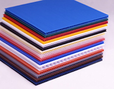
They are nothing but landfill fodder after the polls close, and they make great DIY gridspot raw material. Black is best (no internal reflections) but white is doable, too. Avoid colors - they give you a color cast.

In fact, Strobist reader Leann has a neat little tutorial for making coroplast gridspots that make my little cardboard jobbies look like crap.

The advantage to my version was that they were free. But it's practically raining free coroplast tomorrow morning, and you certainly don't wanna miss out on that.

Multimedia Monday

When catching up on my October archiving, I decided to add two new categories in which to place future articles - business and multimedia.

The former has grown in interest on the site because of the transitional-pro nature of many of the readers. And the latter is an exploding genre of photojournalism that is just going to keep getting bigger.

Neither will detract from the main mandate of Strobist, which is to teach lighting. But if you are serious about the craft and/or profession, you want to be up on these areas.

This is a very exciting time. We are jumping in whole hog at The Sun, learning all we can and trying to get ahead of the curve. We have a projects board up in photo with a list that would choke a horse, and it seems like everybody has something going on.

I have just finished shooting a 3,000-frame, time-lapse project on fall which should be up within a week.

One of my Fellow Sun shooters, Monica Lopossay, just did a neat piece on a regular, drop-in bluegrass jam session in a small town in Maryland. Check it out if you get a chance.

The big news this week was the "auctioning off" of a multimedia piece by Mediastorm. The piece is a stunning example of new-media photojournalism by Ed Kashi on Iraqi Kurdistan. I cannot wait to see the final product.

Just as important is the way in which it came to market. Mediastorm auctioned it directly to the market, with MSNBC.com winning the bidding.

The important takeaways here are (a) this is an exploding new medium for visual storytelling, and (b) how the digital nature of the entire process allows forward thinking shooters and agencies to retain control from conception to sale.

It's heady stuff.

I will do a separate post on Iraqi Kurdistan when it debuts. It will be a watershed moment for photojournalism in several ways. You'll wanna be there to see it.

Saturday, November 4, 2006

The Hot List, Oct 2006

Before we get to the October Hot List, I have to say that I like Pieter's match photo so much I am just looking for excuses to stick it up.

Pieter, if you have a problem with this becoming the Hot List icon, please let me know in the comments and I will swap it out for something else.

In what will be no surprise for regular readers, Harrington's biz book was numero uno with a bullet. As far as I am concerned, he should just give the thing away for free and charge you budding pro's one percent of your increased incomes. The book is gold.

Someone is apparently still shooting naughty pix in the garage, and PDN makes an appearance this month. But other than that, the usual suspects shuffled around but remained largely unchanged.

That said, on to what Strobist readers (via Amazon) are reading:


The October Hot List:

1. Best Business Practices for Photographers

2. Secrets of Lighting on Location: A Photographer's Guide to Professional Lighting Techniques

3. Matters of Light & Depth

4. Art of RAW Conversion: How to Produce Art-Quality Photos with Adobe Photoshop CS2 and Leading RAW Converters

5. Light - Science and Magic, Second Edition: An Introduction to Photographic Lighting

6. Master Lighting Guide for Portrait Photographers

7. Photo District News

8. Photojournalism, Fifth Edition: The Professionals' Approach

9. Garage Glamour: Digital Nude and Beauty Photography Made Simple

10. The DAM Book

Exposure with a Grey Card

Chad Miller says, "your camera is stupid" in this Flickr Technique thread because it wants your image to be middle grey, like the square pictured here. Your camera can't know whether you're aiming it at snow or cinders, so it splits the difference.

Steve Traudt has The Fifty-Cent Solution for Apogee Photo Magazine.

David uses the back of his hand in a very similar way in this installment of On Assignment.

By Mike H.

Friday, November 3, 2006

TGIF! Time for the Reader POTW

It's Friday, which means that (a) I push the boundries of what is considered "casual dress" at work, and (b) time for a Reader Photo of the Week.

This week's image is by Strobist reader X-Pose, who has really sprouted antlers since getting his Dean Collins DVD's. The guy is kicking butt, IMO.

Truth be told, this not even is my favorite photo of his that he put up this week. But being the corporate, extra-work-safe grunt that I am, I hesitated to put this even better one (a tad work-uncomfy, depending on your environment) up on the blog's front page.

X-Pose is doing these tres elegant photos with just one, small Canon speedlight, shot through a large, homemade diffuser which is placed just outside of the frame. He used the technique for both photos and many of the other pix in his Flickr stream.

This is a classic Collins technique which brings all kinds of soft-light-smooth-falloff goodness to your pix.

Keep those photos coming. You guys rock.

Thursday, November 2, 2006

On Assignment: Shade is Your Friend

One of the first things to consider when balancing strobe and ambient light is whether or not you can knock the ambient down a bit, to give you more options with your small-flash lighting ratios.

And for my money, nothing does that quicker and easier than the shady side of a building.

If I am doing a strobed outdoor portrait (as in the above photo of two prep football standouts) I will typically use a building as a "sun gobo" whether I include it in the photo or not.

Even if I am including a bright sky in the background, I'll use the shade of a building to drop my subject to near black when underexposing a stop for the sunny sky. You get more lighting control this way.

If I am starting in full sun as my ambient, there are only a couple of stops of wiggle room before I get to my tightest aperture and max synch speed. No matter how powerful your flash is, that's the end of the light balancing line for you.

You can cheat it a couple of stops with an ND filter, but that is another story (and the subject of an upcoming post.)

But the fact that the shaded area was 2-3 stops darker than the area in full sun allowed me to drop the ambient down some for a more dramatic effect in this photo. When you realize that this photo was taken in the middle of the afternoon of a sunny day, you start to see the lighting ratio advantages that shade can give you.

I had my flashes set on half power, and placed them as seen below.

(FYI, the front/left strobe was on the 85mm beam setting, allowing me to let the light fall off below the guys' faces.)

For you home-gamers, the thought process is as follows.

1) Set the camera on max synch speed.
2) Cross light the two guys, with the flashes on manual at half power (full power if placed further back.)
3) Fire some quick test shots while adjusting the aperture until the lit subjects are properly exposed in your cool little cheater screen on the camera back.
4) Your ambient-lit areas will be very dark. While keeping the chosen aperture constant (to make the strobe happy) open your shutter speed up until the lighting ratio looks as smooth (or dramatic) as you'd like.

With a little practice, this is a very fast process, and does not require a strobe meter.

And with the money you save on the flash meter, you can get another light...

Next: Sometimes it's Not the Photo, it's the Process

Jack O' Lantern Winner

Congrats to bmp_digital for winning the quickie pumpkin assignment.

He actually balanced four light sources - two flashes, one streetlight and a candle to get this positively Halmarkey-looking Halloween photo.

Sez bmp:
"Shot in my driveway, ambient streetlight illuminates orange leaves, upper right, Sunpak 522/blue gel lights rest of background. A Canon 550 w/diffusion and orange gel lights pumpkin left, Canon 580 w/diffusion lights pumpkin right, Pocket Wizards throughout.

Canon 5D, ISO 1000, 1 second @ f5.6. The main problem I had was the candle (1 tealight!) was too bright @ 1 second, so diffusion was added to the pumpkin interior to bring exposure down. "

There was some cool stuff - I really liked the one with the transparent cat - and thanks for all who contributed photos.

I'd also like to give a shout-out to this particular pumpkin, which was impeccably carved and transcended the genre to the point of being fine art.

The subject matter choice was truly stunning, and will no doubt be imitated all over the world next Halloween.

How cruel that the ravages of time (and some hungry bugs, most likely) will shortly claim your masterpiece.

BMP - If you could Flickrmail me your mailing address, I'll get your book out to you!

Share

Twitter Delicious Facebook Digg Stumbleupon Favorites More