Wednesday, January 31, 2007

On Assignment: Lighting a Large Interior

One of the knocks on using speedlights is that they are not very powerful. In twenty years as a photojournalist, I have found that they are more than powerful enough for the vast majority of my assignments. You simply approach your lighting technique in a way that compliments your strobe's abilities.

A good case in point was yesterday. I was assigned to do a biz profile on a place called Earth Treks, which is climbing gym in Columbia, MD. It's a cool environment in which to shoot, but it is huge. The walls are over four stories high.

To complicate matters, it was one of those assignments that was due "immediately."

Don't get me started on that last one. (What, the building wasn't there the day before?) This is the kind of stuff that is counterproductive to the overall quality level of the paper.

My first defense against this kind of artificial scheduling constraint is to arrive early. The assignment was for 12:15pm, which is more specific-sounding than 12:00pm, and led me to believe they might be tight on time just like me.

So I get there at about 12:05pm and scope the place, throw a couple flashes onto stands, find out who I am going to be shooting, etc. I also grabbed some quick, available light photos as the climbers were suiting up with safety gear for use as a jump shot, if needed. This photo would also make a good secondary photo out front.

Here is the available light wide shot I made as soon as I got there. Nothing wrong with this - in fact, I think it is kinda cool. Problem is, I have seen this look in almost every shot made at Earth Treks - including my previous assignment there. So I wanted something with a new feel.

(As always, click on the pic for a bigger view.)

My first step was to stick a couple of SB-26's into the back of the room. I hid one on a stand behind each of the two back/side outcroppings (at ground level, pointing up.) They are both on manual, triggered by Pocket Wizards, set on 1/2 power and zoomed to a 35mm beam spread.

The sodium vapes lighting the room were reasonably close to fluorescent, so I greened the flashes and set the camera's light balance to fluorescent.

These two splashes of light gives me the ability to draw the viewer's eye to where the climber will be, while balancing out the composition to get the full effect of the cavernous room.

More importantly, it also gives me total control of the contrast range of the room.

The above photo is shot at a 250th of a sec, (all are at f/2.8) and gives a strong contrast to the lit and unlit portions of the scene.

Let me back up a little: I always start at max synch speed, as it gives me a better idea of what the added light is doing.

If the ambient part of the room was still too bright at my max sync speed, I would have upped the flashes to full power to let me close the aperture and darken the unlit portions of the room a bit. As it happened, half power on the flashes was plenty. (For reference, the room's ambient exposure would have been about 1/30th at f/2.8 at ASA 500.)

This photo, shot at 1/60th (with no other changes) shows how I have control over the contrast range of the scene simply by varying the shutter to let in more (or less) ambient light.

In the end, I went with higher contrast, using the faster shutter speed.

The climber was using a spotter (uh, "belay slave" - thanks, Jason) for safety, and I wanted to highlight that, too. So I put in a third SB-26 directly behind her at 1/4 power and on an 85mm beam spread. Since she is hiding the light, it rims her completely and creates a leading-line shadow that draws your eye into her.

The final photo, seen at the top of this post, was shot about 30 minutes after arriving. (Click here to see it at 1024 resolution.)

This photo is not necessarily a show-stopper. But as a quickly lit shot working on a tight time constraint, it works fine for me. Assuming you are reasonably fast at the lighting stuff (practice, practice) the time spent setting up and tearing down lights is almost always returned by lessened toning time at the computer later.

And the results are much better than you can get trying to save a bad image in Photoshop.

From there, I shot the other climber on the wall with a straight-on view. The lighting was very simple - I grabbed one of the SB-26's and set it on a second-floor balcony. I aimed it from a hard, camera-right angle with a snoot to seal the bottom of the frame.

Tearing down is always faster than setting up, and I was out of there in about 30 minutes total. An hour later (over a mouth-watering birthday lunch at Chipotle) the photos were transmitted to the paper.

Could I have gone faster on the back end? Sure. Five minutes door to door, if need be.

But I am not going to pull out all of the stops - or worse, compromise quality - to save a poorly planned "rush" biz profile assignment that should not have been a rush assignment. There's such a thing as enabling.

Lord knows, we have to do enough (legitimate) ultra-fast turns as it is. That's part of the job. But as the saying goes, a lack of planning on your part does not constitute an emergency on my part.

Besides, that delicious burrito carnitas was calling my name with more urgency than page design was.

Next: Found Backdrops, Pt. 1

Introduce your Product, Service or Website to 250,000 Photographers

Why just read Strobist when you can be part of it?

Now you can introduce your company to self-motivated digital photographers all around the word in a single, low-cost step. Strobist is particularly interested in partnerships with quality companies who seek to build long-term, nonpredatory relationships with enthusiastic, growing photographers. Because that's what we do, too.


Consider the stats:

Over the course of a month, Strobist averages 1.5-2 million page views from over 250,000 different photographers from all over the world. (I know. Kinda freaks me out, too.)


Where we come from:

USA: 56.94%
Canada: 8.44%
UK: 7.38%
Australia: 3.33%
Germany: 3.09%
Netherlands: 1.47%
Sweden: 1.26%
Finland: 1.22%
Italy: 1.01%
Spain: 0.90%
155 other countries: 14.96%

(Source: Google Analytics)


Who We Are:

Lighting Geeks: 99.999%
Normal People: 00.001%

___________________________________


General Info

Banner ads are priced per 1,000 impressions on the site (also known as "CPM"). Strobist offers only CPM pricing: No networks, text links, pay for reviews, remnant inventory resellers or CPC/CPA programs. Please do not contact us if you represent an ad network, third party reseller or need a text link/performance based ad. No offense meant.


Main Site Display Ads

PLEASE NOTE: There is currently no main site display ad inventory available. That said, if you would like to get on a waiting list, please leave a comment as detailed below.


Prices for image-linked banner ads on the main site (when available) are:

• 728p X 90p leaderboard: $8.20/CPM
• 200p X 100p sidebar: $3.40/CPM
• 728p X 90p bottom of page: $2.15/CPM

(*Example: At $3.40/CPM (i.e., per 1,000 page views) the cost to get your ad displayed 1,500,000 times would be $5,100.00.)

Ad position within these categories is based on seniority.

Acceptable formats are jpegs, standard .gifs and (within reason) animated gifs. You may host the file, or we will do it for you. (Our preference is for the former if you have the capability, as it allows you swap out ad content at will.) All ads must be appropriate to the niche of the site are subject to prior approval. Payment is accepted via check or PayPal. Minimum time commitment is one month.
__________


Still have questions? Please leave a comment (with contact info) describing your business and proposal below. Your comment and contact info will not be published.

Please note: If you do not leave a contact email address, I cannot get back to you! (D'oh!)

Monday, January 29, 2007

Speedlinks, 1/30/2007

• Canon users, get ready to crack open those wallets. There is apparently a new flagship just around the corner. (Via T-O-P.)

• Old, but interesting: A detailed look into Joe "22-speedlight" McNally's photography for a story on flight. (Via Rob Galbraith, with thanks to reader Hugo V.)

And lastly: On this day, 42 years ago, I was born. So I am taking the day off from blogging and only working at The Sun all day. (Via my mom.)

The Lazy Man's Snoot

Well, heck. It can't get much easier than this.

Strobist reader Mattie Davitt commented on the Snoots and Gobos page that a box of spaghetti makes a perfectly sized snoot for the small-head Nikon SB's such as the SB-800, -28, etc.

This is kinda cool, because you can just keep a couple of these boxes in your lighting bag and let the need of a given subject drive how tight you want to make the beam of light. Just cut (or even tear) it to your desired length and slip it on.

(Thanks, Mattie.)

_____________________________________________

UPDATE: No sooner than I had typed this up, I checked the morning rounds and saw that there was yet another kitchen-Strobist tip from yet another Matt. So here it is:

Seattle photog/hacker Matt W. has converted a cheap, retractable "Swiffer pole" into a strobe-on-a-rope monopod substitute.

(Thanks, Matt.)

Yes, folks, we at the Strobist International Headquarters go to the Matt for you when it comes to scouring the web for cheapo lighting ideas. Got any kitchen flash gear tips of your own? Stick 'em in comments section!

-30-

Saturday, January 27, 2007

The Joke's On You

Moishe, who started this joke thread a while back, is reviving it with a little twist.

He has suggested a little competition of sorts. What with our shared techniques, penchant for frugality, obsession with lighting, etc., there must be some humor in there somewhere.

So, put on your propeller beanies (or rubber chickens) and come up with the best Strobist-related joke that you can. It can begin (as in the joke thread) with, "Two strobists walk into a bar..." or, "How many strobists does it take to change a light bulb," or whatever.

Enter as often as you like. Funny is good, but "original and funny" is better. Inside jokes are welcome, and everything previously posted in the thread is already entered for consideration. Moishe and his crack staff of employee/comedians will judge them in a couple of weeks.

First and second place each gets a Westcott Double-Fold umbrella, shipped anywhere on the planet.

Just drop your entries here.

Luckily for all of you, I am not eligible. Heh, heh.

NOTE: Please place your entry in the Flickr thread, as opposed to the comments section!

Friday, January 26, 2007

POTW 1/26/07; And a Neat Technique

It's Friday, which means I'd better charge up all of my AA NiMH's for a triple dose of hoops tomorrow. Got McDaniel College - way NW of Baltimore - at 3:00p and then I have to be at American University in Washington, DC for two more basketball games, starting at 7:00p.

Yikes. And The Sun does not reimburse speeding tickets, either.

But Friday's also mean POTWs around here. And this week there is a little bonus, too.

Leading off is Melissa's wonderfully simple shot of a young girl draped in a scarf.

The photo clearly has that "less-is-more" thing going on. The expression is great, too.

Oh, and it was apparently Melissa's first time using small strobes off camera, too. Guess she did okay, huh?

Question is, what'll she do next?

Next is a cool shot with the gridded strobe shooting on the right through the drink by a guy who must really like bacon.

Can't argue with a name like "Baconisgood," and I cannot find much to argue with about that shot, either.

Neat idea. And I'm not completely sure, but I think that is Bacon himself in the photo.

Last but not least Dan Quan's highly stylized portrait, which mixes tungsten-balance ambient daylight with gelled flash.

He's been working this setting for a little while now, and seems to have it down. There's some post work done in Photoshop (a little color enhancement, and a branch-ectomy) but he is working that tungsten-flash-blue daylight thing pretty well. I'd suggest overwarming the flash on her face - perhaps an additional 1/2 CTO - to get it closer to the final result in camera.


Techneek of the Wique

Okay, I just love this photo by James Hamilton.

Not even so much for the image itself (heck, there's extra strobe gear in the photo just sitting around on the piano stool) but for the possibilities the technique opens up.

Click through on the photo to see James' description, and there is even a setup shot here. I am thinking of doing this with both lights on the same axis, as a cool (literally) portrait technique in a boring room.

I get lots of boring rooms. Lots.

On a neat housekeeping note, we passed 5,000 Flickr group members yesterday. Cool beans.

But amazingly enough, that's only about 5% of the number of the different photogs who cruise through here in a typical month.

So, I guess you 5,000+ would be, like, "cadré," or something. And no, I am not buying a round for everyone, either.

Thursday, January 25, 2007

Whoa. Avoid "Broadway Photo," Folks...

Apparently, they screwed over the wrong customer this time. Now Consumerist.com has gone and unloaded a big ol' can of documentary whupass on those guys.

Priceless.

Kinda makes you appreciate MPEX, huh?

Speedlinks, 1/25/2007

Lotsa interesting stuff dropping from the ether these days. Do you have what it takes (i.e. free time) to see them all? Make sure to look like you're working if the boss walks by...

• John Harrington flipped me a neat little tutorial on shooting smoke.

• Speaking of John, check out his walk-through (uh, make that run-through) of a three-minute, two location assignment on Capitol Hill. (Of course, he lit both locations, too...)

• Young Icelander Thorsteinn C. did a 100-self-portraits-in-100-days thing. The guy sure can shoot for a greenhorn. Very diverse, creative set which uses light well, too. Check his stuff out.

• If you hurry, you can be one of the first 5,000 (current tally: 4974) people to sign up for the Strobist Flickr group. (Think how much it'll impress the grandkids later...)

• Something I had totally forgotten about: Dean Collins and his crew did a book called Photographic Global Notes in the '90's (early digital era) that you can still find used at Amazon. No idea where my copy is after all these years. But it has lotsa good stuff from several top-notch photographers.

The whole book is just cool photos and how they were lit. Diagrams, how-to's - the whole lot. Amazon only has 11 used copies, so I wouldn't dilly-dally if you wanna snag one. It's quite good, too. (Thanks, Mark!)

• And the last one is a goodie: Speaking of Dean Collins, you can now rent his "Best of Finelight" DVDs at SmartFlix.com. Not cheap, but then, neither are the DVDs to buy. Following the link to do it will benefit Strobist.com, too. (Muchas gracias.)

Don't know about the Collins DVDs? It's basically 6-hours of eye-opening fantasticness. Read the review here.

Note: If you are gonna rent them just one at a time, be sure to start with the fourth disc - Collins on Basics. You should watch that one first.

FYI, they have 11 copies, and 5 more on order. So you may have to wait in line a few days.

(Thanks, Victor!)

Wednesday, January 24, 2007

On Assignment: Book Club

Okay, the polls are closed and the votes are in. It was fun to watch you guys try to reverse engineer a photo which was lit in a very not-very-obvious way.

Several of you got it pretty close. And if you didn't, no worries. First, this was not an easy photo to reverse. And second, the final look was a little nebulous and could probably have been achieved through any one of several different techniques.

This photo was very much a figure-it-out-as-you-go kind of process. We played with the setup until we got a look that we liked.

I say "we" because this photo was very much a collaborative effort between the designer and myself. She was the one who came up with the concept of shooting origami chairs on a book, and it was my job to light and execute her idea.

This is the best of all worlds, IMO, as she brought a good concept to the table with enough flexibility still left in the process to further improve the result.

So, here's what we did. Click on any photo to see it bigger and/or comment.

I decided my goal for the lighting was to connote a winter's night with a semicircle of readers near a fireplace. So, the first step was to position the pieces and set up the backlight, which would provide the mood.

In the photo above, the only light for the scene is an SB-26 into an umbrella behind the book. This gives a soft, three-dimensional feel to the scene.

Next, I gelled the light with a moderately blue gel (1/2 CTB) for mood. This was less blue than I needed, so I also set the camera's white balance to tungsten to enhance the blue color.

Normally, I prefer more subtlety. But newspapers are not known for their prowess in reproducing a saturated blue. So sometimes you have to hit that color over the head with a hammer.

Next, the Zip-lock baggie. We placed that over the lens, as a couple of you guessed. Easy diffusion.

We actually doubled it up for more softness, but the combination of the soft (umbrella'd) light and the baggie made it too diffuse for my liking.

To solve this, I swapped the backlight to a bare flash to make it harder.

I felt that this would give me a better looking diffusion edge when I shot it through the baggie.

Playing with the location of the hard backlight (so as not to cover the crest in shadow) and various levels of baggie diffusion gave me this result, which I liked.

Now, it was time to create the frontal light.

I did this by light painting over a 30-second exposure. My continuous light was an SB-800 flash, using the modeling light button to create daylight-balanced continuous light in 1-second bursts.

You could easily use a flashlight for this, too. In fact, I think a flashlight might have worked better.

Since I was shooting at tungsten balance, the light would be blue. To make it neutral, I gelled it with a CTO. To warm it up past neutral, I stuck on a second CTO. You can stack them this way for more effect.

The snoot on the front was quickly made with Rosco Cinefoil, which is basically black aluminum foil. This gave me a light beam about two inches wide at a distance of two feet.

Here's the setup. The shot was done in almost total darkness. You can see the background flash in the back at upper left. The big black gobo is to block as much of remaining shaded window light as possible.

The card in the front of the camera is to gobo the background flash to control flare.

To complete the shot the following sequence was used:


1. Lights out.

2. Place baggie in front of lens. (It helped having a second set of hands here.)

3. Fire the blue flash with the start of the 30-sec exposure.

4. Immediately remove the baggie.

5. "Light paint" (using the double-CTO'd, snooted SB-800 flash on modeling light function) on the sides of the chairs facing the camera and the top front edges of the book.

6. Repeat over and over until you get one that you like.


Here is an alternate choice to the original pick. I actually liked this one better in RGB form, but the more saturated photo looked similar to this in tone by the time our presses got done with it.

Also, we nixed this shot because the shadow fell on the crest, which was distracting.

You can see why this photo is so hard to reverse engineer. The back light is hard, yet diffused - and blue. The front light is sharp, very warm and coming from multiple areas at once. I like this overall effect because it has three simultaneous forms of lighting tension: Front/back, hard/soft and cool/warm.

If you are not thinking "light painting" the front light is almost impossible to solve. It is low-angled, yet the front chair does not shadow the back chair. It seemingly has to come from the left and and right, because that is what it does at various times in the painting process.

Look around the chairs closely in a big version of the final choice and you can see some neat things happening in there along the edges where the soft and hard light overlap.

Also, I love that the designer folded the chairs in a way as to be able to read snippets of titles on the vertical sections and neat little sentence fragments on the leading edges of some of the chairs. Those details make the photo.

I really enjoy shooting this type of a concept photo, as the success is always going to hinge on execution. I hope to do a lot more of this kind of work at The Sun.

Next: Lighting a Large Interior

Monday, January 22, 2007

2007 Northern Short Course Roster Announced

If you are going to be anywhere near Warwick Rhode Island in early March, I'd like to invite you to attend the 2007 Northern Short Course.

I'll be part of a large roster of speakers, and will be doing a session each on the morning of Thursday, March 8th and the afternoon of Friday, March 9th. John Harrington also will be there, speaking about business practices.

Other presentation topics include picture editing, Photoshop, several different multimedia subjects, how to get a job, studio lighting (this is in addition to my speedlight stuff) web design, video storytelling, web-based marketing and other subjects.

There is also a "multimedia shootout" and a photo competition. The NSC is geared toward both professional and student photojournalists. Most of the seminars - including mine - will be structured with that audience in mind. So if you are a beginner, you might want to hold out for a full-day Strobist-specific seminar at a later date.

There will be PJ portfolio reviews, a vendor trade show, the usual BS-filled late-night stories at hotel's watering hole and other neat stuff. It is a great value for the dollar, IMO, and I think many of you would get a lot out of it. You can go whole hog, or a la carte, and there are even significant student discounts.

For more info, visit NorthernShortCourse.com, and/or check these .pdfs for other info:

Thursday and Friday workshops
Saturday Lecture Series

Sunday, January 21, 2007

On Assignment: Book Club Pt. 1

This week I had an assignment for The Sun to illustrate a story on book clubs. I am going to write a detailed On Assignment for it later this week, but I wanted to throw the final photo out as a reverse engineering exercise first.

So, to be clear, you are looking at the result and trying to backwards-engineer the lighting involved. If you wanna play, take a moment to analyze the light and leave a note describing how you think it was done in the comments section.

Don't hide behind vagueness. You explanation should allow someone to reproduce the look - in camera. There was only minimal Photoshop: Curves correction and the cleaning up of some sensor dust. Nothing fancy.

I'll even give you this much: It was lit with an SB and one small continuous light source. Oh, and there was a ziplock baggie involved. There, I've told you too much already.

You can see it big here. I'd suggest looking around the individual chairs for clues about the lighting.

Please note that your comments will have to be moderated, (otherwise, it's spam city around here) so they will not appear until I have a chance to move them. But I do moderate comments several times a day.

Have fun, and beware unnecessary complications.

Now, I am off to try to clean my dusty camera sensor for the very first time, using one of those Copper Hill sensor cleaning jobbies.

I will write about my sensor-cleaning results later. Hopefully without long streams of profanity.


Next: Book Club Pt. 2

Saturday, January 20, 2007

Hey, You UK Types

Given that there are about 7,000 different photographers from the UK visiting the site within a typical month, I have some info that might interest you.

First, there is a Flickr thread now for you guys to share info, introduce yourselves (and find out if your next door neighbor might share your affliction.)

Second, UK reader Jon Leighton has put together a shot of his basic gear, seen here, which he sourced locally. Click on the pic to get to the info.

You can, of course, go through Midwest Photo Exchange to get the stuff, too. But Jon has even sourced the wire bits and bungees locally, as some of the hardware stuff can be a bit hard to find there. Thanks, Jon.

Finally, I am checking into the feasibility of popping over to the London area for an all-day workshop this summer. Two hurdles would be (a) checking the general interest level, and (b) finding a location.

If you might be interested in attending, please leave a comment below and let me know. This is not a commitment on your part, just a rough estimate.

As for the location, if any of you happen to work in an academic environment that might be able to offer a room like a classroom or meeting room all day on a Saturday (or Sunday, as some people would prefer) in the mid or late summer, I'd love to hear about it.

It would need to be able to hold about 40 people, with some working space for lighting. I could pay - in pounds, live chickens, workshop tuition(s), whatever. Please give me a heads-up with any ideas via Flickr mail. (My Flickr name is Strobist.)

As for the cost, I would have to recoup airfare, lodging, seminar room costs and 5 or 6 days' lost time from work and still have it make sense after taxes. My guess would be that it would come in at ~150 Euros for the day. But that might change a little as we cost it out.

If you guys are interested and the details pan out, I'm up for it.

Friday, January 19, 2007

POTW - 1/19/2007

Howdy, Buckaroos!

It's Friday, which means it's TGIF, which means POTW. This time, it is "Pictures of the Week." I kept trying to get it down to one, and I couldn't. Heck, I had enough trouble getting it down to two.

But they are two very different photos, so choosing between them was somewhat like apples and oranges anyway.

Leading off is Cicobuff's "Sunday Sun" photo, which shows just what a small flash can do if you can synch it way up in the nosebleed section of your shutter speed dial.

He used a special "focal plane flash" feature on the Nikon SB-800, which only works in conjunction with some of their high-end camera models.

At 1/8000 of a sec, you can pretty much nuke daylight with your flash if you play around with it.

Cool beans.

Next is Kipzilla's gorgeous photo. It's not his baby, but his friends are admiring his new-found flash skills and hitting him up for pix of their own little munchkins.

And his diffuser of choice for the speedlight, which was at camera right? A shower curtain.

Howzat for lighting value?

That's a priceless photo. And the light quality really makes it sing, IMO. Nice work, both of you guys.

Happy weekend, y'all.

Thursday, January 18, 2007

On Assignment: Always Look for a Detail

I have written before about finding (and lighting) details in the Lighting 101 section before, and it bears repeating.

A decent detail shot can elevate a decent shoot into a very good one. Or raise a D+ shoot up to a B- one. It can also give the designer the ability to turn a boring lede picture into a nice, graphic package.

You freelancers would do especially well to follow this line of thought. Many times, how many photos get used from your shoot has a direct effect on your check. So you want the designer to use as many photos as possible.

And designers love details.

Which begs the question of "Why in the Sam Hill would you ever not give them a detail to use?"

Lots of reasons. Sloppiness. Forgetfulness. Cockiness (all my other stuff is better!)

Well, consider this. In a typical environmental portrait, you can turn in three killer shots of a guy (or gal) but all three of those shots are pretty much competing with each other.

But a detail just begs to be slipped into the type under a main photo. Designers do it so often, you'd think they have a "detail function key" in their layout program. It spices up a page, and adds balance to the main photo.

But the better designers will frequently grab a well-done detail shot and blow it up as the main art. That kills that one-environmental-portrait-after-another rut that so many publications fall into.

So the idea is to give them a good detail on each assignment. Good news is, they are not that complex to do. You can usually bang one out in five extra minutes.

And on a typical magazine or corporate shoot, you might get $50 or $100 extra (each) for those extra photos which are used. You do the math as far as the time spent and the money earned.

But it just gets better. Because if you consistently turn in graphic details in addition to your main shots, your photos will be used more often as packages, Which means you get better overall play. Which means you get called back for more assignments.

In Lighting 101, we talked about how to make a two-dimensional item into a nice detail. Here, I am using a transparent object as an example.

The assignment was to shoot the administrator of an organization that helps to plan our battle against food-borne illnesses. He is a scientist, but his role in this fight is mostly big-picture now.

I only had him for a few minutes, and made what is admittedly a series of mundane pictures of him in a lab. This photo is typical of the lot. Blech. Not terrible, but not very much going for it, either.

So, before I left I made a detail shot of the e. coli itself, which is seen at the top of this post. It was a graphic image of what was really at the center of the story, if you think about it.

The lighting for this really could not be simpler. Rather than light the test tubes (which might be a little complex and time-consuming) I just lit the wall behind them.

The fall-off was controlled by how tightly I set the beam spread on the flash. I wanted the edges to seal themselves, so I set the flash at 85mm beam spread. Easy-greasy. Just use manual mode for repeatability and dial in your best exposure on the aperture.

Now, if you are the designer, suddenly you have options. You can just use the mediocre portrait. Or you can use it and then stick in the detail as, well, a detail.

Or you can use the "detail" as main art and shrink the guy. That's what I would have done.

That third choice is the only one that could have actually yielded a good-looking page if this story had to carry a section front, IMO. Alas, the story got bumped from metro front main art to A-1 below the fold.

Which is where photos go to die a tiny, cropped death. But the detail made decent jump art for the inside of the section, so it still helped.

You cannot always find a decent detail shot. But you can always spend five minutes looking for one.

It can be the difference between "good" and "great." Or, it can be the difference between "sucks canal water," and "doesn't."


Next: Book Club Pt. 1

Wednesday, January 17, 2007

Herb Keppler's Hot Shoe Fetish

So, what do you really know about that little hot shoe you left behind?

Probably not as much as Pop Photo's Herb Keppler. He has traced the history of the venerable flash mount from its humble beginnings on a 1913 prototype Leica.

The Bidness End of Things

I was very happy to wake up to the overnight e-mails this morning to see that Photo Bidness Guru John Harrington has not only launched a blog on the subject, but has quietly been populating it for some time now.

In the same way that I hope to expand your comfort level with light, John is going for the side of your brain that brings home the bacon.

If you even think you might wanna turn pro one day - and certainly if you already are - mosey on over to either the welcome page or the main site and start reading. He hits you with a lot of info, so pace yourself.

I truly hope that my prolonged nagging had some small part in helping this to happen.

Monday, January 15, 2007

January Workshop Follow Up

I have almost recovered from Saturday's lighting seminar. I was surprised at how much five hours of talking and demos wore me out. I must be am definitely getting old.

I thoroughly enjoyed meeting many of you - especially during the dinner at Bare Bones afterward. (Too bad the Ravens choked against the Colts.)

We covered a lot of ground on Saturday afternoon. Given that there was such a wide range of experience in the room, There was a constant balance to bringing everyone along while not letting the more advanced folks get too bored. At least no one actually fell asleep where I could see them.

The afternoon seemed to fly by. For any future sessions, we might consider a whole-day approach, broken into a beginning and an advanced session. That way, someone could choose either or both, and we would have more time.

I especially enjoyed the real-time feedback of the TV monitors and the Q and A. The latter was the only way I could tell when it was time to hit the gas or ride the brakes. That and the occasional blank stare, that is.

Given that we did a lot of real-time thinking aloud and shooting improvisation on the fly, it is important not to lose perspective on the early stuff that was covered. The lighting theory is the basis for everything. The bag-of-tricks stuff flows from that.

Theory will get you the technique. But the technique without the theory is of little lasting value.

I wanted to pull a few of the shots we did up to the main site and give some brief explanations as reminders and for the benefit of those who were not there. Also, I had a couple of surprises pop up after I saw the shots at full size.

We were working pretty fast - at times, very fast - so I did not think to shoot all of the setups. I know you guys shot a lot of what was going on, and if you have any setup shots that might be helpful, please throw them onto Flickr and leave a comment here, so I can link to them.

Actually, feel free to throw up anything that you shot at the workshop into Flickr and note it on the discussion thread. I'd love to keep the discussion going just in case you guys had any unanswered questions and for a variety of other reasons.

FYI for those who were not there, we took a vote with about an hour left and had an overwhelming majority in favor of doing more lighting demos rather than breaking out in to shooting groups. We left the option for those who wanted to break out and shoot to do so, but in the end we all opted to hit a few more setups.

Before I get to the shot setups, I wanted to note a couple of things.

First, thanks again to the kind and super-efficient folks at the Central Maryland Photographers Guild. Planning just the content part of the seminar was far more work that I anticipated, and to know that everything else was being taken care of was a great relief and help.

Second, I am definitely taking into consideration requests for future seminars in other locations. Google Analytics gives me the ability to know where the site's readership is the most dense. I am bearing that in mind and looking at several locations for future programs.

That said, I am scheduled for another East Coast US workshop in a couple of months which is being put on by another organization. I will post details here as soon as the schedule is announced on their site.

We are also working on something at MPEX for this summer. That may be more of a low-key drop-in/ad hoc kind of thing. Dunno yet. But we're working on it.

Finally, thanks very much to those of you who came and to those attendees who filled out the exit surveys. Your opinions and suggestions are very important when planning future events.

____________________________________________

Workshop Photos

First off is a set of variations done using the corner headshot technique that I wrote about last spring. For much of the workshop we used victims volunteers coerced attendees from the audience, and this was no exception.

In the first two of the three photos, there is an umbrella at camera left and a white wall at camera right. I have a white background behind him, as if we were just working in a white corner.

(We were, in fact, working in a white corner. But the wall was painted concrete block and the joints would have introduce patterned reflections of the flash. So we stuck a white Polartech background up instead.)

The difference between the first and second photo is the distance between the subject and the background. By keeping the light-to-subject distance constant and varying the light-to-background distance, we can control the tone of the background.

Similarly, we could have altered the fill light by varying the distance between the subject and the wall. One light, two surfaces, much flexibility and control.

(If anyone has a setup shot of this, post if in Flickr and give me a URL in the comment section here.)

The third shot was also with just one raw flash and set in the same next-to-the-wall location, except we swapped the background to black. The flash was behind David and still at camera left, which is not a typo. Reason is, it was aimed to bounce off the nice, white wall and hit his face from a back/profile angle at camera right. We caught some glare from David's head in the first shot, and merely gobo'd the flash and aimed it to miss him on the way to bouncing off of the right wall.

I did not notice it at first glance on the small camera screen, but we apparently got some "extra help" from a slaved flash somewhere behind me (to my right) as you can see from the frontal hard fill throwing a shadow behind David's ear.

This is one of the last setups we did, in response to a request to do a multi-person shot. This was done in an all-white room, with the color coming from a full CTO gel on the background light, which was snooted to limit the beam width.

The front light had a half-CTO gel (from a free sample pack) to develop the warm theme. This is a subjective call to get away from the neutrality of the room and add a warm color key to the photo.

Here's the setup. I would post it but the photo is restricted by the photographer. The front light was from a hard camera-left angle, and was unmodified. The backlight was from hard camera left and aimed to skim the wall.

From there it was an easy swap to shoot this "found cookie" setup, using a fake tree.

Here's the setup for the tree cookie shot (which is also restricted by the photog) where you can easily see the pattern the tree created. A snoot was used to control the beam width. We used an umbrella to soften the front/side light. We brought it in close for more softness, more efficiency and less spill on the background.

Last but not least is the more complex shot (also seen at the top of the post) using four SB strobes to do some multi-color, 3-D type of lighting.

This was a first-time effort as I had never done a dual-rim SB shot using cool colors from the back. The technique has a lot of potential, IMO, and I will be exploring it more later. The BG flash was neutral, and the two rims were gelled with 1/2 CTB (color temperature blue.) The front was 1/4 CTO warmed. (See the link on gels further up if the abbreviations confuse you.)

Two of the things we explored on this setup was how little light it took (1/64th power) on the black background light to turn it to grey, and the various effects from the different light restrictors we used on the front light.

And here's the four-light headshot setup, shot (and restricted) by an attendee. We were not quite that, uh, nuclear. (Might consider taking that aperture down a coupla stops!)

If you have questions, reactions, discussion or whatever, feel free to continue the yakking here. I am off to begin digging out of a mountain of e-mail.

Friday, January 12, 2007

TGIF - POTW 1/12/07

Friday, at last. I'm wrapping up my assignments for the week and prepping for tomorrow's seminar.

I have been so busy that I almost forgot to post this week's reader photo, which is a real stopper. I placed it in the POTW holding-bin bookmark folder the moment I saw it.

It's by Wylie Maercklein, who is making his second appearance on the Picture of The Week page, and it has got quite a few creative elements going for it.

First, there's her gaze. You can crank all of the cool light in the world, and it is not gonna do anything for you if there is no connection to the subject.

Second, Wylie (I keep wanting to say "Wylie Coyote") has the subject in a bathtub, with her head partially submerged. That accounts for the neat floaty-air action.

Third, he makes use of the close, reflective nature of the bathroom walls as a light box, giving plenty of fill to his two (speedlight) flashes. Glamour-light-wise, it would have been hard to go wrong here.

(Wylie's doing some strong stuff, BTW, as seen in this Flickr Set.)

I would note with eyebrows raised that the flash -- including its deadly, charged capacitor -- is not only on a light stand in the tub but the stand is being held by the model's wet feet.

("Darwin, white courtesy phone, please...")

But as far as we know, this shoot went off with zero fatalities. So that's good.

By the way, this isn't the first time someone has used the lightbox-like qualities of a bathroom on this site.

Back to tomorrow's seminar, I got a chance to pop in at the place we'll be meeting. It's a nice, big white room with pretty consistent fluorescent lighting and plenty of blank wall space. Should work fine.

(I'll bring some green gels for you guys, so the ambient light color should not be a problem.)

Note: Folks, I'm exagerrating on the lethality of the submerged flash. Plenty of volts across the capacitor of a small, battery-powered unit. But not enough sustained amps to getcha.

Thanks for all of the engineers' responses nonetheless. Even had one guy actually offer to sit in the tub while someone tossed a flash (someone else's) in the water.

No, thanks.

-DH

Wednesday, January 10, 2007

Lest We Take Ourselves Too Seriously, Pt. 1

While crawling around the archives at The Online Photographer, I came across Mike Johnston's priceless look into how some of the world's greatest photographers might have been received on internet photo message boards.

Any of these responses ring a bell?

Tuesday, January 9, 2007

On Assignment: Political Portrait

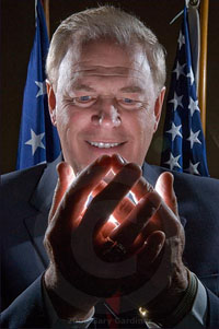
NOTE: As I continue to bask in the abject glory of Florida's stunning upset of Ohio State to win the NCAA football championship, Ohioan Gary Gardiner has written up an "On Assignment" about his portrait of Ohio Governor-elect Ted Strickland. Check it out for a look into Gary's thought process while making a really cool photo in just a little time with his subject.

Oh, and check out Gary's other work on his website, too. Nice stuff.

And congrats to OSU on a great season. They'll be back.

-DH


______________________________________________


I knew there would be little time for a formal photo of Ohio Gov-elect Ted Strickland during the half hour interview with a reporter he'd scheduled at his inaugural headquarters. The photos would have to come at the beginning or end of the session. I'd been there before when photos were seemingly secondary to the purpose of the interview.

Strickland, a Democrat, was coming into office after a Republican disaster in the election. Gov. Bob Taft was leaving after two terms, ethics violations and criminal charges against some of his close associates. Strickland would be the first Democrat in the office since 1991, as would most of the newly-elected statewide officers.

It's easy to shoot during interviews. I'd done it for more years than I'd like to remember. The reporter asks questions while the subject has a serious look as if they are really listening. Intense eyes, little movement, hands to the face. They then answer the questions, also with seriousness but more movement and hands that fly over the room. It's rare to get great photos from this setup but I always try.

The best images came from moments where I have been able to better define my interaction with the subject. CEOs, governors, and entertainers are the most difficult because they want you in and out in a hurry expecting you to shoot and run, usually without their worrying about the photo. I didn't want that to happen this time.

I once about five minutes to shoot Wendy's owner Dave Thomas at his original restaurant. I arrived early with an assistant that matched Dave's size, walked him through and around the restaurant, camera and lenses in hand, marking the floor and sidewalk where I wanted Dave to stand with his tray of food. The shoot took less time than was available. We got to eat the food and had enough time to talk to Dave who was surprised how efficiently I'd photographed him. I later was on the receiving end of a personal note from Dave telling me how much he liked the photos.

The plan was similar for Strickland.

Again, an early arrival to scout location and background for the portrait I'd hoped to shoot. I also wanted time to shoot secondary photos of workers and the headquarters atmosphere.

Most of the staff returned from lunch as I assembled two SB800s with Pocket Wizards on light stands, an SB24 on a short stand with the strobist cereal box snoot to splash a streak of light up the background and made a few tests.

I pulled a worker aside, handed him a small optical slave unit I've had for about 15 years, demonstrating how I wanted him to cup it in his hands for a quick lighting test. It had been a few years since I'd used the strobe and despite the guide number rating sheet I'd pasted on its side, I'd never used it in the cupped hands of a subject. This was a new experience.


The SB800s were moved into position slightly behind a second Strickland stand-in and in front of the U.S. and Ohio flags while I tested their exposure with the background light. Her blond hair was too light sucked up the light making the test inaccurate. I used a third stand-in that better matched Strickland in height and tone. I adjusted the SB800s, raising them higher for better spill across the temples and shoulders, zooming them to a narrower beam and testing without and then with the slave.

There were several major concerns.

The wall behind the flags had a broad diamond pattern that became more obvious with the stronger light from my flash. I dialed it down but still was bothered by the pattern. I decided to eliminate the background light. The SB800s hit the flags strong enough to separate them from the background. The flags, moved closer together, made a good background.

I chose a high ISO so there would be sufficient depth of field to keep foreground to background as crisp as possible. I thought it important all the objects in the frame be well defined.

Hand placement needed to be below the lips, at a minimum. The strobe, a half-dome with reflective background, needed to point at Strickland with his fingers spread just enough to allow light to pass through his fingers. The light lower than his face required that he tilt his head down to prevent a sinister look. The shape of his hands needed to be relaxed. He needed to look comfortable, as if he genuinely was pleased to be holding a glowing orb that represented the hope of a new generation in the Statehouse.

A final test with my last stand-in (just above) and I was ready when Strickland finished the interview.

I chimped him the final test frame so he'd know what I was attempting to do. He understood my instructions about hands and face. I chimped him and his PR guy the first frame. Fired six more frames in the next 79 seconds, thanked him for posing and asked if I could reset my gear for another location and a second sitting.

He agreed but I knew I already had what I'd come for.


By Gary Gardiner


(Feel free to comment on Gary's photo here.)

Details:
Camera: Nikon D200
ISO: 400
Strobe(s): Two SB800s with Pocket Wizards
One SB24 with pocket Wizard (discarded as background light)
One Morris Mini Slave Wide (15 years old)
Lens: 17-55mm f2.8
Exposure: 1/250th, f20

Web Portfolio with Lighting Diagrams

Photographer Scott Smith has a neat website that takes the idea of the typical web portfolio and kicks it up a notch by adding lighting diagrams and how-to blurbs to many of the photos.

It's well worth clicking around a little. But be warned that the boudoir section is a little NSFW-ish. Plenty of other stuff to see if the boss is around.

For those of you who noticed a little strangeness on Strobist today, you were right.

There was a Blogger "planned outage" that turned into a "prolonged day of weirdness." This resulted in things as odd as some readers getting notices that their request looked like those of spambots, of virus-infested computers.

Fear not - the problem is with Blogger, not your computer.

Serves me right for hooking up with a fly-by-night company like Google.

(Thanks for the heads-up, Craig.)

Monday, January 8, 2007

Couple of Seminar Tix Available

EDITOR'S NOTE: We worked out the spare tix issue in the fairest way possible.

-DH


We had a long lead time on this to allow people to snag a cheap Southwest flight if they were traveling to this Saturday's workshop. As such, a couple of the attendees' situations have changed and there are two or three tix available from individuals.

If you have a ticket that you cannot use, please contact Geren Mortensen at the original paypal addy ASAP-est and he can match your vacancy up with the top person on the waiting list.

The Jan 1st refund deadline was set primarily for clerical reasons (long-date paypal refunds are a bear) and Geren is devising a workaround.

We are only talking a few tix anyway, so this should not be too much work for the CMPG folks. And this way, each person showing up will have the appropriate docs, which will make things easier for the people working the table. And the appropriate people on the waiting list will get the slots.

Sorry for any confusion.

-DH

If You are Coming to the Seminar:

Addendum: If you have a copy of the Grecco book, please bring it. There are a couple of examples we are going to talk about. No need to go out and buy it just for this. But if you have a copy, please bring it.

Just a couple of admin items if you are signed up for this week's workshop. It is this Saturday from 1p - 6p, and directions can be found here.

1. Please let me know how you will be synching during the shooting part of the seminar. There is a thread on Flickr, here. If you have not already posted your synching method, please do so ASAP and we can work this out with the least crosstalk possible.

2. Please let us know if you will be joining us when we meet at BareBones for dinner afterwards. Just leave a comment under this post (if you are joining us) with a first name and last initial. Please note that there will be separate checks/split tab/etc - whatever they can arrange that does not involve me funding all of your microbrew/rib habits.

3. You should bring your camera(s), your small flash lighting gear (assume battery power and bring fresh and/or extra batts) a notebook and something to write with. No need to bring superwides or long tele lenses. Something that passes through the portrait length will be fine. Bring lots of questions, too. The subject matter will be variable, based on the experience level of the group. Audio recorders (for personal use) are okay, if you want.


That said, the agenda is basically:

• Intro
• Figure out where we are as a group
• Lighting Theory
• Gear
• Basic practice
• Advanced practice
• Turn you loose on each other

How much ground we cover will be determined by the group, questions, discussion, etc. Of course, we can continue the discussion at BareBones if you like. Heck, after three microbrews, the Inverse Square rule might actually start to make sense...

I'm in it for the Money

I noticed a thread in the Flickr discussion group in which someone suggested nominating Strobist for the Bloggies. To that end, some thoughts:


• If you really like the site, please just nominate it in one category. I am thinking "photo" might be most appropriate. Or possibly best photo site by a supermodel. (No, wait, that's Fred Miranda's joint.)

• If you participate, you are required to nominate blogs in at least two other categories. Please be creative and find a couple that are good but have not yet gotten much notice.

• "Blog Of The Year," which I sincerely doubt this one would win, carries with it a prize of 2,007 dollars pennies. With that kind of loot, I am pretty sure I would retire to Mexico.

• So doubtful am I about the last item, that if Strobist were to win Blog Of The Year, Lighting Boot Camp II rolls again this summer. And I will get no flippin' sleep at all. But I feel pretty safe on this one.


That said, I am heading over to nominate three other sites.

Sunday, January 7, 2007

Digital Journalist Excerpts LatDP

Strobist reader Joris van Alphen tipped us off that that Digital Journalist has a big piece on Michael Grecco's book. Better yet, they included more than a dozen photos done up with lighting diagrams and text.

Definitely worth a read if you have not gotten the hard copy yet. Digital Journalist is a great site, BTW. You could spend weeks clicking around through their archives.

To check out Joris' site, click on his name above.

(Thanks, Joris!)

Saturday, January 6, 2007

Next, They'll be Using Nitro

Not ones to settle for limited performance from the much-talked-about cheapo eBay flash remotes, some Strobist readers are souping them up.

Check out this Flickr Strobist thread for a how-to on swapping power sources (AAA's good, exotic batts bad) and swapping the antenna for a reported extended range of 200 feet.

(!)

One thing to consider: You could be breaking the law by adding a six-inch piece of wire to the cheap remote transmitters. While technically you would only be breaking the law for 1/250th of a second per shot, keep an eye out for the black helicopters.

(I'm just saying.)

Weekend Surfing: Lost America

Looking for some weekend reading? Photographer and Strobist reader Troy Paiva makes the wrecked cars, abandoned trailers and decrepit aircraft skeletons of the American desert west his ghostly subjects at his website, Lost America.

Using a balance of moonlight, multicolored strobe pops and light painting with a flashlight Troy evokes a surreal mood in these once-glorious, now rusted-out settings.

Troy has a large volume of work that comprises many years. He has a book and a ton of pix posted in the Strobist Flickr pool.

And there's a detailed how-to page on his site, too .

By Mike H.

Friday, January 5, 2007

TGIF - POTW: Jan 05, 2007

Whew.

Nine straight workdays, with a few 12-hour-plus Ford Funeral days thrown in. Love those oh-dark-thirty security sweeps on the risers behind the Capitol. And that's on top of whatever I managed to do here. Me be mucho tired.

Luckily, I have a four-day weekend in which I am catching up on some sleep, grabbing some family time and finishing up plans for the seminar a week from tomorrow. I spent this morning playing guitar while my six-year-old boy, who is home sick, messed around on his harmonica to some Neil Young. ("Long May You Run" is a great song.)

Fortunately, there was no shortage of strong flash work in the Flickr Strobist Pool to choose from for Picture(s) of The Week. So I chose three.

Leading off is jordanchez's quiet, ultra-detailed portrait of his grandfather. There is so little to this picture, and yet so much. The quality of the light - and the detail that it provides - makes the shot.

That's one of the best things about having total control over your light. Being able to choose the way in which light is going to reveal your subject lets you add a layer of quality to a simple photo to bring it to the next level. Make sure you see this one big.

Next is a photo that was an impromptu grab shot from a shoot of the band, Cloud Control. This one has gotten wide notice on Flickr, and for good reason. Wiredjazz gives a pretty good explanation of the technique on the photo's Flickr page. Check it out.

Last but not least is this portrait of an expecting couple, by Paul_G .

Nice light - one soft source from the side - with a simple composition and background reduce this photo to the bare essentials. Converting to black and white takes it one step further to make this one a standout in the less-is-more category.

The heart shape formed by the hands is a great bonus, too. Click here to see it big.

These days, we have new people joining the Flickr group in droves. (Welcome, everybody!) With a group this size we will obviously have a wide range of experience among the different members. No worries if you are a beginner. No one here was born with an off-camera flash in their hand.

And the best images just keep getting better and better.

Share

Twitter Delicious Facebook Digg Stumbleupon Favorites More